
Doctify
Objectives
Market Repositioning / Brand Awareness / Product Adoption
Deliverables
Branding / Website Design / Product Design / UX & UI
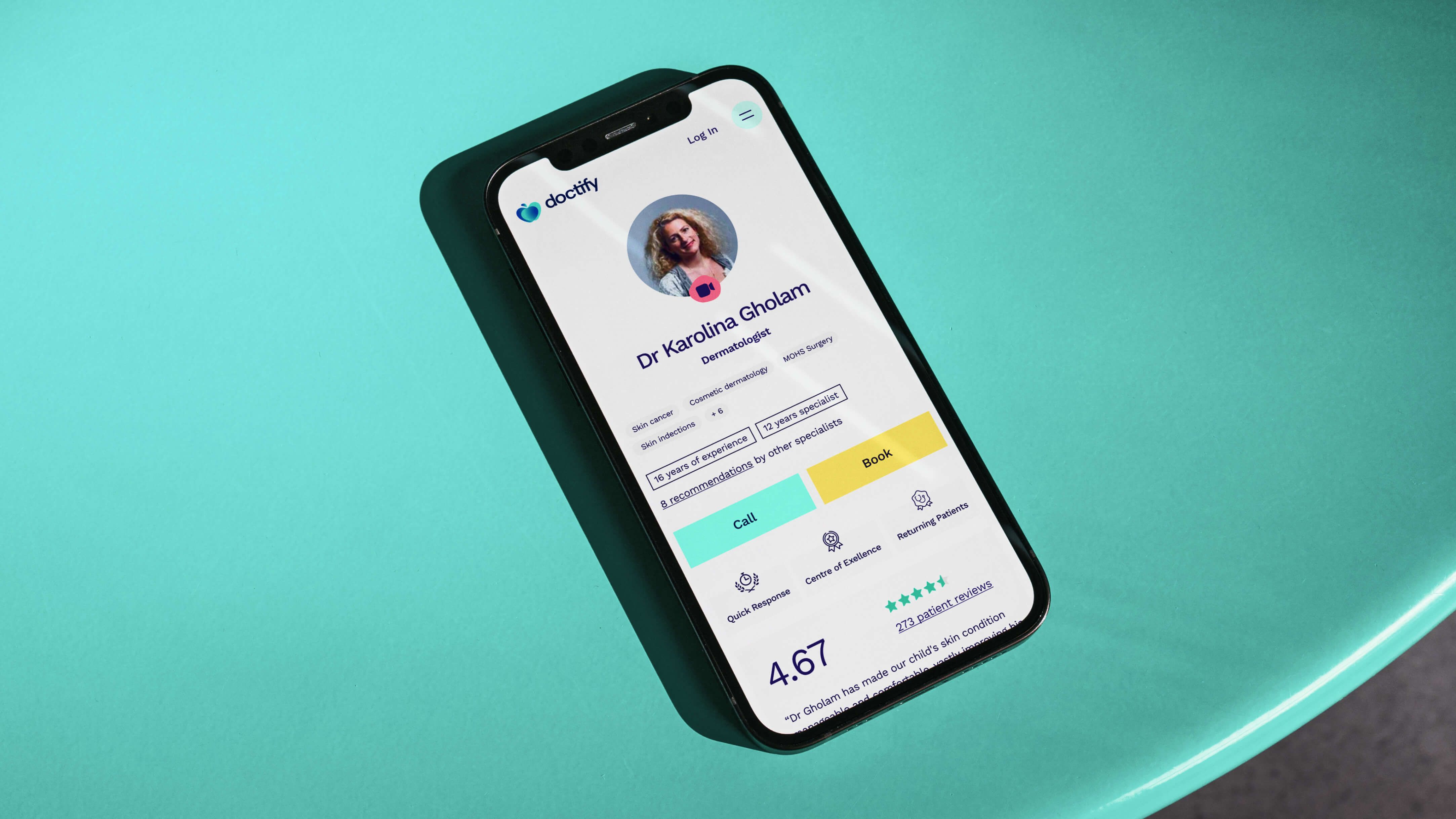
Doctify is a reviews platform, facilitating transparent and insightful reviews for doctors, dentists, and hospitals. Serving as a critical resource in the UK, Austria, Germany, and the United Arab Emirates, the platform offers visibility into healthcare options, allowing patients to find, research and book appointments with trusted specialists.
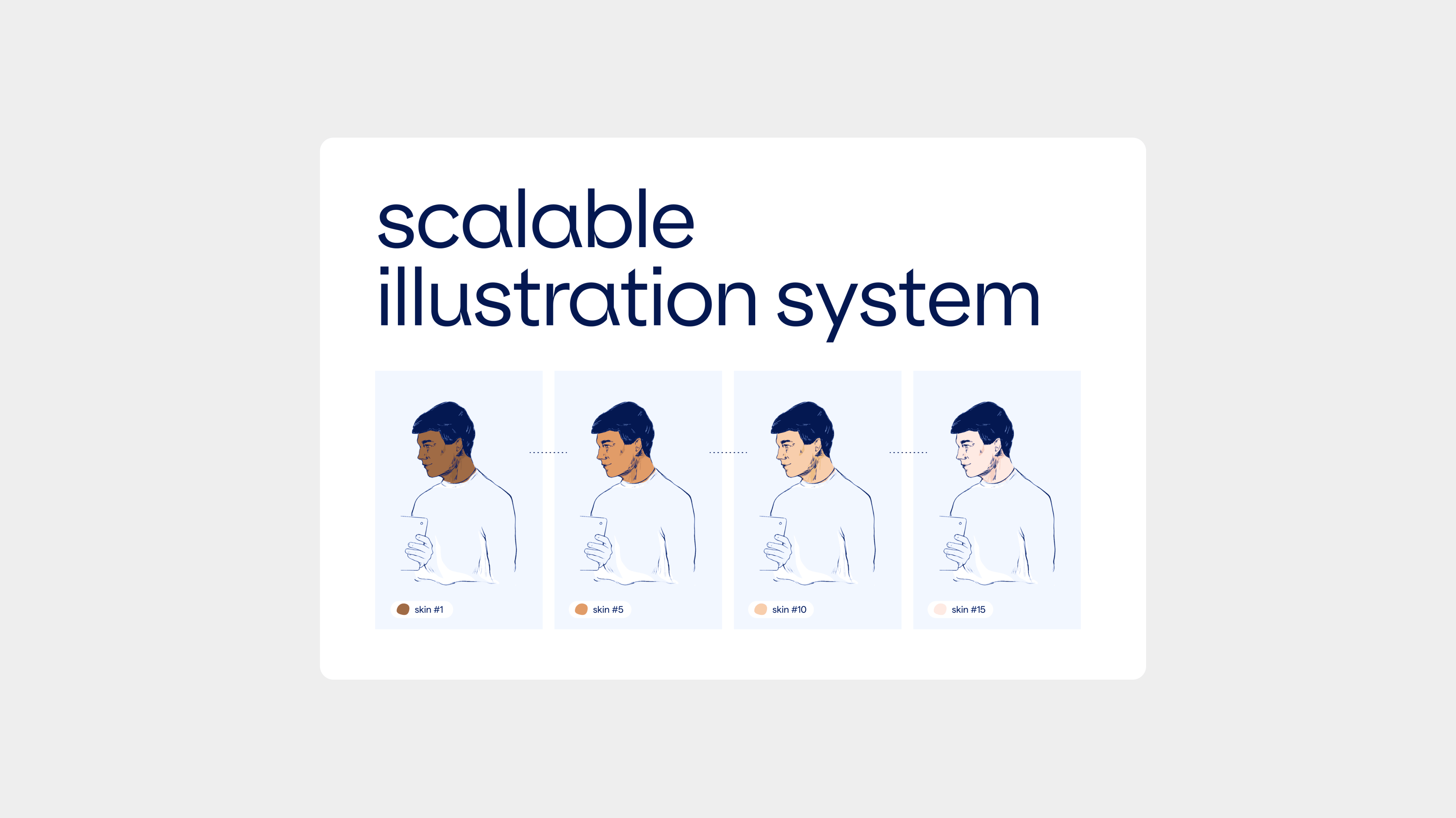
In redefining Doctify's brand identity, our goal was to reflect their dual nature as both a technological innovator and a caring, approachable healthcare brand. We preserved the 'apple' in their logo, symbolising their growth journey, and evolved it to integrate the fruit of life with motifs of love (heart) and connectivity (two overlapping rings), symbolising Doctify's dedication to care and connection in healthcare. At the heart of Doctify's refreshed identity is its distinctive illustration style, conveying their values of warmth, approachability, and commitment to demystifying healthcare, aiding patients in finding the best care with ease and confidence.
Objectives
Market Repositioning / Brand Awareness / Product Adoption
Deliverables
Branding / Website Design / Product Design / UX & UI


Doctify's brand transformation embodies their commitment to enhancing healthcare experiences with an emphasis on trust, transparency, and genuine patient care. A warm and caring guide in the patient's healthcare journey.


An outstanding team - not only very creative but also very professional. Can highly recommend!


