INOI
Objectives
Market Positioning / Brand Awareness
Deliverables
Brand Refresh
INOI is a global mobile phone brand focused on making technology more accessible, expressive, and human. Operating across emerging markets, INOI sits at the intersection of affordability and aspiration, connecting millions of people to the digital world through everyday devices. Our challenge was not to reinvent INOI, but to evolve it. To take an existing, functional brand and refresh it into something more emotionally resonant, culturally relevant, and distinctly human, without losing its recognisability or market equity.
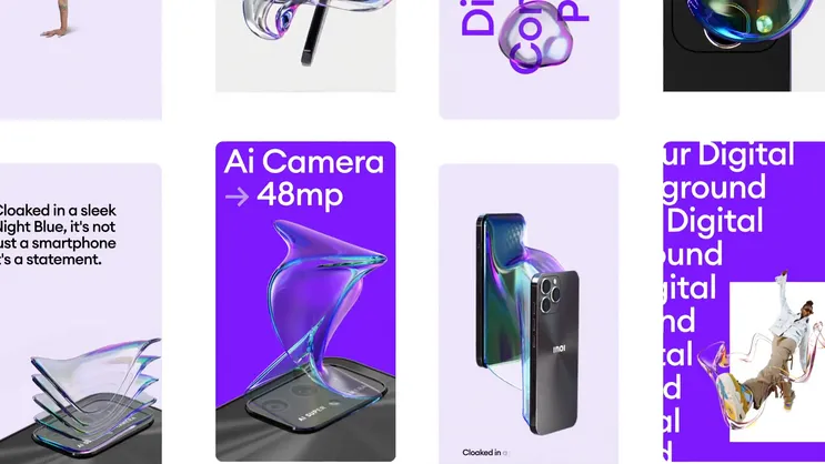
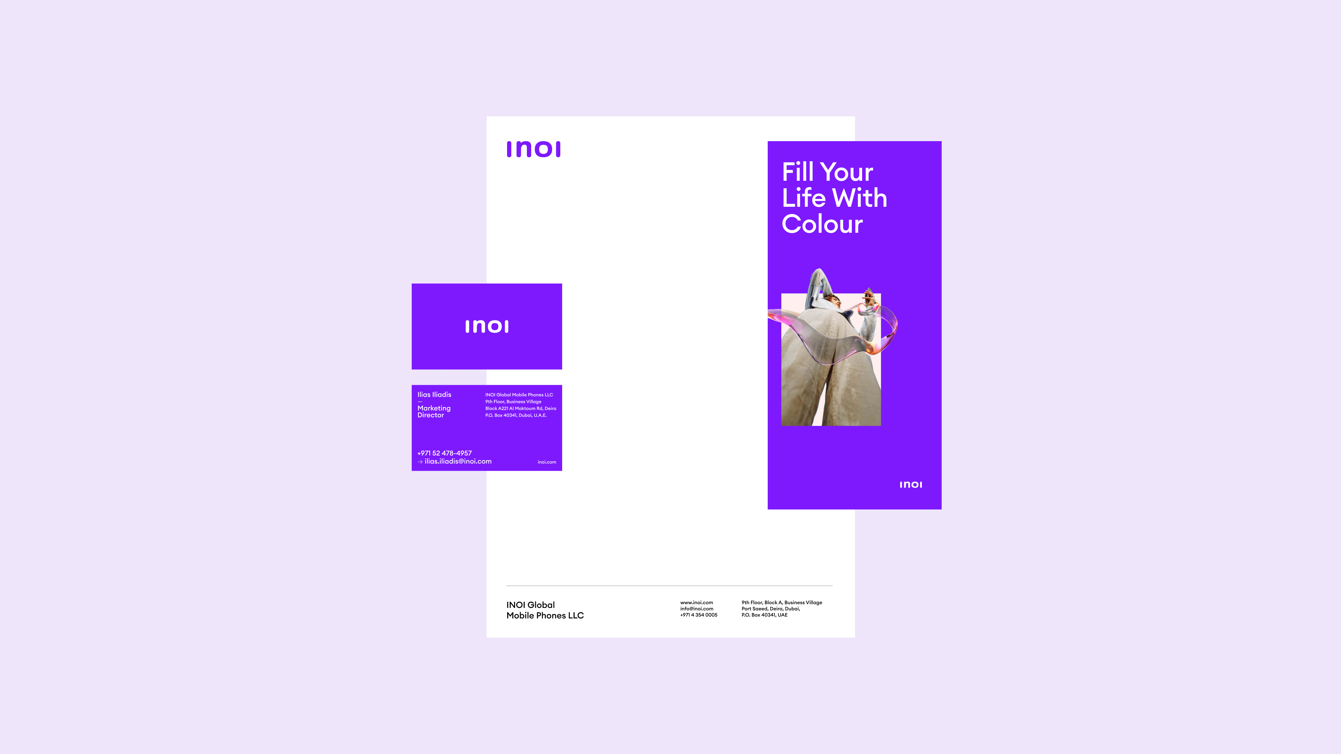
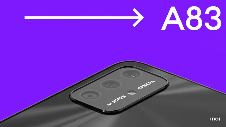
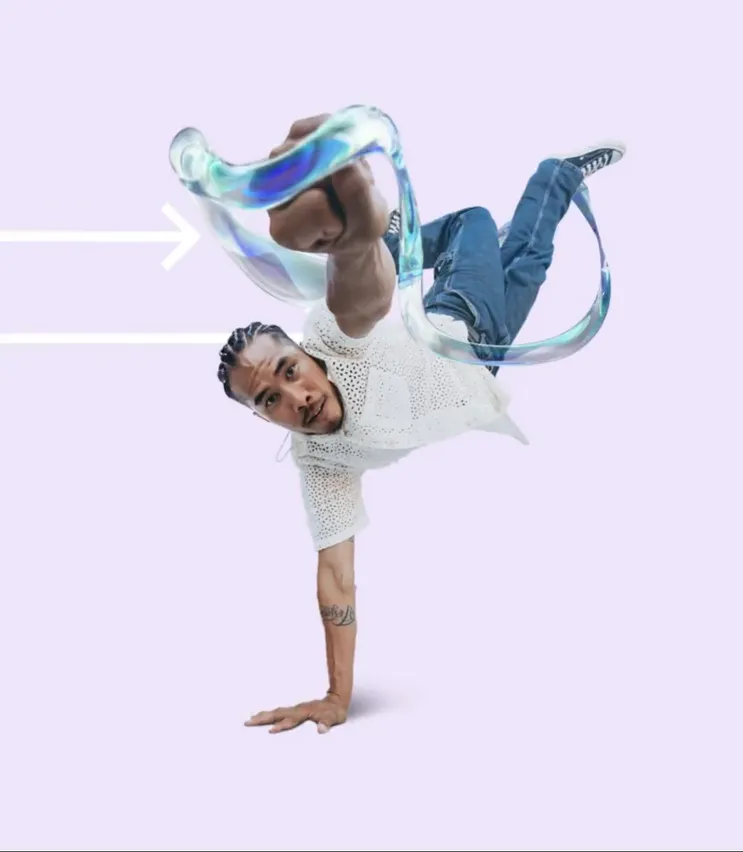
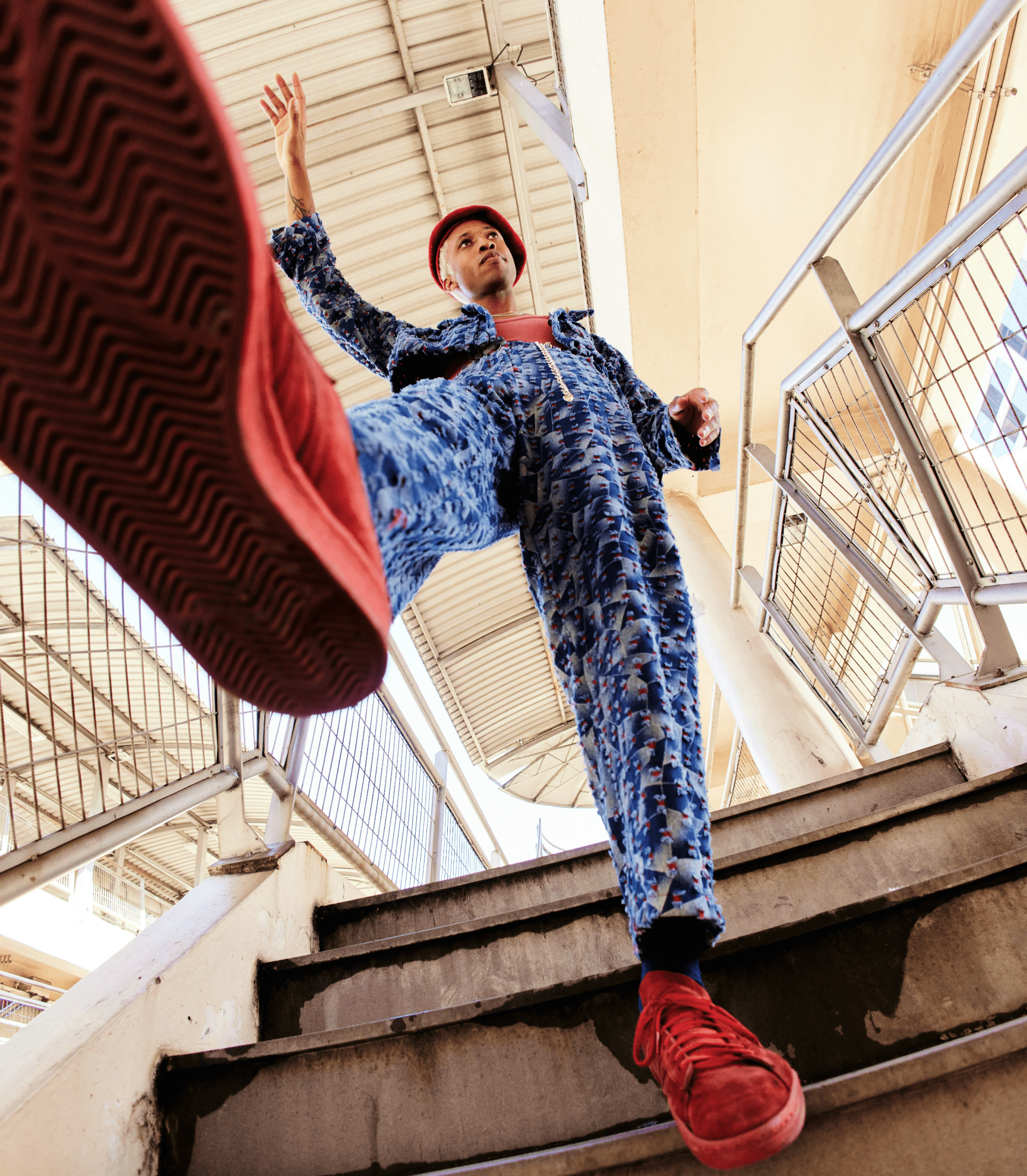
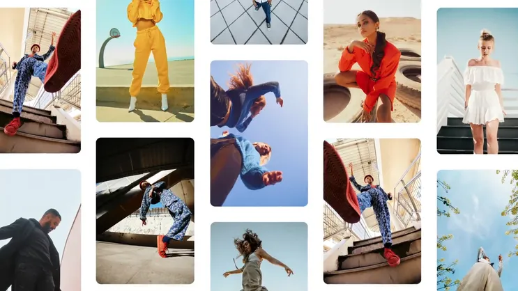
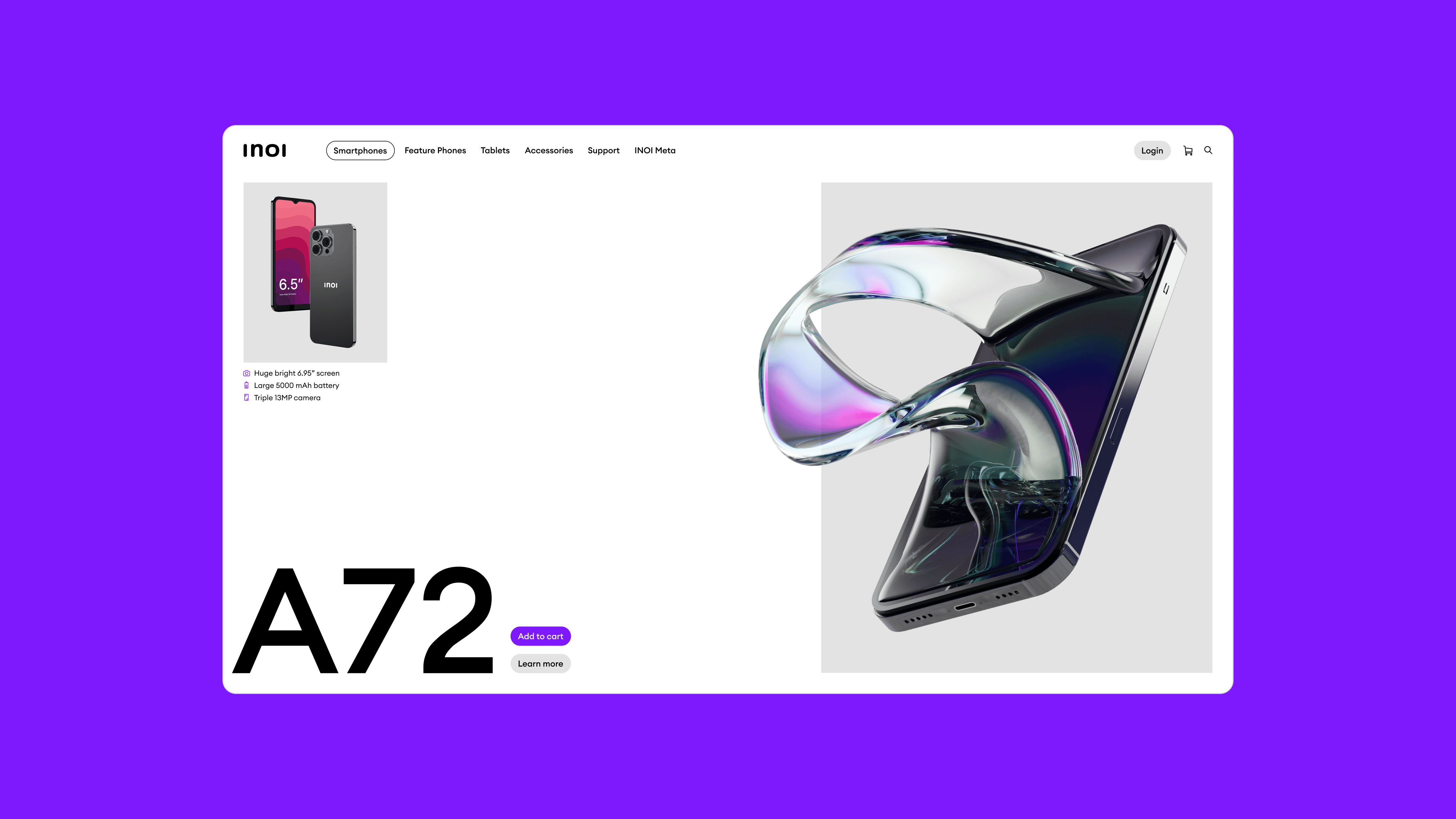
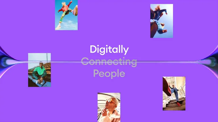
Working with INOI’s established logo and core purple accent, we pushed the identity further than ever before. We refined the visual system, expanded the colour language, and introduced a more expressive, people-first creative direction anchored in the idea of “Swipe to Joy”. The brand refresh focused on shifting perception. From generic mobile hardware to a brand that celebrates connection, self-expression, and the small moments of joy technology enables in everyday life.
The result is a more confident, vibrant brand ecosystem that feels contemporary, optimistic, and human-centred. Across product visuals, campaign assets, and digital touchpoints, INOI now speaks with greater clarity and emotional warmth, digitally connecting people while staying true to its roots. A considered evolution that brings more joy, relevance, and personality to a global mobile brand.
Objectives
Market Positioning / Brand Awareness
Deliverables
Brand Refresh


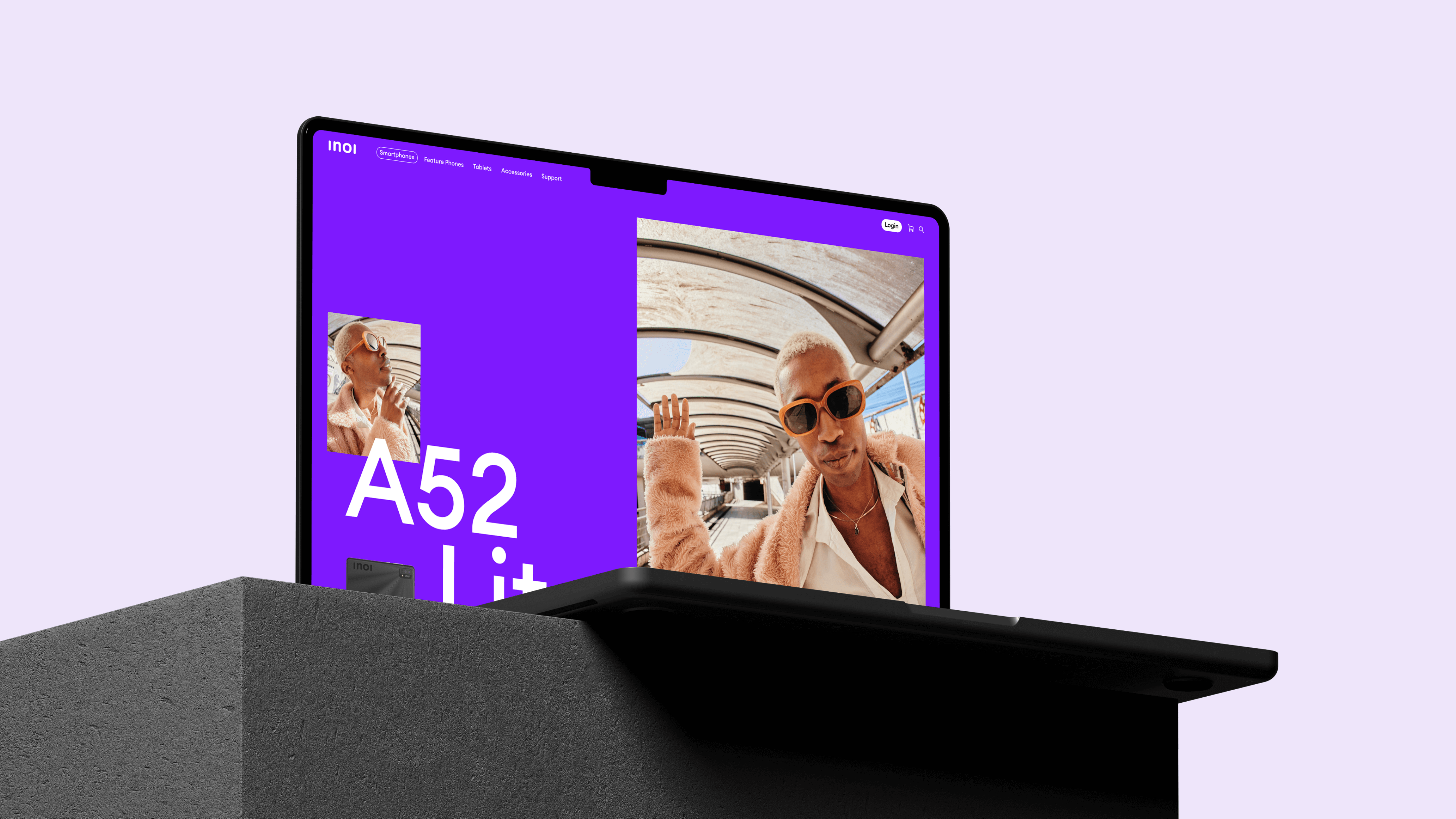


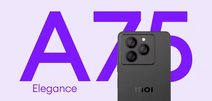
The refreshed visual style builds on INOI’s existing foundations while pushing the brand into a more expressive, contemporary space. Retaining the recognisable logo and signature purple, we amplified contrast, saturation, and scale to create a bolder, more confident presence. Clean product renders are paired with vibrant colour fields, human photography, and playful motion-led compositions, bringing energy and warmth into every touchpoint. The result is a visual language that feels optimistic and human-first, balancing clarity and accessibility with moments of joy, emotion, and personality.