Moneda
Objectives
New Product Launch / Market Positioning / Brand Awareness
Deliverables
Branding / Category Design / Website / Brand Application
Challenge
Moneda is building a new model for everyday finance: one where money is fully owned by the user, yet as intuitive and usable as the best neobanks. Built on regulated, self-custodial stablecoins, the model allows people to hold, move, spend, and grow their money across borders without relying on traditional banking infrastructure, while benefiting from high-yield earning accounts and intelligent financial guidance.
The first challenge wasn’t visual, it was conceptual. As a completely new player, Moneda couldn’t compete head-on with incumbent neobanks, nor could it afford to be positioned as a web3 or crypto product if it wanted to reach a mass-market audience. The product felt like a neobank, wasn’t a bank, and ran on crypto rails. Before designing the brand, we had to define the space it actually occupied and could credibly own.
Objectives
New Product Launch / Market Positioning / Brand Awareness
Deliverables
Branding / Category Design / Website / Brand Application
Strategy
That work led to the creation of Neo Finance, a category we defined to bridge this gap: neobank-level usability combined with self-custodial, regulated stablecoins and real user ownership.
Neo Finance became the strategic foundation for everything that followed, clarifying what Moneda is, who it’s for, and why it exists.

Identity
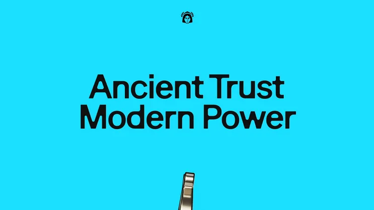
Ancient Trust. Modern Power.
With the category defined, the identity was built by looking both backwards and forwards. We returned to the original meaning of money: value exchanged directly between people, before banks, intermediaries, and opaque systems inserted themselves into the relationship. Ideas of sovereignty, trade, and trust became the foundation, reinterpreted through a modern financial lens. The result is a brand that feels rooted and enduring, yet unmistakably forward-looking, where history and innovation reinforce rather than compete.
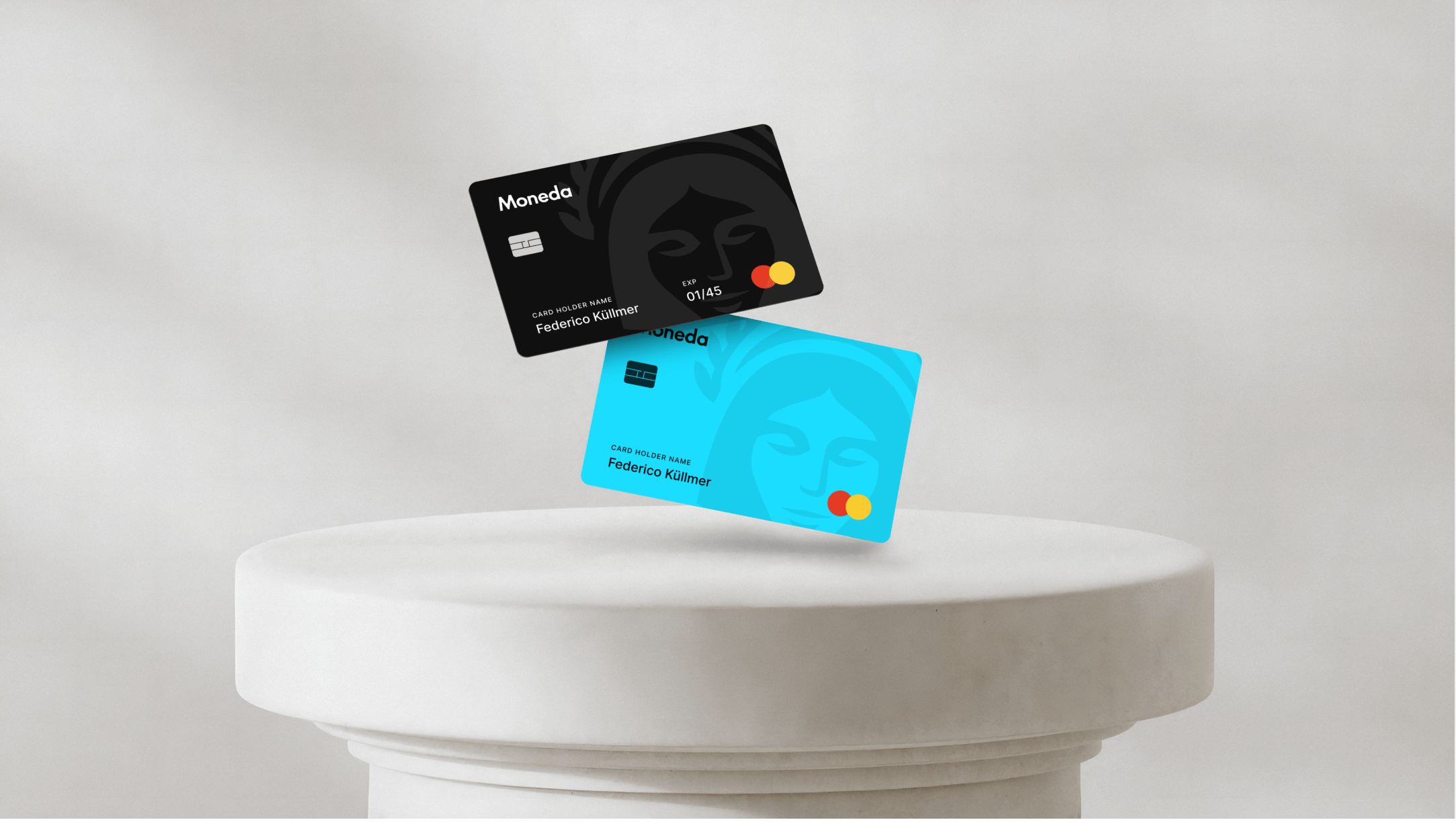
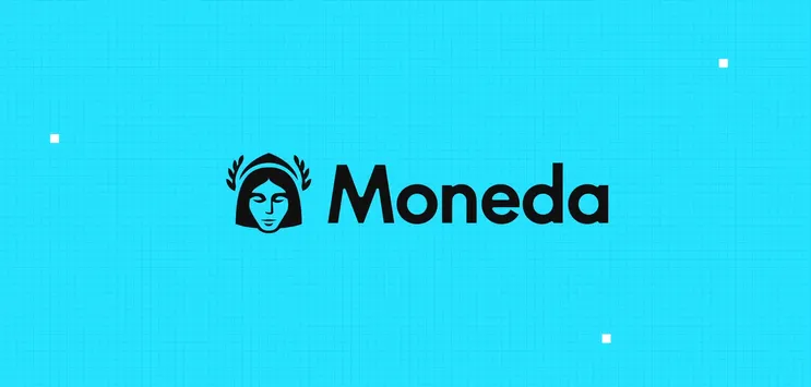
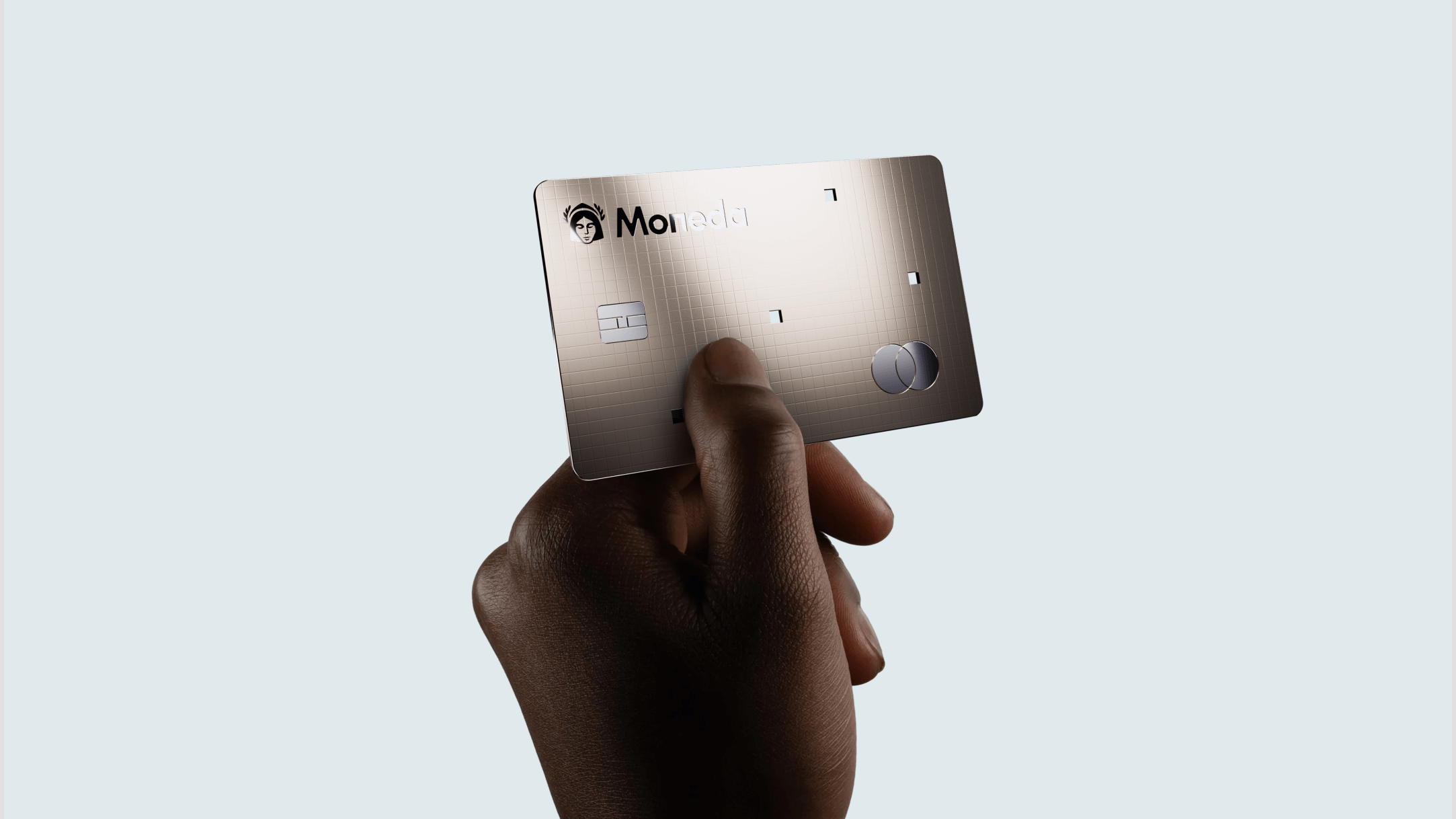
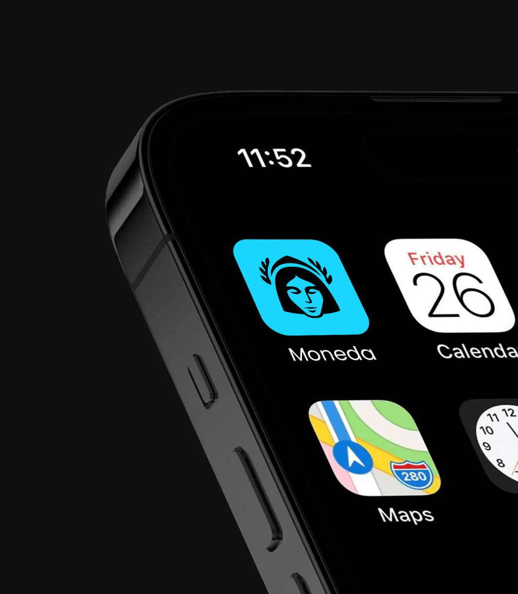
The visual language blends classical references with contemporary expression. Illustration draws from ancient sculpture, using faces, forms, and reliefs that evoke permanence and authority, reworked through modern composition, colour, and scale. Bold photography and a strong accent colour push the system firmly into the present, creating tension between old and new. At the centre sits a deliberately brave, unconventional logo: distinctive and confident enough to stand apart in a category crowded with safe, interchangeable marks.
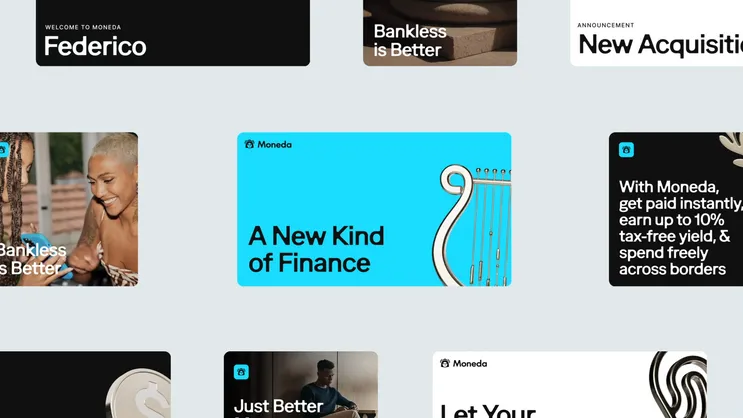

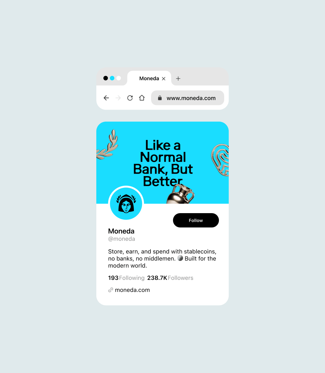
Application
The new brand was activated across every core touchpoint:
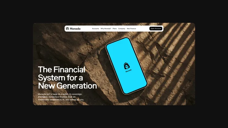
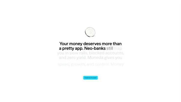
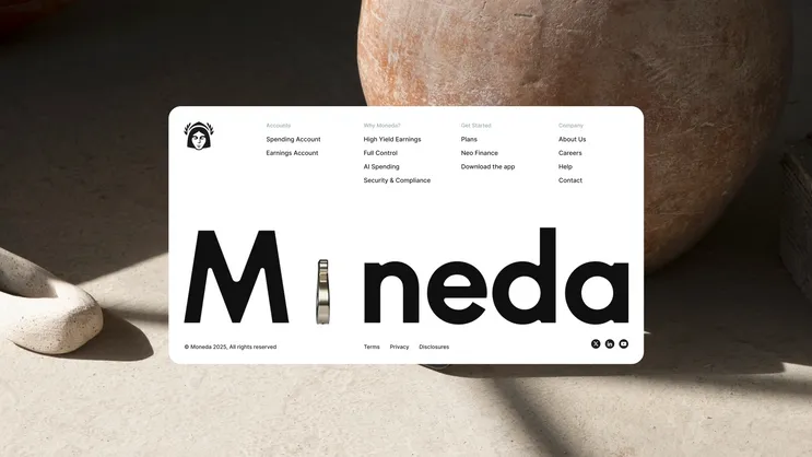
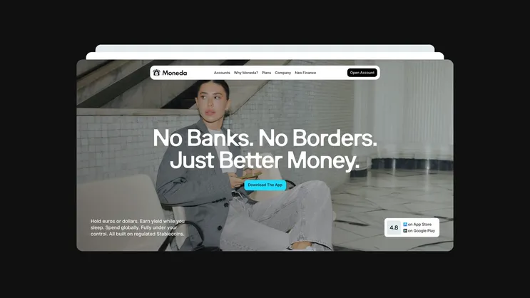
Website design & development A conversion-focused, product-led experience translating Moneda’s new category into clarity and trust.
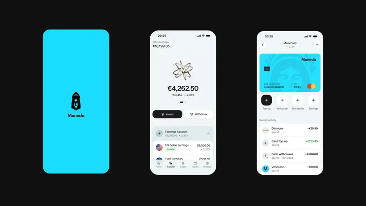
Product UI A refined mobile app design system aligning stablecoin infrastructure with a seamless neobank-grade UX.
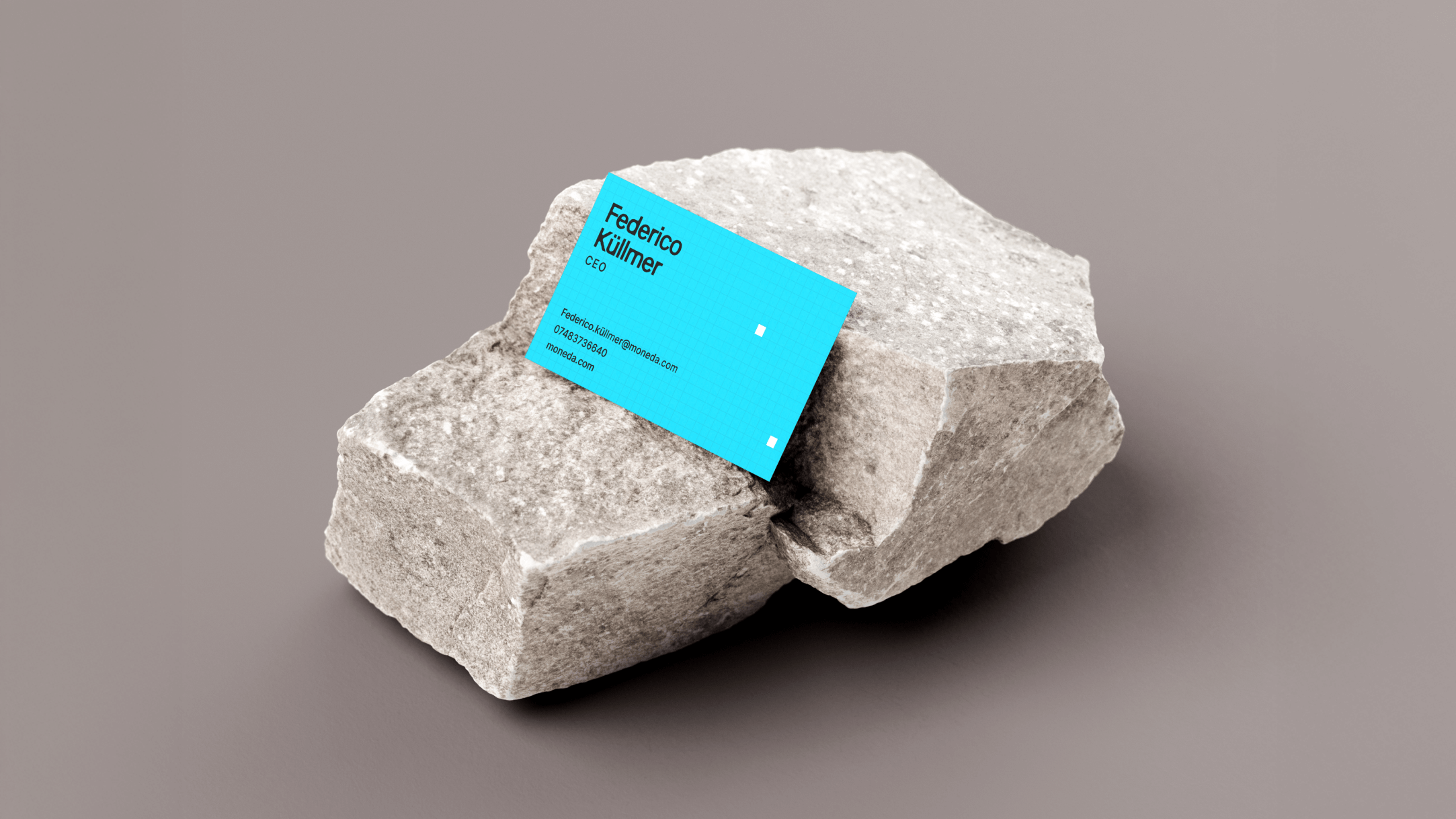
Marketing collateral Launch assets, social templates, and investor materials built for consistency and scale.
Launch video A cinematic brand introduction articulating the vision of self-custodial, AI-native finance.
"The team we worked with was extremely talented and passionate. One thing that especially resonated was the level of attention to detail they put into creating the identity and the different elements and interactions within the app. Working with Pony was simple, effortless and fun. They met all deadlines, sometimes even ahead of schedule, and communication was smooth over Slack and on calls. They took feedback in a very professional way and gave recommendations when they felt strongly about a direction, whilst respecting our wishes. Since launching the rebrand it has been received well by our beta users and has attracted a lot of traffic to the platform. We’ve also had designers and other creatives actively reach out to us to congratulate us on the website."