Radius
Objectives
Market repositioning / Brand Awareness
Deliverables
Branding / Website Design
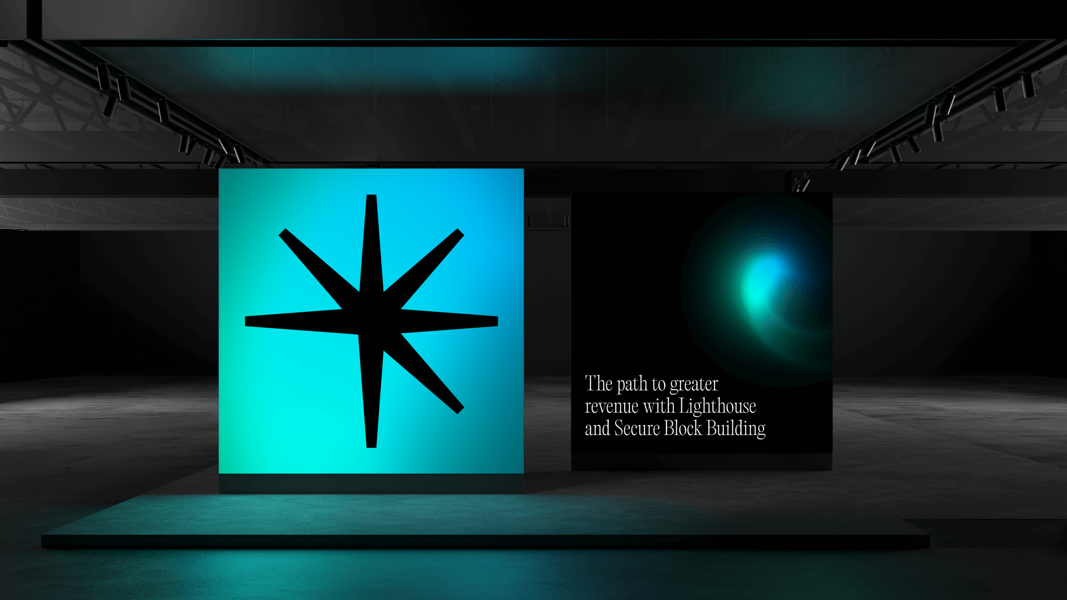
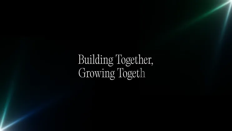
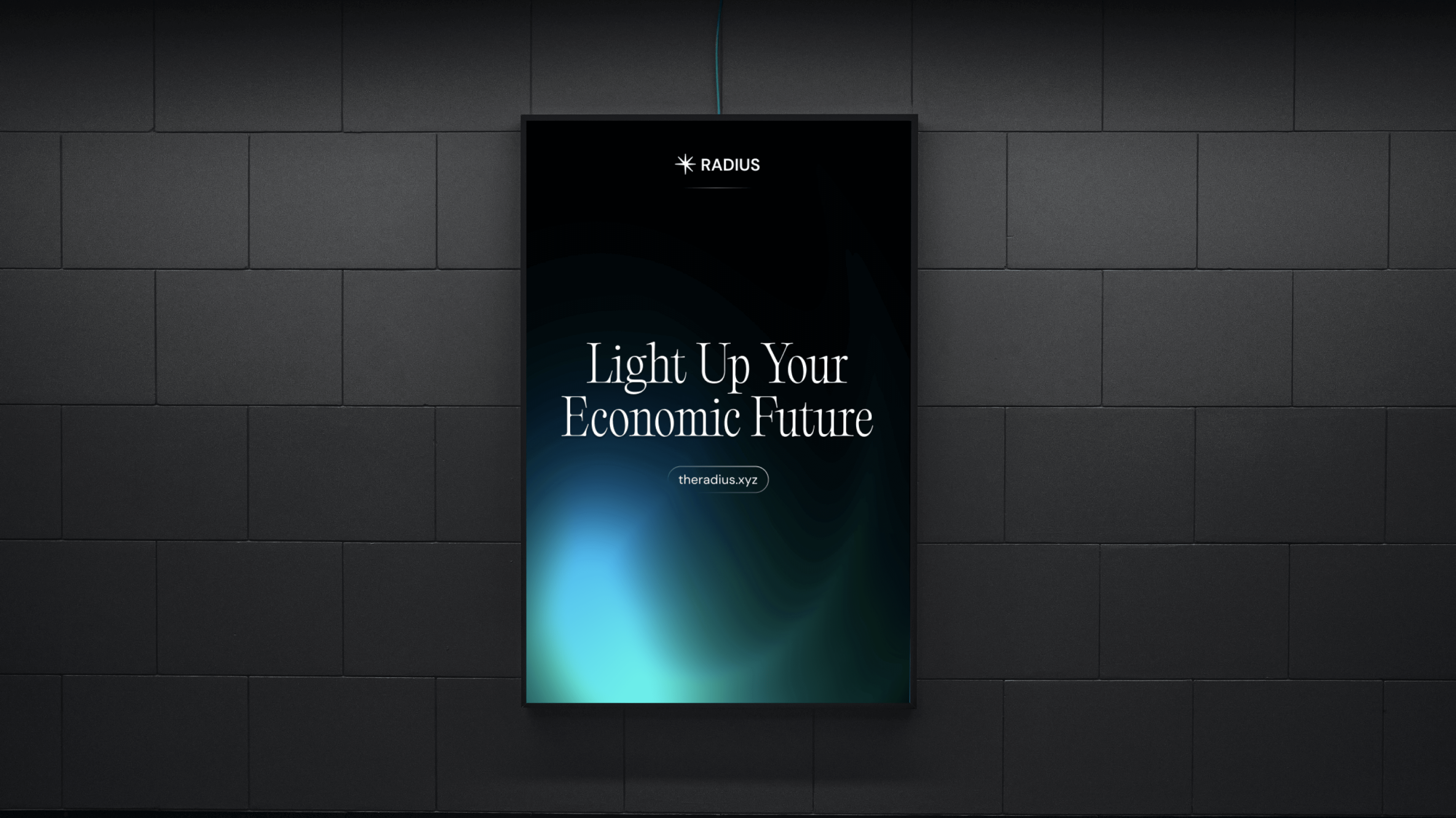
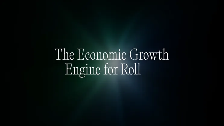
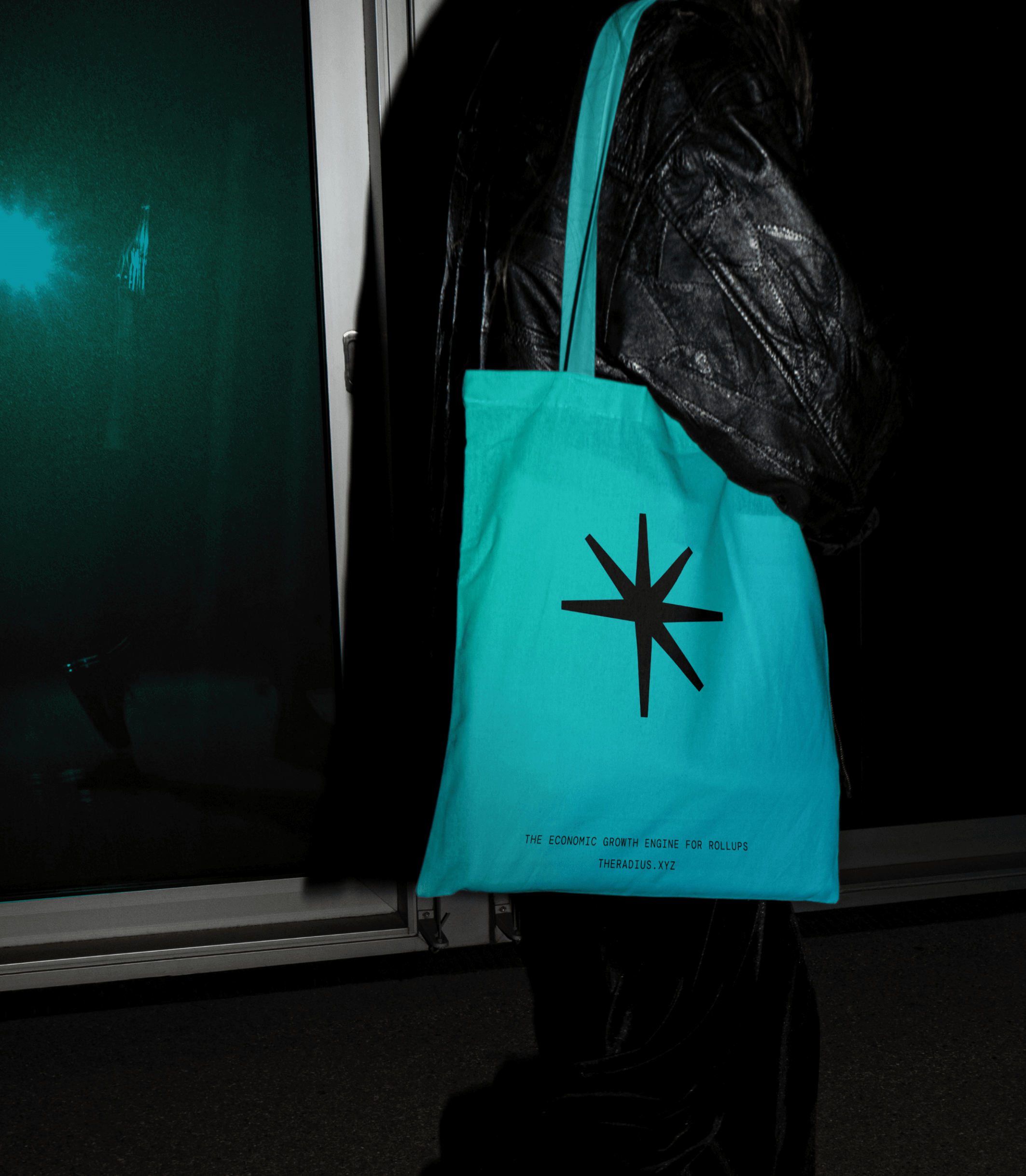
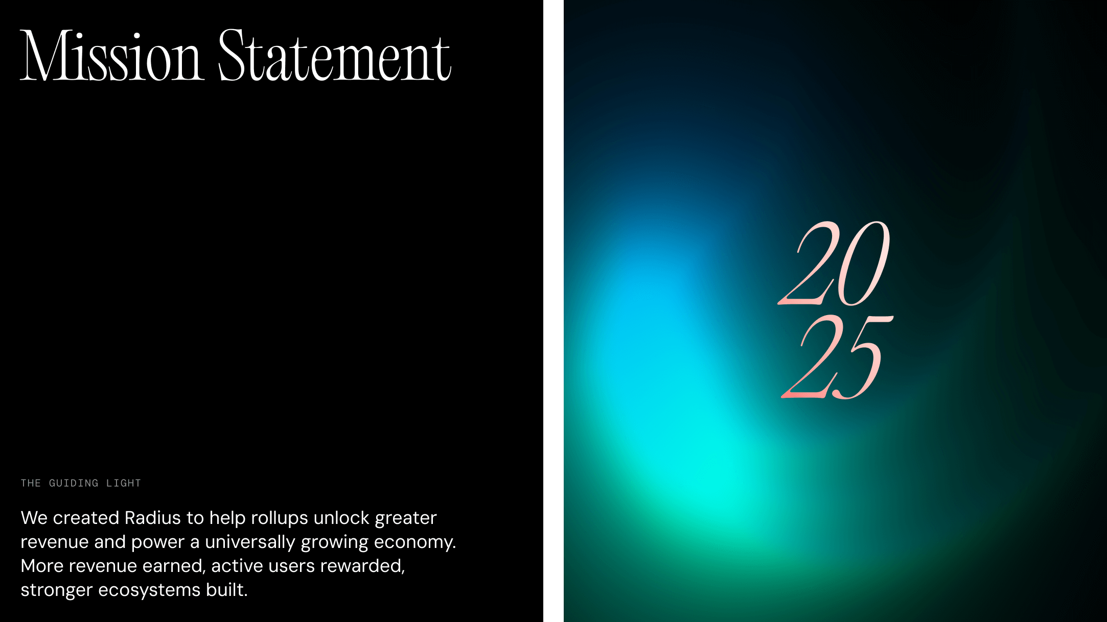
Radius exists to power the economic engine of rollups - quietly enabling them to unlock value, generate revenue, and strengthen their ecosystems. While their role is foundational, it often operates behind the scenes. As we reimagined the brand, we introduced a core narrative to reflect this: Radius as the guiding light for rollups, illuminating opportunity and surfacing value, while letting others take centre stage. It’s a positioning that captures their quiet influence without overstating it.
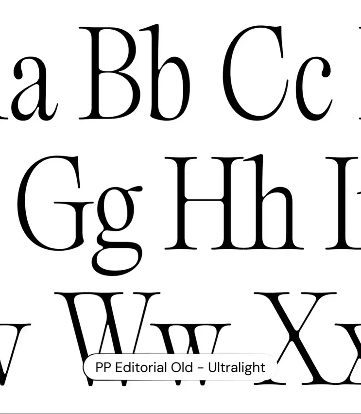
We translated this story into a visual and verbal identity that feels confident yet understated, technically advanced yet calm. Using a refined palette of natural greens and blues, subtle glow effects, and a minimalist visual language, we created a brand system that mirrors Radius’s purpose in the Ethereum ecosystem - steady, mature, and built to support long-term growth.
Objectives
Market repositioning / Brand Awareness
Deliverables
Branding / Website Design

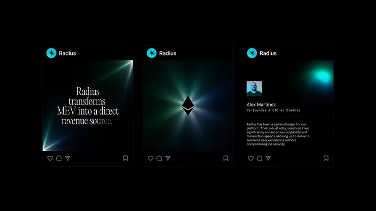
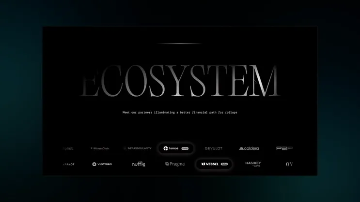
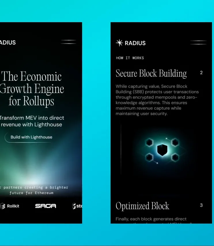
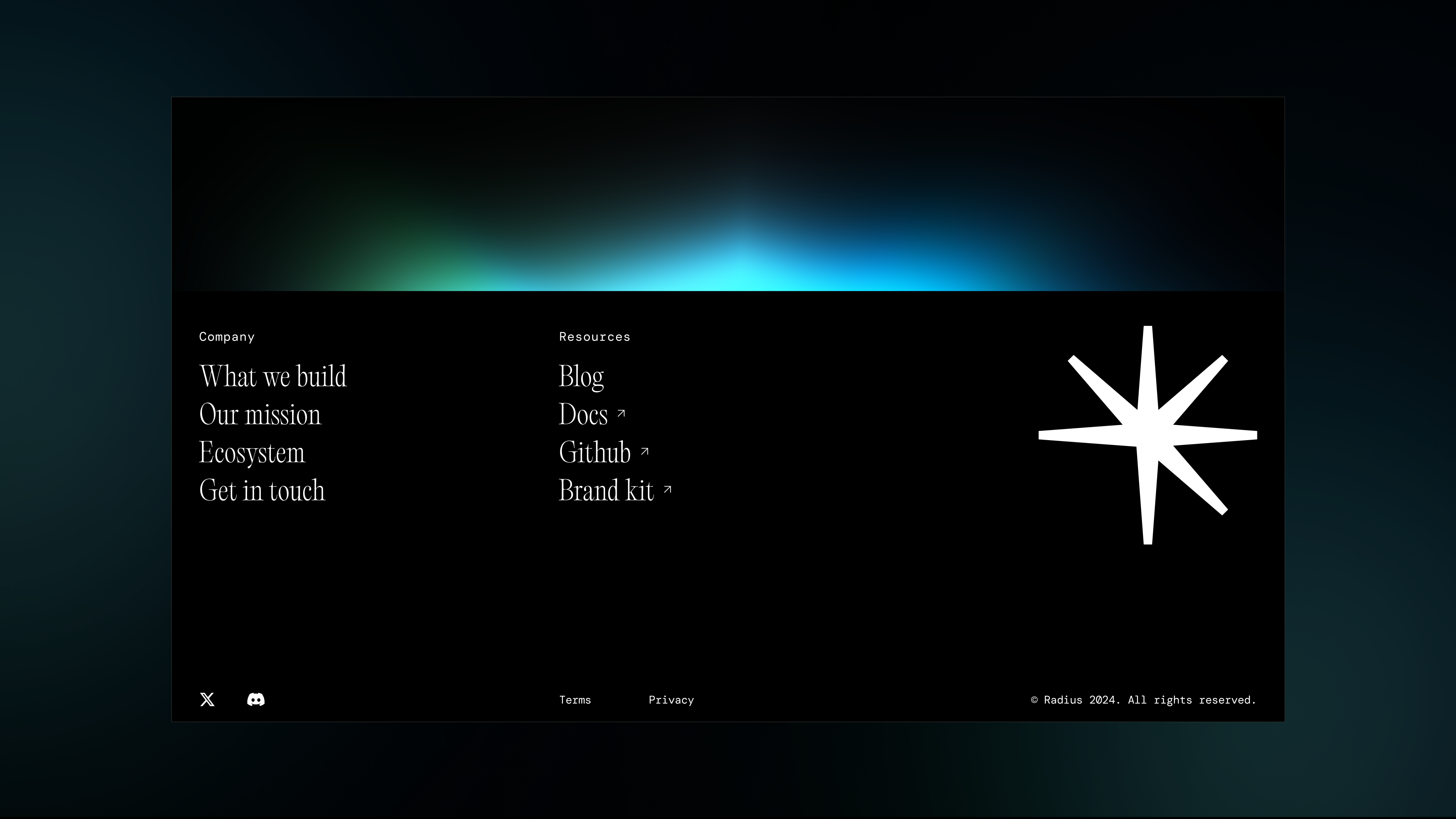
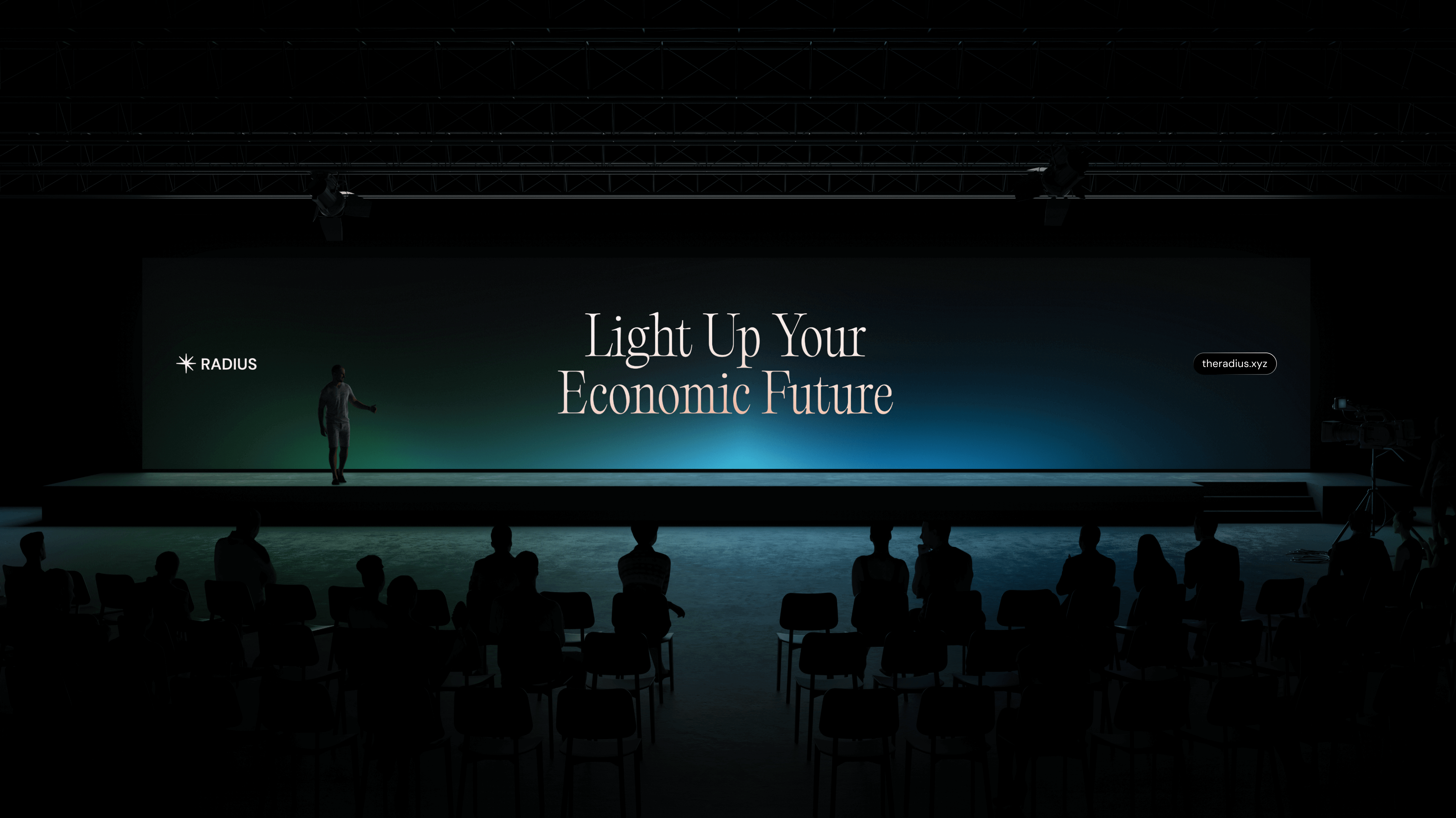
This visual identity is complemented by a website experience designed for clarity and ease. Interactive elements are employed judiciously to enhance user engagement without overwhelming the content. The overall design approach reinforces Radius's role as a steady, supportive presence in the Ethereum ecosystem, aligning with its mission to empower rollups and foster long-term growth.

"Working with Pony was an incredible experience. It was collaborative and intuitive, with constant iteration that made the process feel alive. They understood what Radius is about and brought our personality and mission to life in a way that feels bold, clean, and aligned with who we are. The rebrand has leveled up how we show up in the ecosystem to a whole new level."