Branding
7 min read
2024’s Most Successful Rebrands, As Seen by the Pony Team
Rebranding has the power to reshape perceptions, attract new audiences, and reaffirm a brand’s relevance in a rapidly evolving world.
In 2024, several companies executed bold and effective transformations, setting new standards in the industry. Here’s a look at the standout rebrands of the year, with insights from our expert design team.
Bose: Harmonising Heritage with Modernity
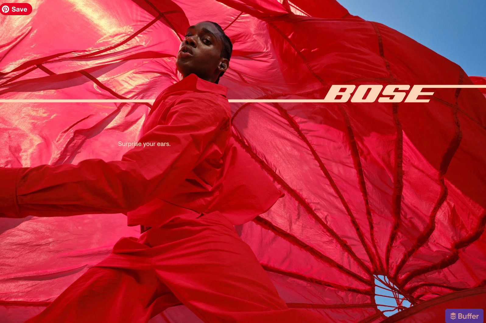
"Bose retained its iconic 1960s wordmark while adding subtle updates to bring it into the present. It speaks to younger audiences while remaining familiar and nostalgic for those who’ve grown up with the brand." – Stef Ivanov, Creative Director at Pony
Bose’s rebrand is a masterclass in balancing heritage with contemporary appeal. The subtle yet impactful refinements honour the brand’s legacy while ensuring its relevance in a competitive market. This evolution reinforces Bose’s commitment to innovation and design excellence, resonating with a diverse audience.
Creative Team: COLLINS
RSPCA: A Playful Evolution of Tradition
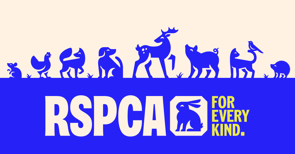
"The RSPCA’s rebrand gives a fresh and modern touch to a company that was overdue for change. The icon set of animals is playful, diverse, balanced – and yes, even sexy! It makes the brand feel bold and approachable while staying true to its mission." – Huw Vicary, Design Manager at Pony
After fifty years, the RSPCA’s updated identity uses vibrant colours and a playful set of animal icons to reintroduce the brand with renewed energy. The redesign creates an engaging and contemporary aesthetic, ensuring the organisation feels relevant to new generations while maintaining its commitment to animal welfare.
Creative Team: Jones Knowles Ritchie (JKR)
GUSH: Vibrancy Meets Innovation
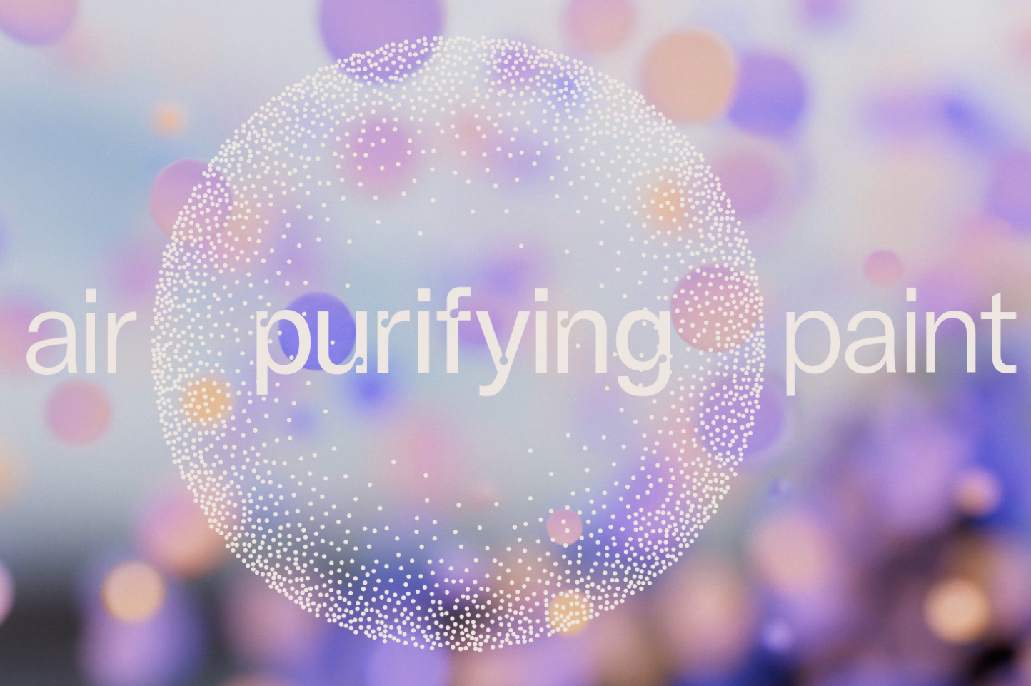
"GUSH’s branding is a perfect balance of fresh and functional. The 3D design elements feel elegant and timeless, and the overall look captures both the scientific and creative aspects of the brand. It’s an unusual but exciting take for an air-purifying paint." – The Anh Bui, Motion Designer at Pony
Although the project was technically completed at the end of 2023, we couldn’t resist including it here because the visual language is absolutely stunning. GUSH’s rebrand breaks away from conventional norms in its industry, positioning the brand as both innovative and aspirational. Its modern, vibrant visuals resonate with eco-conscious consumers and creative professionals alike. The refined use of 3D design elements ensures the branding feels timeless, while perfectly showcasing the product’s unique combination of science and artistry.
Creative Team: Pentagram
Hello Klean: Simplicity at Its Most Powerful
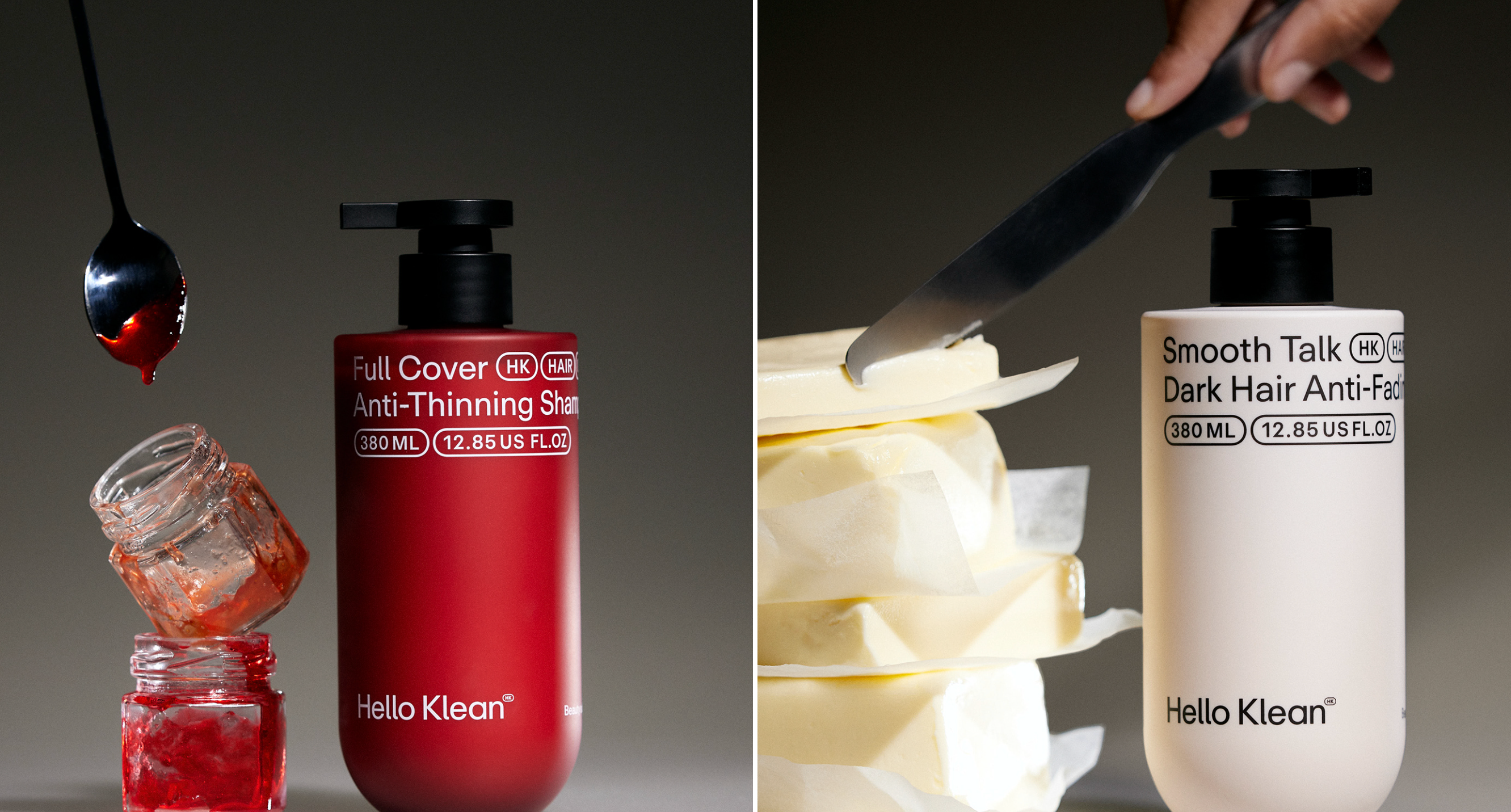
"I love how simple and refined it is. The design feels incredibly mature, timeless, and elegant. There’s something undeniably powerful about minimalist packaging like this—it communicates confidence and sophistication effortlessly." – Oli, Senior Designer at Pony
Klean’s rebrand embraces a stripped-back, minimalist aesthetic that speaks volumes. The clean and understated design balances elegance and timelessness, projecting a sense of trustworthiness and clarity. By avoiding unnecessary embellishments, the packaging highlights the brand’s core values of simplicity and transparency, making it stand out in a crowded marketplace.
Creative Team: Klean In-House Design Team
Lloyds Bank: Friendlier and More Modern
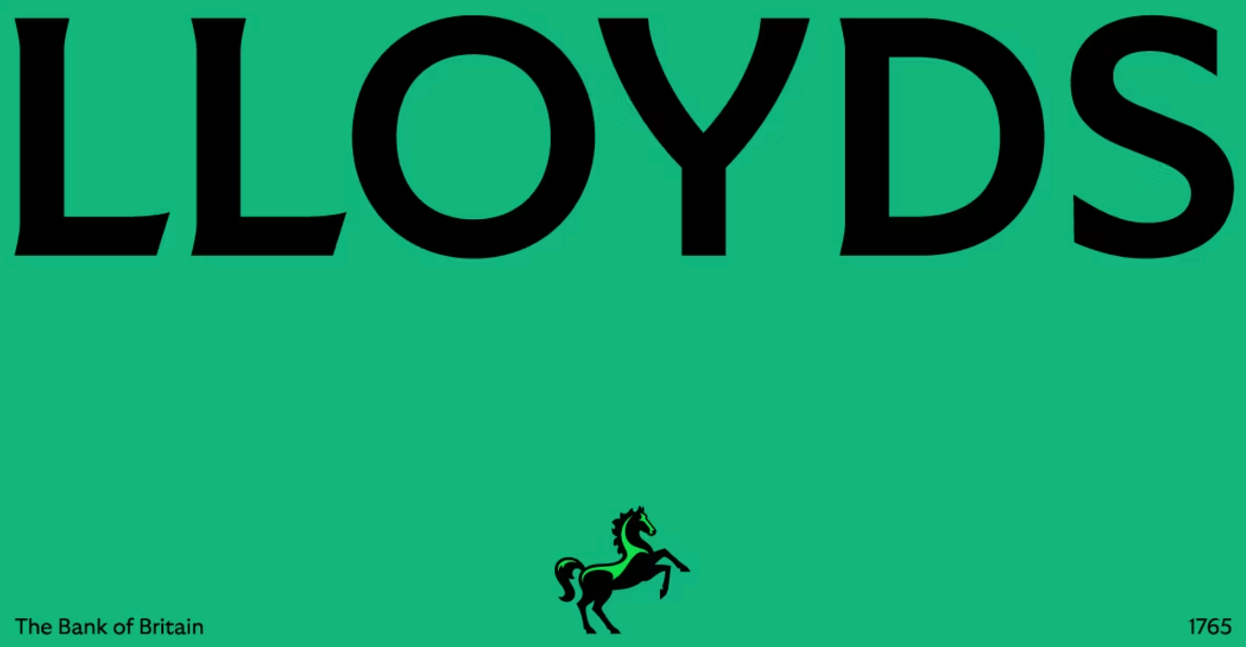
"The refreshed visual assets, brighter green tones, and playful advertising make Lloyds feel more approachable to millennials and Gen Z. It has the personality of a modern fintech brand, while still honouring its trusted legacy." – Desi, Brand Strategist at Pony
Lloyds Bank’s rebrand embraces a fresh chapter for the institution. By introducing bright, contemporary colours and dynamic illustrations, the new identity repositions the brand to connect with a younger, digital-savvy audience. It balances modernity with trust, staying true to Lloyds’ heritage while projecting a friendly, forward-looking ethos.
Creative Teams: Wolff Olins and adam&eveDDB
Pepsi: A Bold Return to Roots
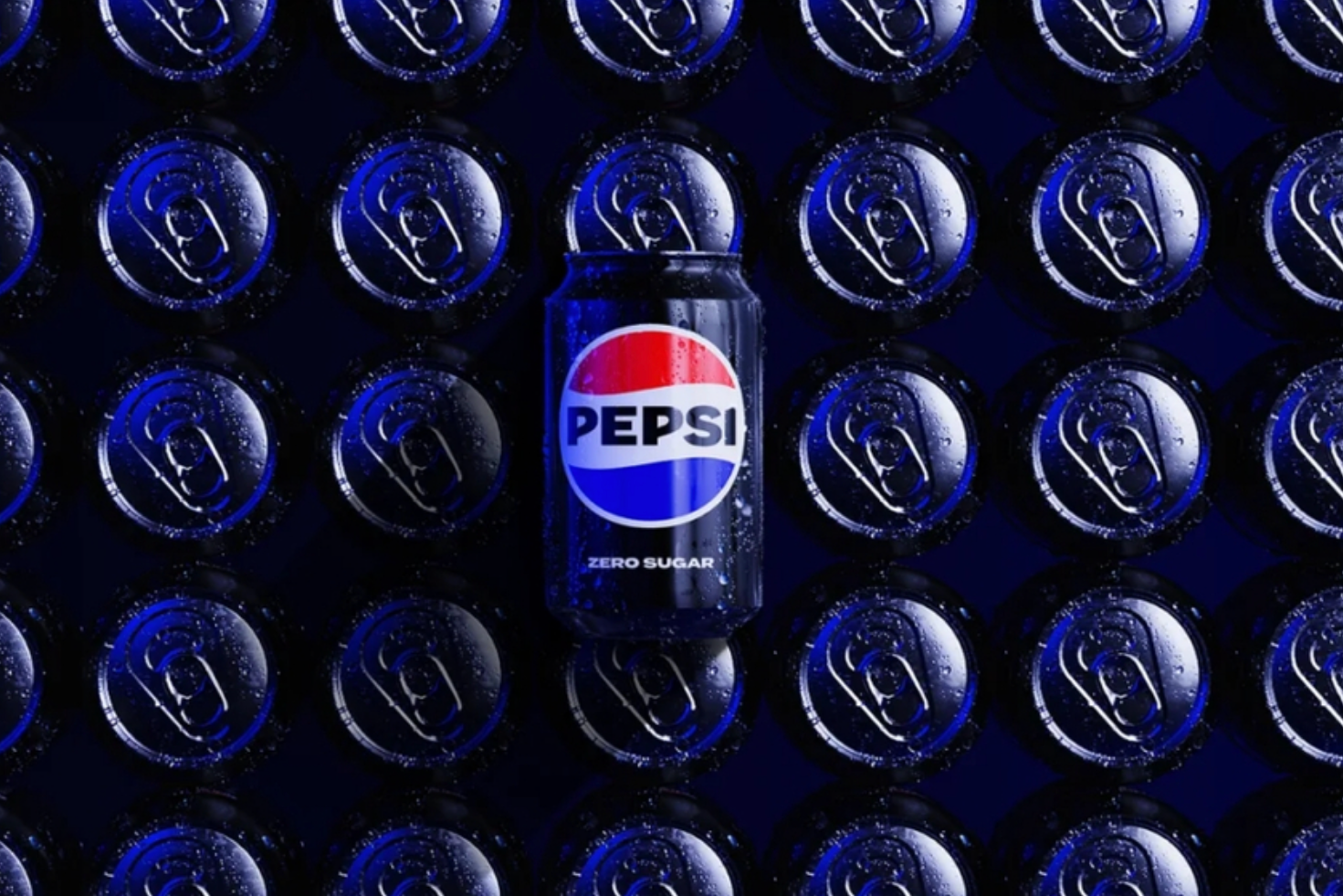
Celebrating its 125th anniversary, Pepsi reintroduced a modernised version of its classic logo. The updated design includes bold typography and a vibrant colour palette, blending nostalgia with a contemporary twist. This rebrand bridges generations and reaffirms Pepsi’s position as a cultural icon while embracing its legacy with renewed vigour.
Creative Team: PepsiCo Design & Innovation
Decathlon: A Dynamic Evolution
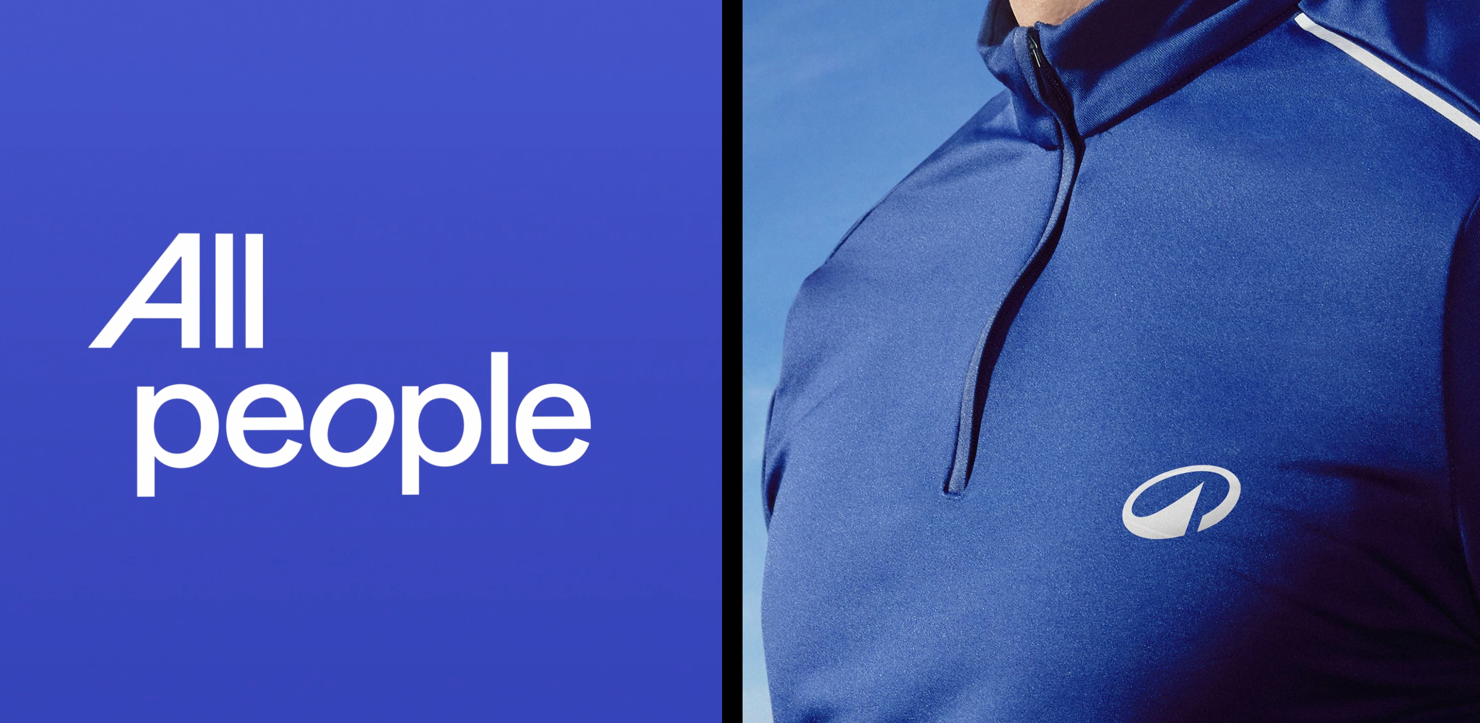
In 2024, Decathlon, the global sports retailer, unveiled a comprehensive rebrand that many felt was slightly... boring. The new visual identity introduces a streamlined logo with a dynamic swoosh, symbolising movement and athleticism. While the design might not feel groundbreaking, we believe it achieved exactly what it aimed for: modernising Decathlon's image to appeal to a younger, active audience while staying true to its mission of accessibility and innovation in sports equipment. One standout element we particularly liked is their inclusive new messaging: "All people, all sports, all ages, all levels." It’s a strong statement that encapsulates their core values.
Creative Team: Wolff Olins
Deezer: Harmonizing the Digital Experience
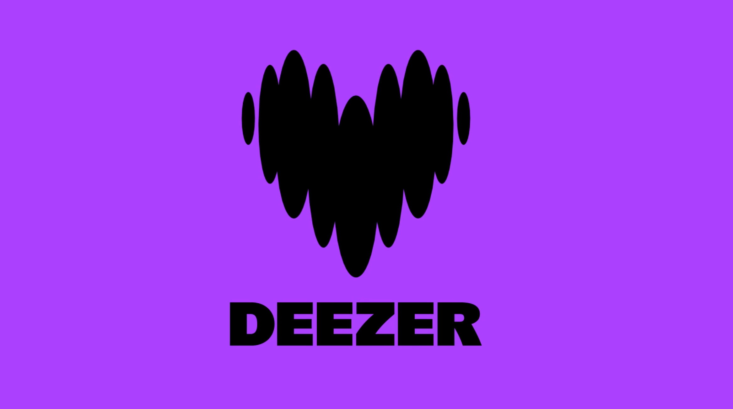
Music streaming service Deezer refreshed its brand identity in 2024, introducing a vibrant colour palette and a refined logo that enhances the platform's visual appeal and user experience. We particularly liked how the updated logo incorporates wave-like elements, subtly evoking the visual language of audio waves and tying the design to the essence of music. This transformation reflects Deezer's dedication to delivering a seamless and engaging music experience, positioning itself competitively in the global streaming market.
Creative Team: Koto
Ligue 1: Elevating French Football
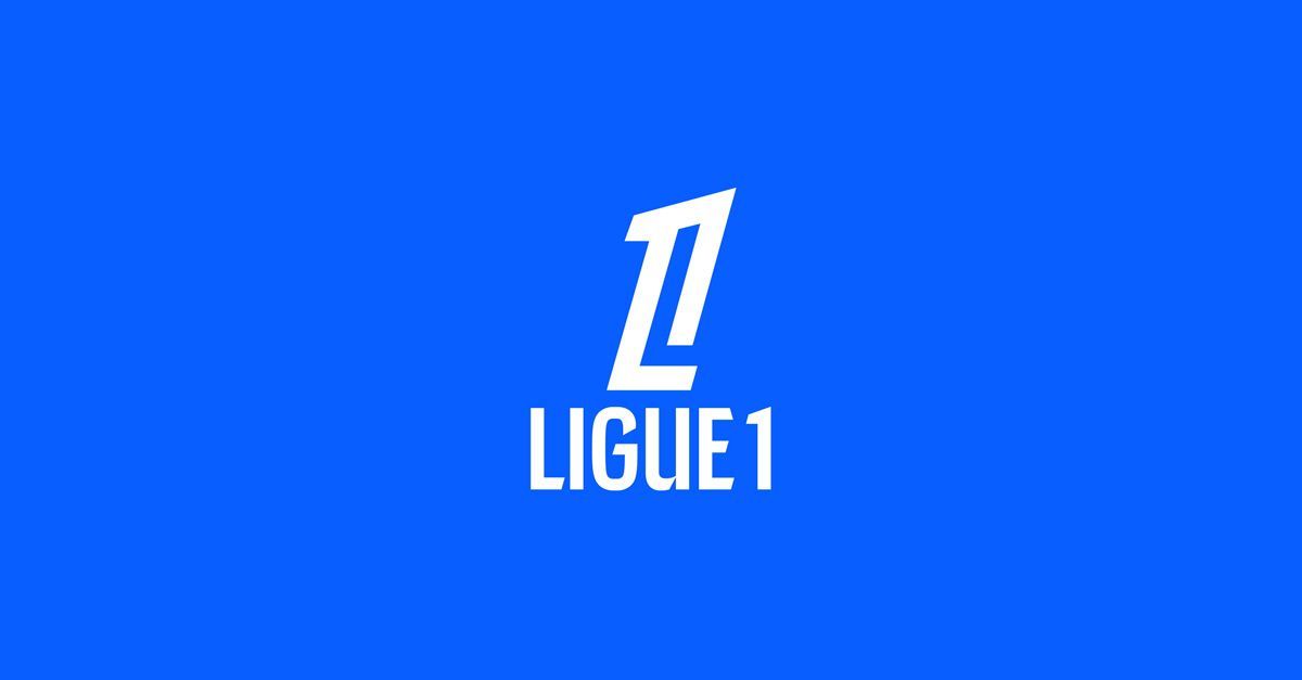
France's premier football league, Ligue 1, unveiled a significant rebrand in 2024. The updated identity features bold typography and a streamlined design, encapsulating the league's dynamism and prestige. While the logo concept reminds us a bit of the approach behind the OneFootball logo, we still love its bold simplicity and how it positions Ligue 1 as a modern and competitive player in the global football scene.
Creative Team: Dragon Rouge
Do you think there’s an incredible rebrand we missed? Email us at hello@pony.studio and share why it deserves a spot on our list!
And if you're looking for a creative design and branding agency to help elevate your brand, don’t hesitate to reach out to our team -we’d love to connect!


