Branding
Design
14 min read
The Impact of the Most Successful Rebrands in History
In the ever-changing landscape of business, a company’s brand is like its fingerprint – unique and telling. However, there comes a time when a brand starts to feel out-of-date or misaligned with the company’s direction or values. That’s when rebranding steps into the spotlight – a strategic decision to give a company a fresh face and a renewed sense of purpose.
Rebranding isn’t just about sprucing up a logo or adding a catchy new slogan. It’s about a deeper change, almost like a company taking a bold step into a new chapter of its story. The most impactful rebranding efforts are those that go beyond aesthetics, weaving together the threads of innovation, relevance, and strategic foresight.
Consider this: from the tech world to the realm of fast food, successful rebrands have reshaped not only how companies are perceived but also how they operate. Whether it’s a tech giant redefining itself to stay ahead of the curve or an iconic fashion brand revamping its image to appeal to the next generation, the process is as challenging as it is rewarding.
In this journey through some of the most successful rebrands in history, we’ll look at why and how these transformations happened, and what effects they had. From Apple’s leap into a new era to Old Spice shaking off its old image, each story is a lesson in how a well-thought-out rebrand can breathe new life into a business.
So, let’s dive into these stories of change and innovation. We’ll explore how companies like Burberry, Airbnb, and Guinness navigated their rebranding journeys, emerging not just with a new look, but with a revitalised identity that propelled them to new heights. It’s a journey through the power of branding and a look at how the right changes at the right time can make all the difference.
Apple
History & Context: Apple, founded in 1976, was struggling by the mid-90s, with declining sales and a lack of clear direction. The return of Steve Jobs in 1997 marked a pivotal moment, as he initiated a series of changes to revitalise the brand.
Logo Evolution: The transition from the colourful rainbow logo to a sleek, monochromatic design marked a significant shift in Apple’s brand identity. This change first appeared on the PowerBook G3, symbolising a move towards a more modern and sophisticated brand.
Colours: The shift to monochrome represented simplicity and elegance, moving away from the playful rainbow colours.
Typography: Apple bid farewell to the Gill Sans typeface in favor of Myriad with the launch of the iMac in 1998. Later, the introduction of the iWatch in 2015 saw the adoption of the San Francisco typeface, which became a staple across all Apple products.
Graphics and Design Philosophy: The focus was on user-friendly design, which was also reflected in the logo placement on Apple laptops, oriented to face the user when opened.
Impact: Post-rebranding, Apple’s stock price soared, and it regained market share. The success of the iPod in 2001 and later the iPhone in 2007 solidified its comeback, transforming Apple into a tech giant with a market capitalisation that briefly touched $1 trillion in 2018.
Burberry
History & Context: Founded in 1856, Burberry had become associated with mass-market replicas and a tarnished brand image by the late 1990s.
Logo Evolution: In 2018, Burberry introduced a modernised logo and monogram, designed by Peter Saville, featuring uppercase letters and a minimalistic approach. However, in 2023, Burberry made a significant shift, reverting to its historical roots by reviving the equestrian knight motif, a symbol of the brand’s heritage for over a century.
Typography: In 2023, Burberry’s typographic shift saw a return to a serif font, resonating with the brand’s historical aesthetic. This typographical transition harkens back to Burberry’s pre-2018 wordmarks, signifying a reconnection with its legacy of classic and sophisticated typography.
Graphics: The 2023 rebrand reintroduced the Equestrian Knight Design, a storied motif dating back 122 years in Burberry’s archives. Featuring a knight in motion bearing the “Prorsum” flag, which means “forwards” in Latin, this graphic element merges Burberry’s rich tradition with a vision of progression.
Impact: The rebrand led to a revenue increase from £225 million in 2000 to over £2 billion. Burberry re-established itself as a symbol of luxury, attracting a new, younger clientele.
Guinness
History & Context: Founded in 1759, Guinness is a storied beer brand. By the early 2000s, it needed to modernise its image while maintaining its heritage.
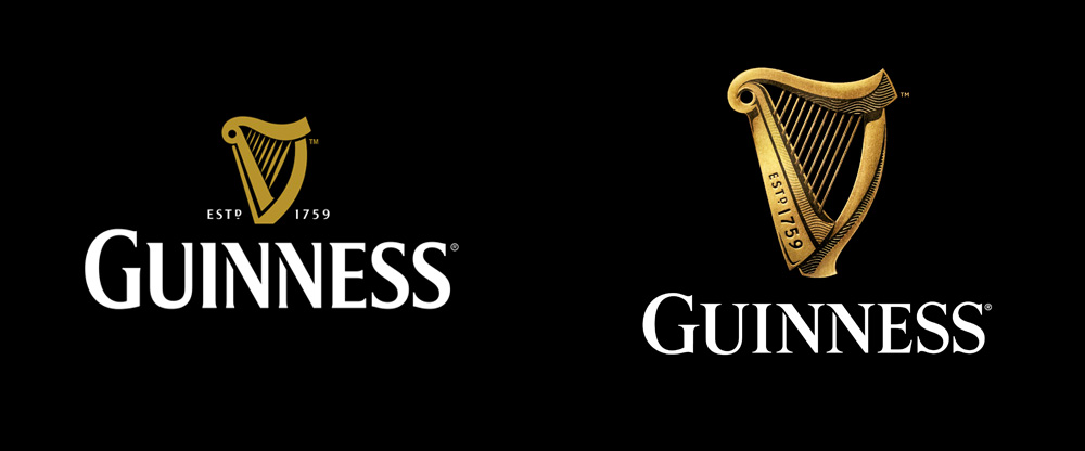
Logo: Guinness recently revitalised its emblematic harp logo, marking the first redesign in a decade since 2005. This endeavour, led by Design Bridge in London, aimed to infuse the logo with modern vibrancy while honouring its historic roots. The updated design deviates from the prior flat aesthetic, offering a richer, more tactile representation reminiscent of Guinness’s long-standing legacy.
Typography: The redesign incorporates hand-drawn lettering, drawing inspiration from Guinness’s earliest advertising in the 1920s. This typographic approach contributes to a genuine, artisanal quality that resonates with the brand’s historical narrative.
Creative Direction: Described as a passion project, this redesign mirrors Design Bridge’s commitment to authentic storytelling. Collaborating with harp artisans for genuine accuracy and employing illustrator Gerry Barney, the team meticulously crafted a logo that reflects the intricate details of the harp. This refreshed logo not only pays homage to the historical lettering found in the Guinness Storehouse but also enriches the brand’s image with a sense of depth and historical context.
Impact: This rebrand helped Guinness maintain its strong market position. In 2019, Guinness reported global sales growth of 6%, with particularly strong performance in Africa and Europe.
Old Spice
History & Context: Old Spice, established in 1938, was perceived as an outdated brand for an older generation by the late 2000s.
Logo and Packaging Redesign: The rebrand included an updated logo and website design. Landor’s redesign brought back ships, a nod to Old Spice’s heritage, while maintaining a modern appeal.
Advertising Campaign: The brand’s revival was largely credited to its advertising campaign, featuring humorous and viral ads that appealed to younger demographics.
Typography and Colour Scheme: Specific details about typography and colour schemes in the rebrand were less prominent and less important to the overall strategy, with the focus being more on the overall marketing and packaging redesign.
Impact: The campaign led to a 107% increase in overall body wash sales. Old Spice became the number-one brand for men’s body wash in the United States.
Airbnb
History & Context: Founded in 2008, Airbnb grew rapidly but faced challenges in differentiating itself in the competitive travel market.
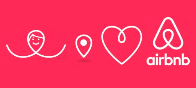
New Logo – “Bélo”: The introduction of the “Bélo” symbol, an upside-down heart or a paperclip shape resembling an “A,” was a significant part of the rebrand. It encapsulated concepts of people, place, love, and Airbnb.
Colours: The switch to a light red colour, complemented by bold purple and teal shades, was designed to reflect passion and emotion without the aggression of pure red.
Custom Font: Airbnb adopted a custom version of the ‘Circular’ font for its logo and communication materials, contributing to a unified and modern brand image.
Impact: Following the rebrand, Airbnb’s listings skyrocketed, reaching over 7 million by 2019, and the company was valued at $31 billion before its IPO in 2020.
Microsoft
History & Context: Founded in 1975, Microsoft had become synonymous with personal computing. By the 2010s, it needed to modernise its image in the evolving tech landscape. Microsoft’s 2012 rebranding came after 25 years without a logo change.
New Logo: The redesigned logo consisted of two components: the logotype and the symbol. The logotype used the Segoe font, consistent with Microsoft’s products and marketing communications. The symbol, comprising squares of colour, was designed to reflect the company’s diverse product portfolio and to be meaningful in a digital world.
Brand Philosophy: The rebranding went beyond just a visual change; it was about enhancing the way people experienced Microsoft’s products. The new logo drew inspiration from Microsoft’s product design principles while honouring the heritage of the brand’s values, fonts, and colours.
Implementation: The new logo was prominently used across various platforms including Microsoft.com, one of the world’s most visited websites. It was also featured in Microsoft’s retail stores, television ads, and other marketing materials. This comprehensive implementation underscored the importance of the rebranding in Microsoft’s strategy.
Impact: This rebranding was integral to Microsoft’s pivot towards cloud services and mobile computing, with their Azure cloud services growing exponentially, reaching a 48% increase in revenue in 2020.
Volkswagen
History & Context: Established in 1937, Volkswagen faced a major crisis with the Dieselgate scandal in 2015.
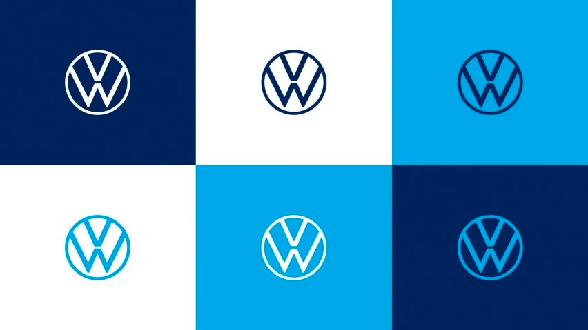
New Logo & Brand Design: The rebranding, which aimed for a neutral carbon balance, included a complete revision of the company’s design, imagery, and communication style. This was a key part of Volkswagen’s initiative to become the world’s most sustainable automotive brand.
Typography: Volkswagen’s 2023 rebrand introduced a new global typeface, merging square shapes with soft curves for warmth and friendliness. The typeface is split into two families: VW Head for bold headlines and VW Text for detailed, smaller text, enhancing readability and customer engagement.
Colour Scheme: The rebrand emphasised a deep dark blue, moving away from traditional chrome elements to symbolise modernity and versatility. This new colour scheme was complemented by the minimalist and digitally-optimised “VW” logo, with light playing a pivotal role in highlighting the brand’s identity across various platforms.
Impact: The rebrand was part of a broader strategy that included investing €30 billion in electric mobility by 2023. Volkswagen aims to become the world leader in electric vehicles by 2025.
Dunkin’
History & Context: Dunkin’ Donuts, established in the 1950s, was known for its donuts. However, by the 1990s and 2000s, consumer preferences shifted towards a health-conscious approach and an increased interest in coffee.
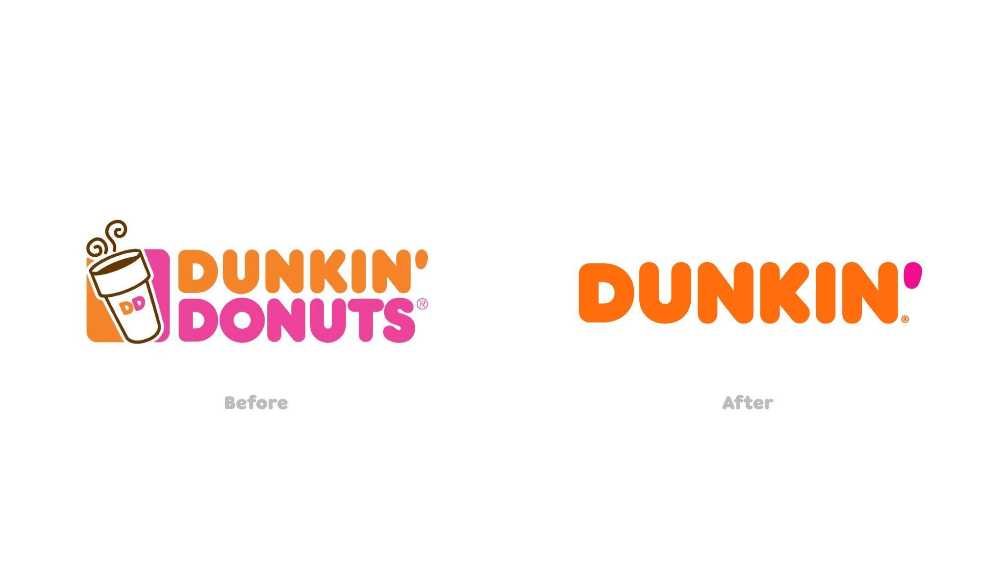
Rebranding: In response, Dunkin’ transitioned its focus from donuts to beverages, particularly coffee. By 2011, Dunkin’ sold more coffee in the U.S. than Starbucks. To reflect this shift, Dunkin’ officially dropped ‘Donuts’ from its name in 2019, emphasising its broadened product range beyond donuts.
Impact: This rebranding was part of a $100 million brand refresh plan, including modern store designs and a focus on mobile ordering. Dunkin’ sold 1.6 billion cups of coffee in 2019, which increased to 4.4 billion in 2021. The rebrand helped Dunkin’ stage itself as a beverage-led, on-the-go brand.
As we conclude our exploration of the most successful rebrands in history, it’s clear that rebranding is much more than a superficial facelift for a company. It’s a strategic, often bold move that can redefine a company’s trajectory and open new avenues for growth and connection with customers.
The stories of Apple, Burberry, Old Spice, and others demonstrate the transformative power of rebranding. These companies didn’t just change their logos or marketing strategies; they rethought their entire brand identity to stay relevant and competitive in an ever-evolving marketplace. Their journeys highlight the importance of adapting to changing consumer tastes, technological advancements, and market dynamics.
What we learn from these rebranding success stories is that change, while sometimes risky, is necessary for survival and growth in the business world. A well-executed rebrand can rejuvenate a company’s image, attract new customers, and re-energise its existing base. It’s about understanding the core of what your company stands for and how it can continue to resonate with your audience in a changing world.
As businesses continue to navigate the challenges and opportunities of their respective industries, the art of rebranding will remain a crucial strategy. It’s a reminder that in the world of business, staying still is not an option. Embracing change, reinventing, and staying true to your core values is what makes a brand not just survive but thrive.
In essence, the most successful rebrands teach us a valuable lesson: To keep moving forward, sometimes you need to take a step back, reflect, and boldly stride in a new direction.


