Design
9 min read
How to Tell a Story with Design
Why is storytelling in design so important? The short answer is – storytelling evokes emotions, emotions make people act, and when it comes to acting on a webpage or digital product – it most certainly means improved conversions. People care about the stuff they care about. You read this right. They don’t care about what you or your company are passionate about, they’d only pay attention if your product strikes a chord in their hearts and it could be seen as a plot point of their personal story. This could be in the form of a pain point, deep emotion, happy memory, urgent need, etc. Having a good narrative connects you with the audience on a much deeper level, beyond fast onboarding, generous welcome offer, and a hassle-free app. People remember stories up to 22 times more easily than remembering facts.
And what happens when people remember your website or app? They usually come back. This means activation or retention.
What happens if they tell their friend about you? It means word of mouth marketing and if you’re really good – virality.
But here’s the catch.
Online users don’t have the patience and they’re usually not in the right conditions for consuming the traditional narrative structure (Exposition, Rising Action, Climax, Falling Action, Resolution), unless it’s the John Lewis Christmas advert of course, but even then think about how many times you need to hear about it to actually watch it.
Telling a story with design is different. Designers tell stories with colours, shapes, photography, layouts, microinteractions, animations, information architecture. Unlike J. K. Rowling, we don’t have 4,224 pages to impress the audience with a landing page or a product. We have around 5 seconds if we’re lucky.
Things get even more challenging when we have to put performance and business metrics first because let’s face it, only a few brands in the world can afford flashy animations and lengthy videos on their splash section. In real life, storytelling has to complement and even enhance the user experience, not to make you choose between the two.
So given that we have to think about UX, brand guidelines, copy requirements, and a number of other practical considerations, what’s the best way to tell a story in a few seconds?
The first step is that we have to reframe our understanding of storytelling with design. It’s very different from storytelling in advertisement and marketing. The rising pressure on designers to tell a story with their designs often pushes them in the wrong direction, compromising the effectiveness of the final product and making them build questionable user stories to fit the brand narrative.
Our aim shouldn’t be to find a way to make the user fit in the brand story, but to build a journey that places our product in their real-life story. This is the difference between good storytelling and effective storytelling in product design.
Here’re a few techniques we can use to tell a story with design:
The story should be about the user, not the product
Your product should be a part of your user’s story. How it connects with their personal situation is what will really resonate with them. So understanding the user circumstances and building strong user personas and stories as part of the UX process would really help with shaping what narrative we want the final product to tell.
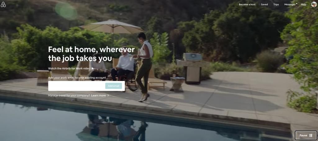
They started with the clear vision that they’re building a product for the business traveler, which was initially portrayed as a businessman in a suit and a hectic work schedule. What they quickly realised though is that the business travelers of 2020 are going to be millennials in their comfy clothes, interested in exploring the world and not obsessed with putting boundaries between their personal and professional life.
So they built an experience that the real lives of their users – about people who enjoy traveling for work, always finding time to explore the new destination and craving for authentic local experiences. It turns out fancy hotel rooms are so 90s.
Create an emotional narrative, not a traditional narrative
The traditional story arc simply doesn’t work with today’s digital design. What we should be aiming for is evoking the same type of emotions and connect on the same level but with a different creative approach. The choice of photography, typography, tone of voice, and UI elements can say as much as a full story.
Let’s look at this wine production company. Their choice of information architecture, multimedia, typography, and even sound takes on a journey to Greece for just a few seconds.
Spend time on understanding the context
If content is the king, context is the queen. No content effort is worth it if it’s not related to a specific context. Understanding the context of a user’s situation and addressing it with the right messaging and user journey is a powerful way to become a central element in their story.
The user pain point is the “Exposition”, the solution your product offers is the “Climax”
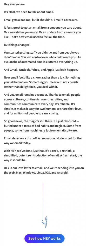
Check out how hey.com approaches this. We’re not fans of their homepage design, but this was probably intentional – their message is that things could be simpler, they’re offering a “fresh start” to email users. They’re deliberately staying away from an attractive marketing look because they understand the context of their users’ complicated relationship with email – people are tired of flashy, unwanted marketing messages. They want a simple email.
It’s actually brave to have this on as your homepage:
Use a brand mascot or a character
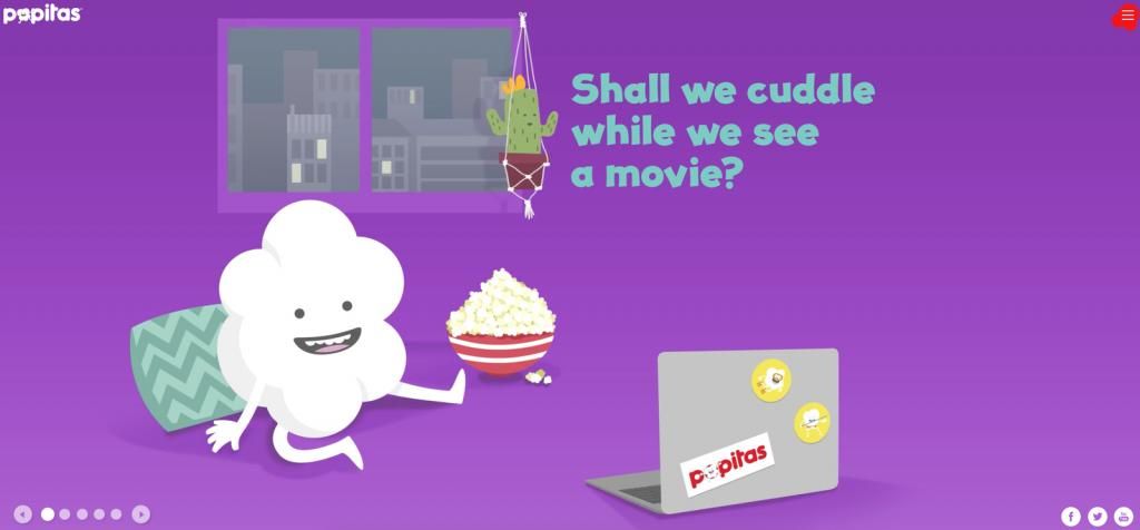
Headspace are doing a remarkably amazing job at turning their cute weird creatures into engaging storytellers that take you on a journey to personal transformation. A number of other brands are following in their footsteps, like the example below. A popcorn company called Popitas that’s got over 70,000 facebook fans thanks for its popcorn character.
Your landing page as a cohesive piece
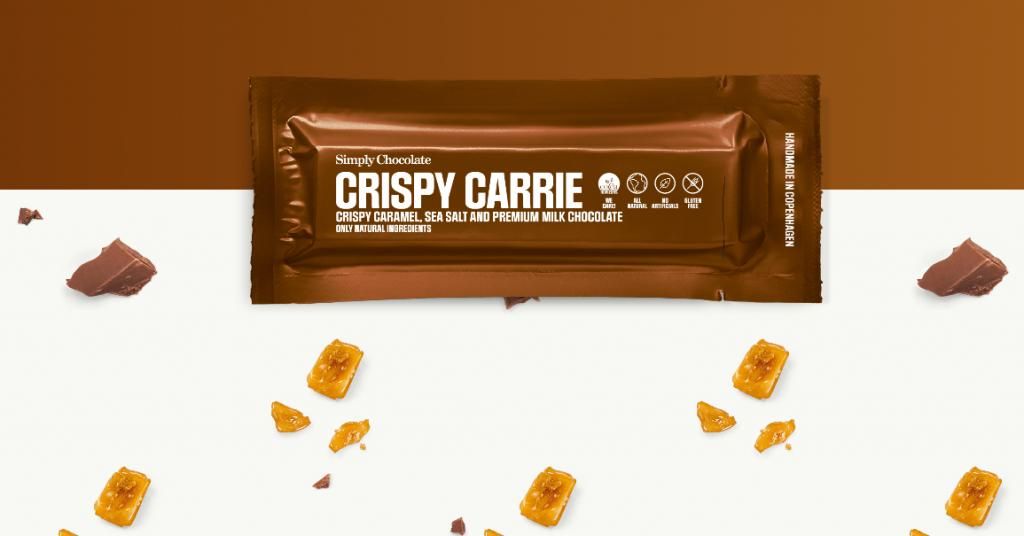
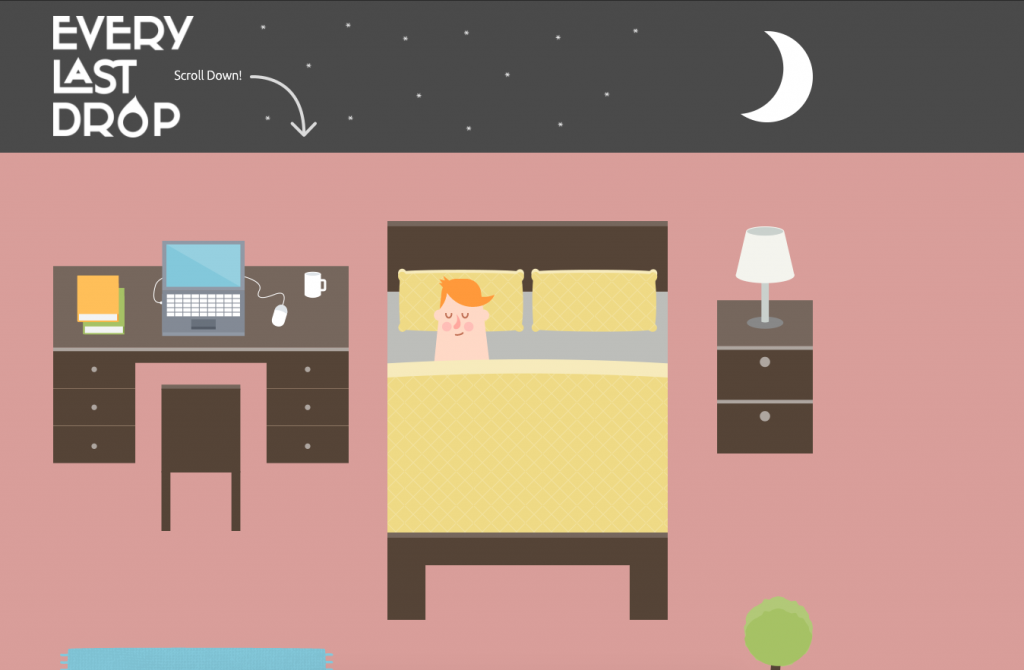
If we apply the Law of continuity to design, we could be aiming for a cohesive experience that communicates the message through a story, with the same level of clarity and achieving the same result as the standard structure.
Check out the simplychocolate.dk website for inspiration:
Here’s another example by http://everylastdrop.co.uk/
Instill a vision for a better future
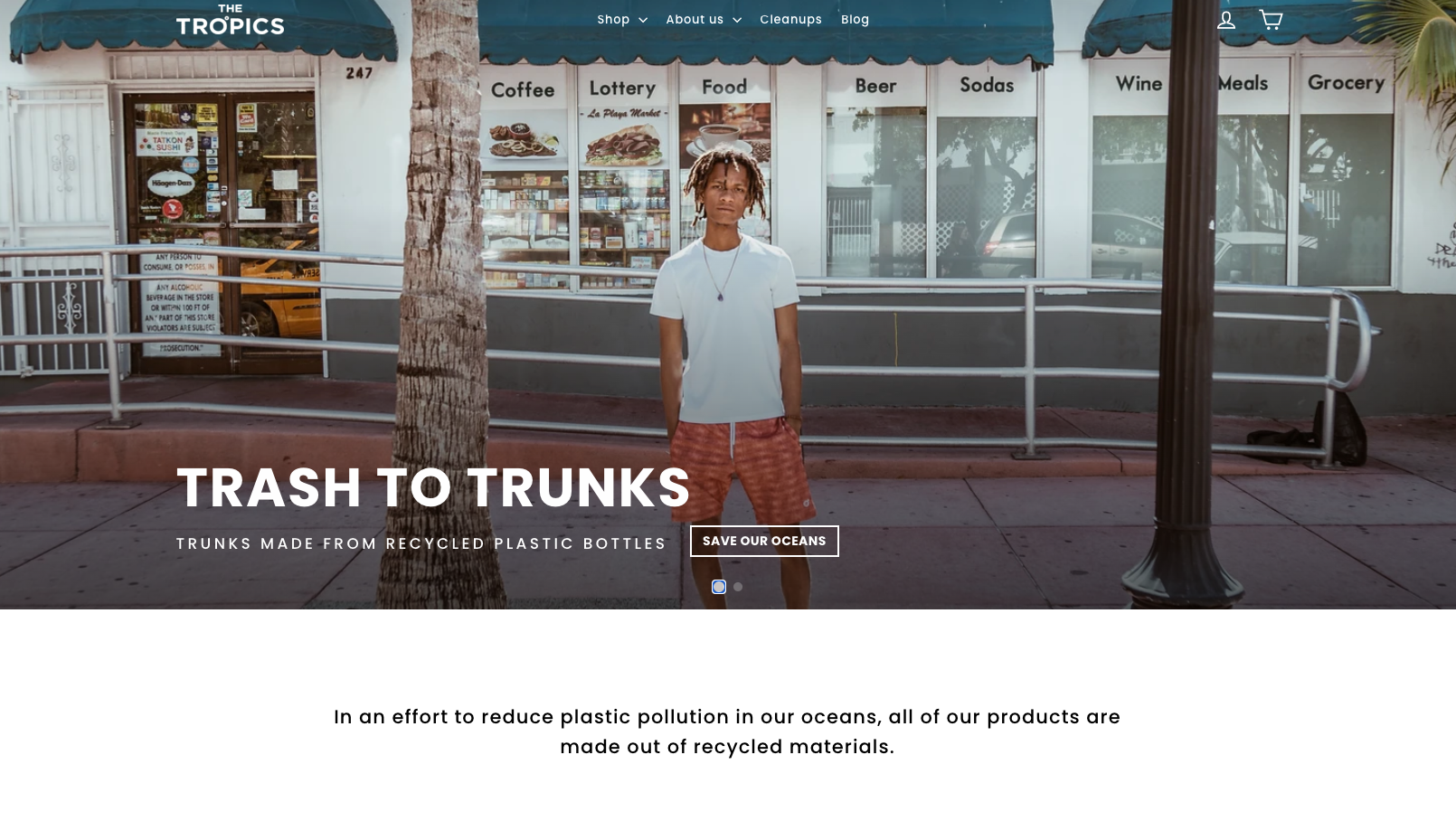
Tell stories about what you think the world should be. This is probably one of the most successful storytelling approaches in recent years. People are striving to do better, to transform the world we live in. And even if they’re not there yet, if you manage to convince them that your brand will get them one step closer to their vision, the message will surely resonate with them.
The clothing brands made from recycled materials have a strong angle, and obviously, this is beyond design, but communicating the message effectively is a design exercise that shouldn’t be underestimated. It’s not only what you say, but how you say it and can it resonate with people in just a few seconds.
No story is better than a bad story
Look at Revolut. Do they have a story? – No. Would their branding be better with a story? – Maybe.
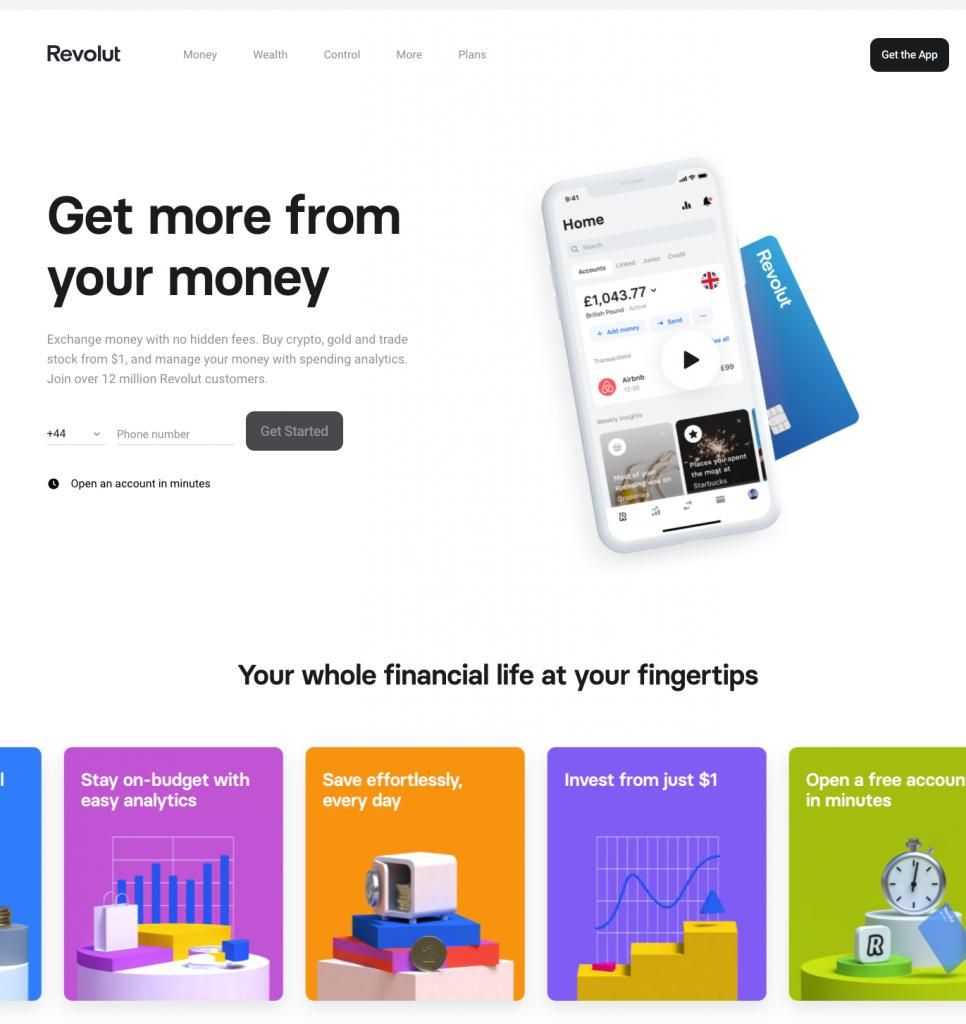
But if you don’t have a good story to tell, avoid forcing it as it will most probably have the opposite effect. Focus on an immaculate UX instead.


