Master Public Speaking (Even If You're Terrified of It)
Dr. Alexander McWilliam


From Gamer to Web3 Disruptor: How Amos Whitewolf Is Rebuilding Gamer Trust with PerionXP
Amos Whitewolf


From 0 to $25M ARR Bootstrapped: Adam Robinson’s Blueprint for SaaS Growth Without Funding
Adam Robinson


How to Scale as a CEO – Mindset, Strategy & Leadership Shifts, with Joe Leech, CEO Coach
Joe Leech


From Corporate Lawyer to Social Impact Entrepreneur: Sanjay Lobo's Journey with OnHand
Sanjay Lobo


From Premier League Star to Wellness Entrepreneur: Thomas Robson-Kanu's Journey with The Turmeric Co
Thomas Robson-Kanu

Master Public Speaking (Even If You're Terrified of It)
Dr. Alexander McWilliam
From Gamer to Web3 Disruptor: How Amos Whitewolf Is Rebuilding Gamer Trust with PerionXP
Amos Whitewolf
From 0 to $25M ARR Bootstrapped: Adam Robinson’s Blueprint for SaaS Growth Without Funding
Adam Robinson
How to Scale as a CEO – Mindset, Strategy & Leadership Shifts, with Joe Leech, CEO Coach
Joe Leech
From Corporate Lawyer to Social Impact Entrepreneur: Sanjay Lobo's Journey with OnHand
Sanjay Lobo
From Premier League Star to Wellness Entrepreneur: Thomas Robson-Kanu's Journey with The Turmeric Co
Thomas Robson-Kanu
Design
3 min read
Is Your Brand Colour Holding You Back?
Colour has the incredible ability to evoke emotions and influence decision-making, making it a crucial aspect of branding and marketing. In fact, did you know that people make a subconscious judgment about a product within 90 seconds of initial viewing, and up to 90% of that assessment is based on colour alone?
Let’s take a closer look at the different meanings behind colours and how they can impact consumer behaviour and brand perception.
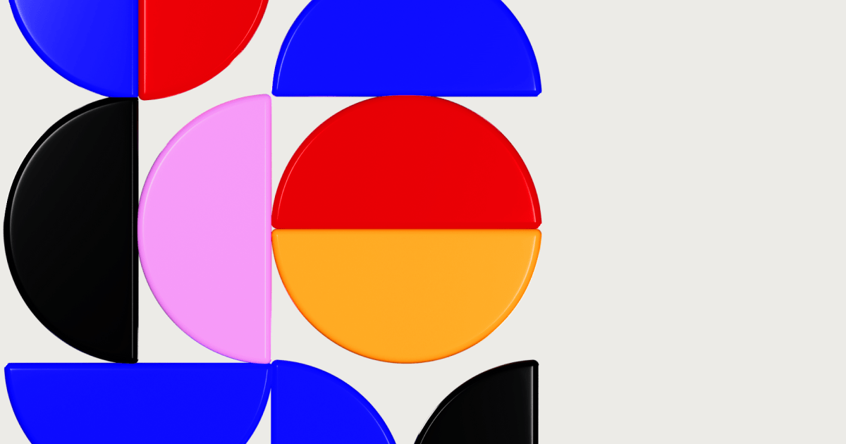
Red
This fiery colour is often associated with passion, excitement, and urgency. Brands like Coca-Cola, KFC, and Netflix use red in their logos to evoke feelings of energy and excitement. Feeling pumped yet?
Yellow
Bright and cheerful, yellow is associated with optimism, creativity, and happiness. Brands like McDonald’s and Snapchat use yellow in their branding to convey a sense of friendliness and cheerfulness. Let’s smile!
Green
The colour of nature, green is associated with growth, health, and sustainability. Brands like Whole Foods, BP, and Animal Planet use green in their branding to convey eco-friendliness and environmental awareness. Let’s protect the planet!
Blue
Calming and trustworthy, blue is associated with security, stability, and reliability. Brands like Facebook, IBM, and American Express use blue in their branding to convey a sense of trustworthiness and dependability. Feeling secure yet?
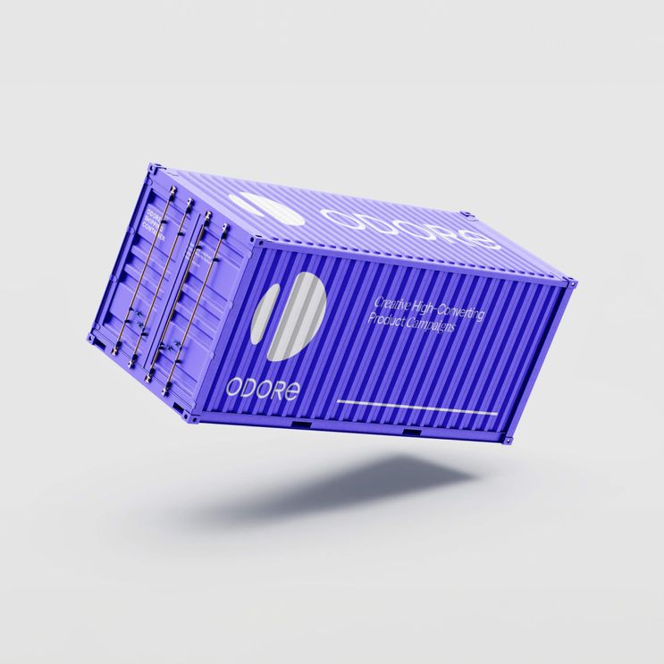
Purple
Regal and luxurious, purple is associated with sophistication, creativity, and exclusivity. Brands like Cadbury, Hallmark, and SyFy use purple in their branding to evoke a sense of exclusivity and elegance. Let’s feel fancy!
Black
The ultimate power colour, black is associated with sophistication, elegance, and exclusivity. Brands like Chanel, Nike, and Apple use black in their branding to evoke a sense of premium quality and exclusivity. Feeling elite yet?
But wait, there’s more! Using contrast can also impact consumer behaviour. A study by HubSpot found that coloured visuals increase people’s willingness to read a piece of content by 80%, and using contrasting colours can make a call-to-action (CTA) stand out by up to 10 times.
So, let’s put this knowledge into action! By understanding the power of colour and how it can impact consumer behaviour, you can create a strong brand identity and connect with your audience on a deeper level. So, what colours would you choose for your brand?