Design
13 min read
The Ultimate Branding Process
If you’re about to start a branding or a re-brand project and you’re not sure how to approach it, you’ve found the perfect resource. In this article, we’re sharing our step-by-step guide to building an outstanding brand that delivers the brand promise and leads the business to success.
So here’s how to build a brand identity in 6 weeks.
Before you continue reading, there’re a couple of very important points to understand:
- Brand Strategy and Brand Design/Implementation are two different stages of the Branding process and require different sets of skills. “Branding” is often confused with the final design assets (logo, brand patterns, illustrations, etc.). In fact, the design is the final stage of the branding process.
- Building a brand is a long process that starts with the completion of the branding project. It’s important to understand that the visuals are just a tool, a device that will communicate the brand values and vision. They’re not the brand. Similarly, the logo is a just mark until it acquires some sort of a meaning in the mind of the consumer.
Step 1: Branding Workshop
Every branding project, done by a design agency, freelancer, or in-house, should kick off with a deep dive into the company strategy and vision. Ideally, you should start with a 3-4 hours workshop attended by the company leadership, the brand strategist, and the designer(s) who will be working on the design assets.
The structure of this workshop is probably the most important element of the entire branding process. Knowing what to extrapolate from the client/decision-makers and how to do it without letting them dictate the visual direction of the new brand identity is the most critical part of the whole branding process.
The structure of the branding workshop could vary depending on the company size, maturity, who’s leading the project, what are the desired deliverables, etc. But the least that should be covered is:
- Competitors landscape
- Target audience/buyer personas
- Brand positioning
- Brand story
- Brand fundamentals – purpose, values and vision
- Brand personality
- Tone of voice
- Business Strategy
Some of the listed points might actually be part of the deliverables (as part of the Brand Strategy), but even if they’re not in their final shape, they should be discussed with the leadership team during the kick-off workshop.
Depending on the project timeline, it’s also a good idea to spend some time discussing visual styles and assets the team likes and dislikes – logos, typography, colours, illustrations, UI elements. The best way to approach this is to bring some examples (screenshots and cutouts from other brands) to help you start the discussion.
Tools you might want to explore if you’re the workshop facilitator – FigJam and Miro.
Step 2: Market Research
Everyone involved in building a new brand must know the market insight out – competitors, trends, other similar solutions (even if they’re not competitors). If you’re not familiar with the industry, you probably need to spend double the time on research than someone who’s from the same space.
It’s a good idea to create a Competitive landscape visual board where you can include screenshots of their website, recent campaigns, social media posts, and other marketing assets from all competitors with notes about their strengths, weaknesses, USPs, tone of voice etc. Having them all together in one place will make your analysis much more efficient.
The main purpose of this stage is to identify gaps on the market, from a branding point of view. What colours and illustration styles have been overused? Is there an opportunity for a different tone of voice that could resonate better with the audience? What brand personality could stand out in the market landscape? What could be a completely unexpected brand identity that differentiates the company from its competitors?
Stage 3: User Interviews & Focus Groups
There’re a number of ways to approach user research as part of a branding project, mainly depending on whether you’re building a new brand or doing a rebrand. Either way – speaking to users is a critical part of the branding exercise.
Unlike user interviews in a product/UX project, the aim here is not so much to understand how and why they use the product (although still important) but to build accurate user profiles/personas of the people the brand is targeting. Who are they? What other products do they use and why? Do they shop in Aldi or Waitrose? How much do they spend on x and y?
The main purpose of this stage is not to find out what type of brand users might like (again – this is not a UX project, users are not leading our process, it’s the other way around) but to spot any potential misalignment between what the company vision for the new branding is and what will resonate with their target audience. For example, it raises a red flag when the company is after a more upmarket look & feel, but the users see the product as essential and they’re not ready to pay extra, even if the product is of better quality.
Ideally, you should try and have online or in-person meetings with at least 5 target customers and then online questionnaires sent to as many people as possible for more quantitative research. The ideal size for a focus group is 6-8 people.
Stage 4: Brand Strategy
Based on the findings from the workshop, market research, and user interviews, you should now be ready to create the first version of the company’s brand strategy that will be the base for creating the actual brand design. The Brand Strategy should be done by the brand strategist in collaboration with the whole team working on the project. The very minimum it should include is:
- Brand story
- Positioning statement
- Audience / user personas
- Brand values
- Brand personality
- The tone of voice (with examples of do’s and don’ts, a strapline, and slogan)
- Brand Vision and Promise
Stage 5: Concepts exploration & development (mood boards)
This is the stage when you start exploring different design concepts. All proposed directions should match the brand strategy, although sometimes they could have very different look&feel.
You should create a few different mood boards visualising the proposed design directions that include colours, typography, shapes, illustration style, iconography, etc. Depending on the project, you could use ready assets to illustrate your ideas (from Dribbble, Behance, Pinterest, etc), or if you have the right skillset in-house, you could create custom assets for each design concept. You can also combine the two approaches – use ready assets and custom designs.
The team should agree on and sign off one of the design concepts/mood boards which will be the base for creating the custom brand assets.
Stage 6: Delivering the final design
Logo design, colours & typography
You’re now ready to start creating the final design assets. The first stop is the logo. Here at Pony, we make sure that the logo is developed alongside the final colour pallet and typography to make sure that all design components work perfectly together. The logo exploration phase could see the team creating dozens of different logo marks and types, but the decision-makers and the wider team are presented with only the best three concepts.
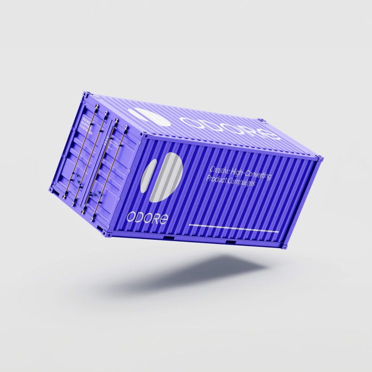
It’s a good idea to create mockups of how the logo, typography, and colours would be used on different marketing materials, offline and online (landing page, billboard, business cards, leaflets, etc) to help the team visualise how the brand will work in real life.
Illustrations & Icons
If the project includes custom illustrations and icons, then these should be explored and developed alongside the logo. The type of illustrations should have been confirmed during the concept development stage (mood boards), but now it’s time to work with the exact brief.
Key components of the illustration brief are the story behind the visual (what message you want to convey with it), its placement (where it will be used), and the scenario (e.g. a man and woman holding hands, looking towards a house). If there’s a storytelling element, the illustrations might be part of a narrative, all telling one story. In other cases, they could simply visualise different concepts (e.g. the company USPs) and their main purpose is to enrich the brand.
Regardless of the number of illustrations and icons being delivered, you should always start with just one, usually the main “hero” illustrations, and work on it until you’re 100% happy with the style. This might require days, sometimes even weeks of sketches and revisions. The good news is that, once you get the first illustration right, the rest of the illustrations and icons will be much faster to create.
Illustrations should never be an afterthought or an add-on. They’re part of the whole visual identity and they must be taken into consideration during the concept development stage. Otherwise, you might end up with a very inconsistent visual style which is exactly the opposite of creating a strong, recognisable brand identity.
Brand collateral
Once you have all branding assets – logo, typography, colour scheme, brand patterns, and illustrations, you’re ready to create the brand collateral items the company needs. They usually vary depending on the business type and products, but some of the most common ones are social media covers, social media post templates, email signatures, business cards, hoodies/t-shirts, packaging, leaflets, PowerPoint deck.
Stage 7: Brand style guide / Brand guidelines
As mentioned at the beginning of this article, the brand creation process begins now. The team should have all the tools they need to start building a brand that will connect with the consumer and will help them be the product of choice in their industry.
The achieve recognition, the most important thing is consistency across visuals and language. Everyone working on the brand must use the branding assets as “prescribed” by the team who created the brand which should be explained in the final brand guidelines document. It contains things like – how and where to use the logo, mistakes to avoid, how to combine the colours, what contrast should be achieved, fonts usage and combinations, paddings and margins, how to use illustrations and photography, even details like the photo editing settings you should use to achieve consistency across all images, etc.
There’re a number of ways to approach a brand identity project, but the above process is tried and tested by our team and has helped us successfully create dozens of head-turning brands, so it’s a safe place to start from. If you’re looking for some design inspiration, check out some of our latest brand identity projects.


