UX & UI
16 min read
The Ultimate Guide to User Onboarding
It’s no secret that churn starts during the onboarding. You’re much more likely to delete an app you’ve recently installed than to become a regular user. Think about all the products and applications you tested and played with, and how many of them you actually use today. On average, only 11% of apps manage to survive for 12 months on a user’s device.
That’s why investing time and resources in an immaculate user onboarding is so critical. It’s almost impossible to get it right from the first time, and even if you do, imagine what you could deliver by optimising an already solid onboarding flow.
The secret to a strong onboarding flow is in continuous optimisation.
The type of user onboarding you choose depends entirely on the type of your product. There’s no silver bullet that works for all cases. As a rule of thumb, consumer products should have shorter, more familiar onboarding processes with a focus on speed, while more complex SaaS products should invest in educational content for easier adoption. The catch is – make it too quick and they’ll forget you the next day; make it too content-heavy and they will get frustrated and never come back.
It’s important to understand that the onboarding is completed well beyond the sign-up, which often consists of just submitting an email address. For too long, companies have been counting emails as an indication of the number of users. If the user never comes back after their first session, they’re simply not onboarded and it’s wrong to invest efforts in retention when acquisition and activation are not properly completed.
Most Popular User Onboarding Flows
We have categorised the most popular types of user onboarding flows and shared some advice on when and how they should be used. The best products in the SaaS space use a mixture of some or even all of these categories in different parts of the user onboarding cycle, so don’t look at them as “pick the best option” but rather as practical examples of what you should experiment with, depending on your user needs and product maturity.
The “Nickel tour”
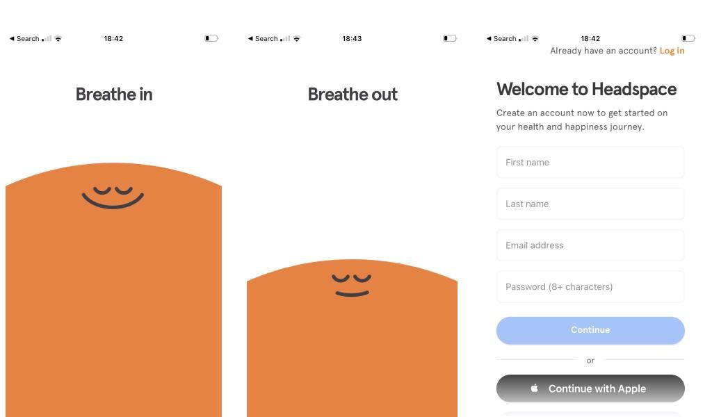
This is a popular, friendly, and safe approach used by many consumer apps. It’s ideal for when you need just a handful of details to onboard a user, but you still want to create a lasting first impression. You don’t need more than 3-5 modals/screens which should be used for welcome messages, quick product tips, and fun contextual illustrations/graphics aiming to engage the user and create a memorable first-time user experience.
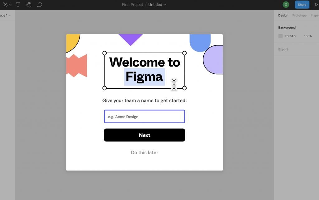
Many brands, especially mobile applications, moved away from the one-click onboarding as this leads to increased churn, especially if you’re in a very competitive market where every interaction with the user is key to impressing and converting them.
Full Page Takeover
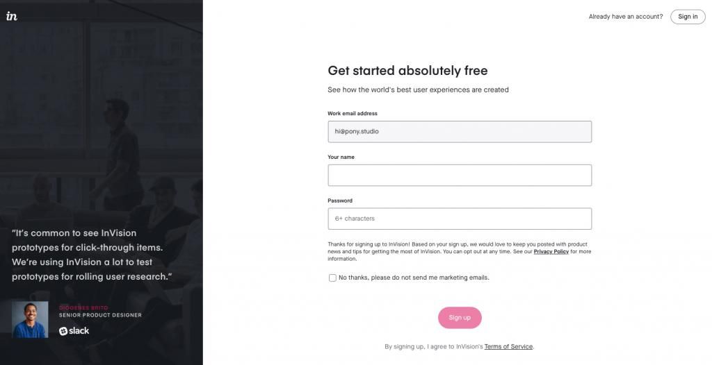
The advantage of the full page takeover is that you can keep the user focused on the task – complete their registration. At Pony we like using the desktop version of this approach for plugging in a few social proof elements like customer reviews or company achievements, similar to the way Invision have designed their onboarding.
The challenge with this onboarding flow is that if it’s too long, the user might lose interest and drop before they complete the signup. Ideally, it should have no more than 1-3 screens. This is also a more traditional approach which might make it a bit unsuitable for new products looking to stand out.
Product Tour
The most common ways to implement a product tour into your onboarding are tooltips and cards. They’re very effective for quick product tips to help users find their way in more complex SaaS products.
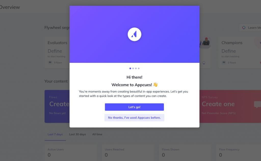
The quality and length of the copy here are crucial – the focus should not be on telling the user how to perform specific actions (the UX of the product should have served this job), but to communicate the value they’re getting from using a certain feature or visiting a specific section.
For example, let’s look at an example with a social media managing app. A tooltip for the saved hashtag groups section could have either of these explanations:
a) here you can find your saved hashtag groups b) save your hashtag groups here to improve your productivity
You see the difference, right? Another rule of thumb is to have no more than 5 tooltips or cards during the first session as too many of the, might overwhelm the user.
Progress Bars
The counter-intuitive thing with relying on a progress bar is that it should never be used for long sign-ups. Seeing more than 4-5 steps will demotivate the user and they might even not start the process if they’re just in the research phase.
If you go ahead with this flow, make sure you make the first 2 steps shorter and if you really need to ask for many details (more on this later), you should leave them for the last couple of steps when the progress bar is almost full. This might come across as a bit cheeky but otherwise, you risk a massive drop and incomplete accounts.
Engage & Delight
This is probably the best approach for consumer products that can offer quick time-to-value. It requires quite a lot of confidence in your product, but nothing can beat impressing the user with the product capabilities before asking for anything in return.
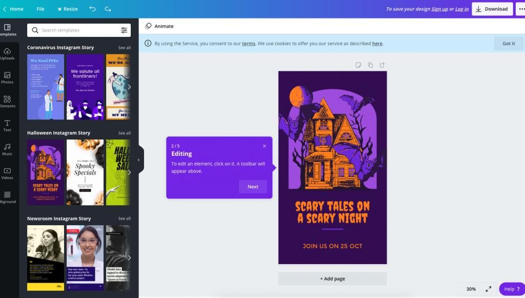
The way Canva empowers non-designers is a brilliant example of product-led growth. People don’t know how easy it is to use Canva before trying it out, so they let anyone give it a go and experience it for themselves.
Hotspots
In 2020, the User is impatient. A challenge for many products is how quickly they can deliver value to the user so they can reach activation and retain. That’s why time-to-value has become an extremely important metric in the UX space.
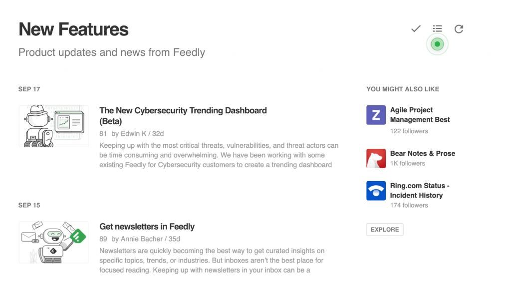
Hotspots are the pulsating circles that you see on some products. They draw the user’s attention to the key product features that provide the biggest value, so the user can try them out asap. They’re also used for introducing new product features and announcements.
Hotspots could be a great tool for delivering quicker time to value, but if overused or not having the right UI design they could be easily ignored or perceived as annoying.
Personalised Approach
Most mature products cater to more than one type of user, that’s why personalisation has become a huge part of their onboarding approach. Usually, the user selects a few preferences between signup and accessing the product which would determine what sort of experience and content they will be presented with.
Here’s a great example by Invision, personalising the first-time user experience based on your job role.
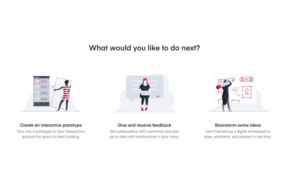
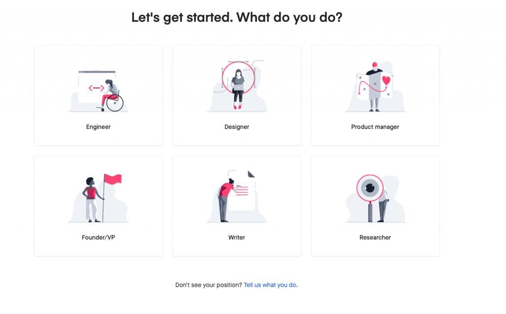
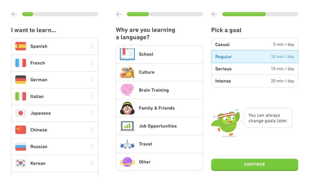
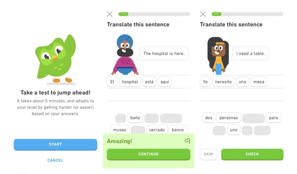
Personas-based onboarding is a very powerful way to make sure you hit the mark with each type of user and maximises your chances for activation. Duolingo is another great example of personalised onboarding – they personalise your first-time user experience based on the language you’re interested in and even assess your knowledge level with quick fun tests.
The 8 Golden Rules of User Onboarding
We’ve covered the most popular UX flows used to onboard new users. We also made a list of some universal rules you should consider when building or optimising your onboarding, regardless of which methods you choose. Let’s have a look.
Ask for Minimum Data
We can’t stress enough how important it is to ask for the very minimum information from the user in order to provide them with the biggest product value. You rarely REALLY need their surname or phone number, for example, but you can still see quite a lot of companies asking for unnecessary details which impacts their conversion.
The sales-led growth approach, whereas sales reps call and try to close the lead, is definitely taking a back seat. The digital user has matured and luckily more and more companies are taking the product-led strategy approach where you lead with the product, not with the offer. For this reason, the less you ask the user to do before you let them experience the product, the better.
Make it Memorable
Having said that, it has become obvious that too quick is not good either. According to the IKEA and Endowment effects, we need to find a smart way to engage the user so they can value the product more and prefer it over all other options.
There’re a number of ways to stand out and engage the user creatively, without clogging the signup process, some of which include branded illustrations, outstanding copy, spot-on personalisation, quick gamification etc. The process of discovering what works for your particular case surely goes through weeks of testing and experimentation, but your main objective should be to find to create a positive lasting memory in your users.
Never Let Them Ask “What’s next?”
Even 4-5 secs of wandering around might cost you the user. The only way to make sure your onboarding is as clear and smooth as possible is by testing with real users. At Pony, we like doing this even before launching the products we’re working on.
You can spot major UX flows even when just testing with clickable prototypes and this is a must for more complex products that can’t follow the common onboarding patterns, or for unfamiliar types of products.
Moderate personalisation
We have a bit of a contrarian view on personalisation. The main reason is that it has been misused by so many products that the user has become reluctant to share personal information when they’re in the research phase. Personalisation should be used ONLY when it helps you provide better product value.
For example, have a look at Duolingo and Invision above. In their cases, personalising the onboarding helps them deliver a better user experience because it makes it more relevant to me.
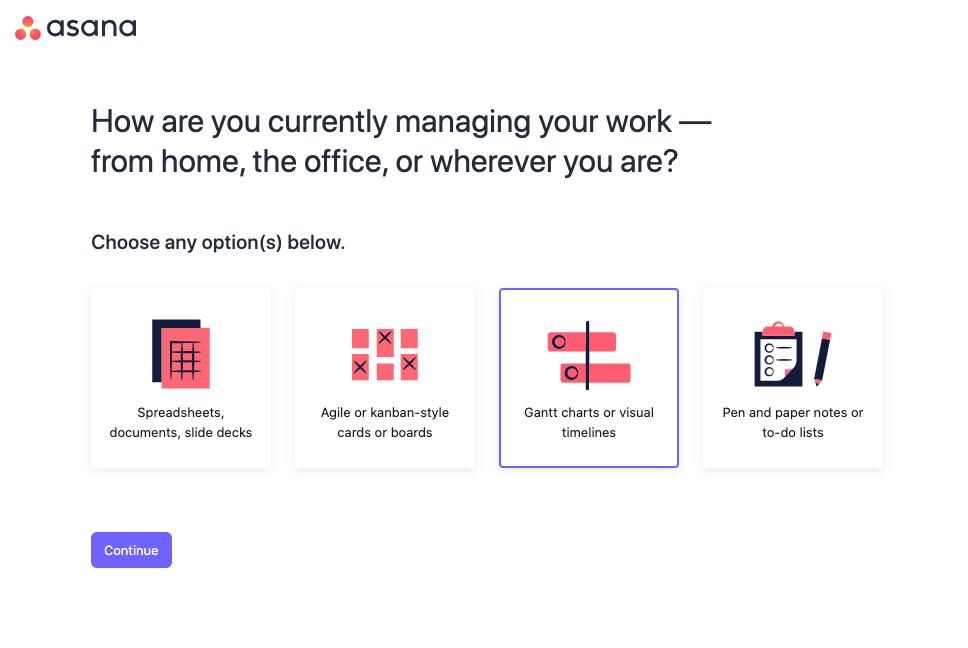
In Asana’s case, they ask a similar set of questions (job role, preferences, team members, company size, etc), but the aim here is to improve their understanding of me as a user, not to personalise my experience. It serves the business, not the user onboarding. All users are sent to the same dashboard.
Demonstrate product value during the onboarding
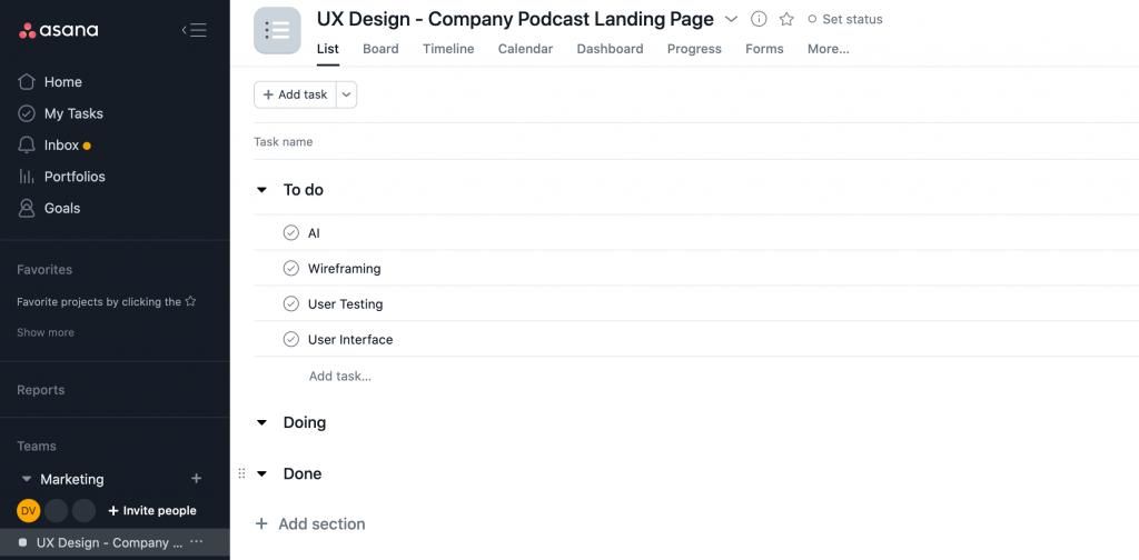
Using Asana’s examples again, but this time their brilliant approach for showcasing value during the onboarding. They assist you with creating your first project during the onboarding, so the user gets a populated dashboard and they’re almost “trained” in using the product when they complete the initial signup.
If you expect users to look for a reason why to use your product, you must be in a very underserved market. And this is very rare. Generally, users are skeptical to new products and would rather stick to what they already know rather than switching to a new solution, unless the new one is considerably better than what they’re used to.
The aim here is bringing them to the Aha! moment more quickly by offering at least one quick win during the onboarding.
The Wow effect
We often work with clients who have a huge number of registered users, but a very small percentage of them are active users. Why? – They made it super easy for people to sign up but missed the main point of the onboarding, which is to get the user excited about their product.
If product value can’t be demonstrated so early, then you should be thinking about creative ways to wow the user so they could get a glimpse of what it would be to use your product.
Think of Uber and how you can see the cars around you, even before you book your first ride, or a smart micro-interaction you experienced with a consumer app and you told your friend about it only because you found it super cool.
Easy on the tutorials
Using video tutorials during the onboarding used to be a common approach for SaaS products because it gave them peace of mind that they have explained how the product is used. For the majority of cases, though this has been a failure of the UX – if you have to explain how a product works, it probably means the product design is not good enough.
We tend to agree with this statement, video tutorials are a huge distraction and they often add friction. Ideally, they should be avoided. However, there are cases where an explainer video could be a powerful way to improve product adoption and save you hundreds of hours of customer support calls. This applies to more complex SaaS products or new, innovative solutions with not many similar players on the market. For example, a no-code dev tool or a sophisticated bookkeeping software might benefit from having a quick intro shortly after signup to put the user at ease that this is something they can handle.
As always – A/B testing with introducing video intros and tutorials is a must. You don’t want to end up with a lower completion rate because of a feature that had exactly the opposite objective, right?
You’re not done with the first session
As already mentioned – getting someone’s email and even a few personal details does not make it a user. It serves your growth graph well, but your ultimate goal should be to turn this lead into a user. We always say user signup does not equal user onboarding. You also shouldn’t rely on endless email drips to bring the user back – if used incorrectly, too many activation emails might have the opposite effect.
What can you offer to make them want to use your product tomorrow? It’s a million dollars question (we know!) and you should start testing your hypotheses and implement them into your onboarding from day 1.


