Growth
16 min read
Understanding How the User is Changing and How to Adapt Your Website and Offering (with examples)
Coronavirus is changing the user. We don’t know if it’s for good or a temporary change, but one thing is certain – it’s not and it won’t be business as usual for months to come. The usual recovery period after a financial crisis lasts around 10-12 months, sometimes up to 18 months. Since we’ve never experienced this type of downturn before, it’s almost impossible to predict how long it’s going to last this time.
We’ve been monitoring user data and campaign stats for a number of products and our own channels, and we’re already seeing some interesting patterns.
For example, Cost-per-acquired-customer (CAC) for most channels has drastically jumped up for non-essential offerings (no surprise here, not everyone can produce hand sanitisers or is in the video calls space). On the other hand, it seems that the time for building an audience has never been better. If you’ve been planning to start attracting new likes to your social media channels, go and do it, prices are dropping and you can increase your followers base quite quickly.
It’s not rocket science why – people are anxious and even if they’re not intentionally limiting their expenses, their minds are preoccupied with more urgent matters – getting used to the working from home reality or even worse – to being unemployed. They’re not actively looking to buy stuff, except the very basics. Things will calm down soon, even if we’re under the current lockdown, but if it carries on for too long, we all know the drill – a recession is inevitable.
On the plus side, people have more time on their hands and certainly more screen time and a desire for online entertainment, so no surprise TikTok is winning the jackpot and content production and consumption are exploding.
But what do we need to do differently straight away?
Interestingly, we’re seeing quite a lot of coronavirus-related activities, like exclusive webinars and premature reports, but some product owners and marketers are missing the very basics – your website and your main offering. We’re not talking about COVID19 promo code (true story!), but about adapting your messaging and offering so it resonates with the reality of the user.
Before we jump into sharing the examples to learn from, let’s quickly cover how consumer’s psychology changes in times of crisis.
How consumer psychology changes in crisis
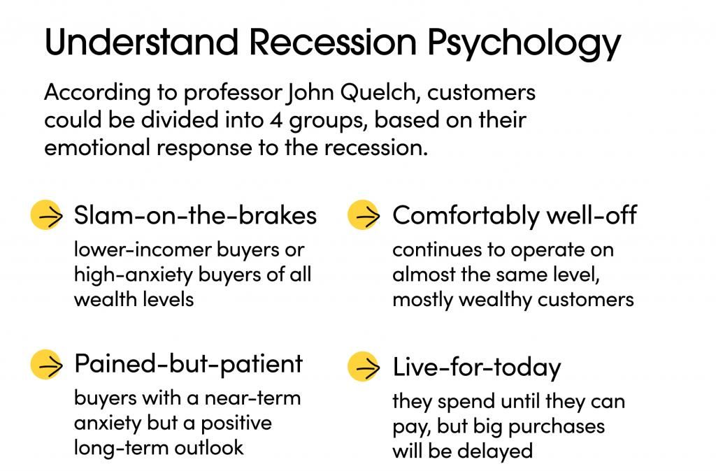
According to professor John Quelch, Charles Edward Wilson Professor of Business Administration, Emeritus, customers could be divided into 4 groups based on their emotional response to the recession:
Slam-on-the-breaks
Usually lower-income buyers but they could also be from any social background. For some, it’s just a psychology thing – they must survive and the most basic instinct is to cut all costs so they can run on savings for longer.
Painted-but-patient
The majority of people say they fall into this category. They’re anxious and some of them are already damaged, but their long-term outlook is positive. You often hear them say “better days are coming” or “we will get over this”. They’re careful with their expenses, but more relaxed than the Slam-on-the-breaks group. If bad news keeps coming though, they could easily slip into the Slam-on-the-breaks group.
Comfortably well-off
They’re usually in the top 5% income bracket. They continue to consume at near-prerecession levels, but they’re now slightly more selective where they spend their money. Retired people and more conservative investors also fall into this group.
Live-for-today
Usually the younger generation and millennials. They’re renters, rather than owners, they invest in experiences and are not too worried about the current situation, as long as they get paid on time. Since they’ve never relied on savings and rarely have kids, they’d continue to operate as before until they can afford it.
The huge difference between now and previous recessions is that even the Live-for-today and Comfortably well-off groups can’t spend in the areas where they would otherwise happily carry on spending, because of the social isolation factor.
So they still have the ability and desire to spend, but the circumstances limit them where and how to spend. This means – it’s a matter of adapting your offering and messaging as quickly as possible, before they fall into the Slam-on-the-breaks or Painted-but-patient segment.
So why does this matter and what can we do?
The most important step in terms of UX and Marketing is to understand in which group the majority of your customers fall. This could be done using a mixture of qualitative vs quantitative research methods, like polls, online surveys, 1:1 interviews, depending on your business. Ideally, you should create your own set of tools and tactics to extract as much valuable information as possible and put it in some context.
Also – this is a cross-functional team effort, it’s wrong to be assigned only to Marketing, UX or Product, as they’d be looking at different things. For example, Marketing could be reporting on how the latest promotion and acquisition campaigns performed, and analyse the “why” behind the changes. UX should be focused on changes in the user behaviour using the product/website, while Research (or the founders for smaller startups) should be proactively reaching out to customers and try to paint a picture of the new reality (e.g. what % are furloughed, canceled recent trips, work with the kids or other changes in their recent circumstances related to your business)
From then on we have to change our segmentation methods. Since almost everyone is drastically impacted by the current crisis, it’s useless to keep using your pre-crisis user segments.
Based on the data you have collected and your BI and analytics tools capabilities, you have to create new user segments and update them on the go, monitoring what works and what not.
Let’s work with an example: Running a large conference in Europe.
Imagine you’re running a Product Delivery conference that’s planned for September this year. Probably one of the worst-hit industries.
Your previous user segment might have looked something like:
- By job role – designers; marketers; developers; product managers
- By seniority – junior and assistant roles; mid-level management; CEOs
- By activity – been to a conference in the last 2 years; regular attendees; never visited a conferences
Segmentation options here are limitless, but many of them, including the three examples above, are becoming useless. No one knows what the situation will be in September, so your task now is to find the best way to analyse your audience’s situation and sentiments. Assumptions might be completely wrong, as no one, including the most experienced entrepreneurs, has been in this situation before.
The best place to start is speaking to people who have already bought tickets. Then reach out to people who attended previous years. Then users who are visiting your website or social channels, but never bought a ticket.
New segments might look something like:
- By outlook – super positive; might attend if things calm down; overly cautious – not coming in any circumstances
- By intent – interested in a digital-only format; prefer to have online and offline options; prefer it to be postponed; not interested anymore
- By circumstances – lost their job; having a hard time; no changes; in a better business situation than before
So based on the new findings, you’ll be more confident in the potential changes you’ll be making, rather than rushing into the conclusion before knowing what the end-user preferences are. For example, you might keep the same price point and push the conference for later in the year. Or you might switch to a a fully virtual conference with a lower price point. A third option might be completely canceling this year’s event.
Your website matters more than ever
So even if you’re not making any major business changes as the example above, what matters the most is how relevant your tone of voice and offerings are to your customers. It’s not business as usual and pretending it is will only alienate people, you might come across as arrogant or out of touch.
It’s absolutely crucial to be empathetic and understanding, and this should be emphasised in all your online and offline messages and activities. How you treat customers now will define not only if your product will survive the turbulent times, but how much business you’ll have left after the crisis is over.
Maintaining relevance to your core customers is of the utmost importance.
According to John Quelch, “during recessions it’s more important than ever to remember that loyal customers are the primary, enduring source of cash flow and organic growth. Marketing isn’t optional—it’s a “good cost,” essential to bringing in revenues from these key customers and others.”
So how you adapt your offering and your message requires quite a lot of personalisation and research, but to help you take the right steps, we have shortlisted a few examples for inspiration what to do and what not to do.
Examples of how to and how not to adapt your website
Starling Bank
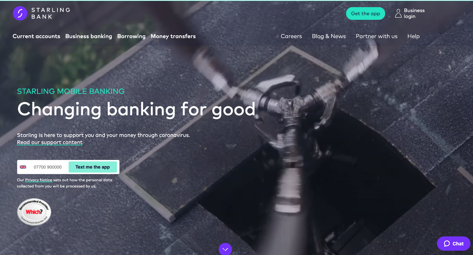
Other than sending an email from the CEO reassuring customers their money is safe, Starling almost immediately updated their splash page mentioning that they’re “here to support you and your money through coronavirus”.
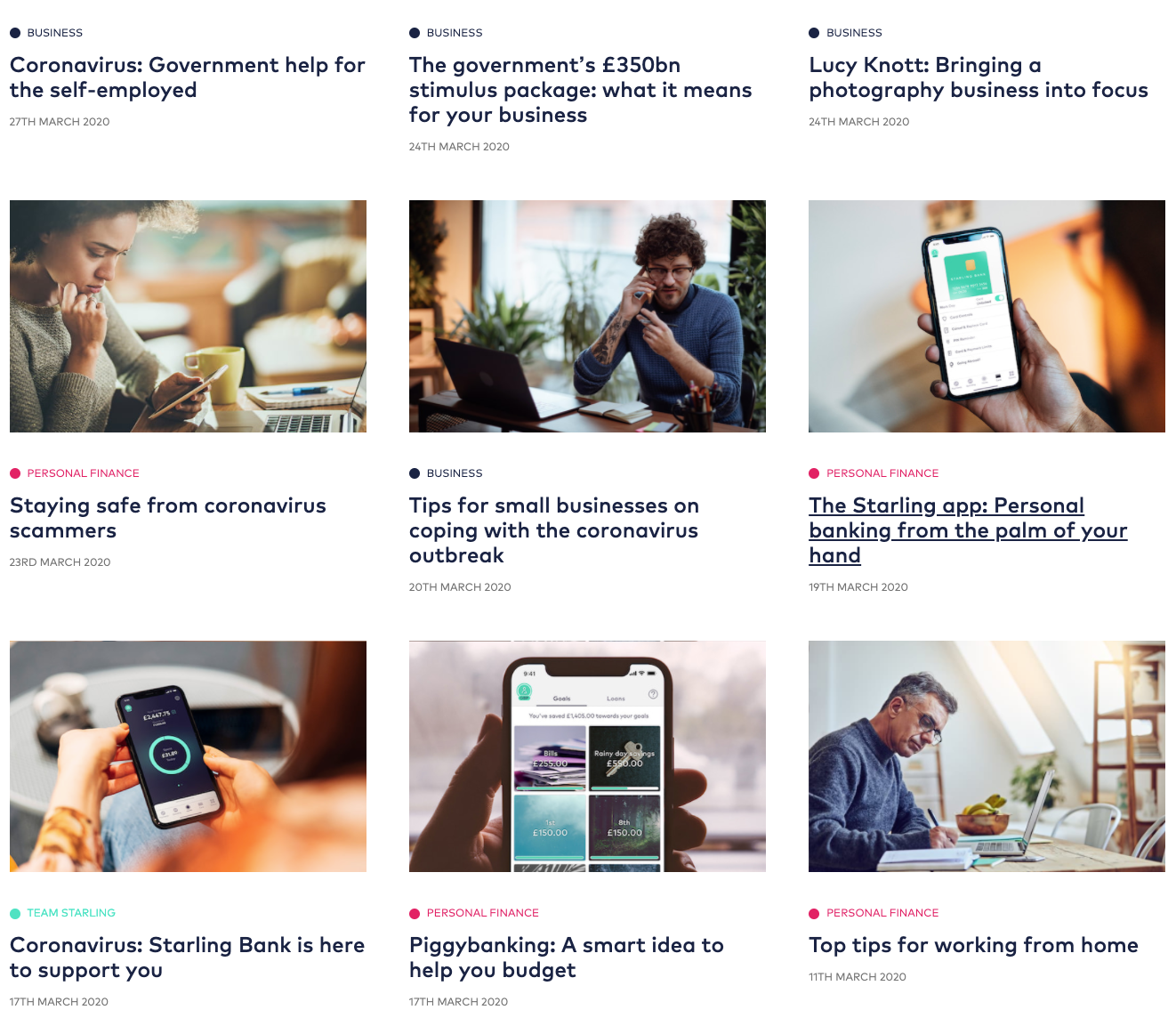
Their content efforts are also focused on helping their customers with practical, financial information, including demystifying the support offered by the government.
Revolut
In contrast, Revolut’s homepage doesn’t mention the word “coronavirus” or “covid”. The most recent communication from the brand has been about their recent funding round and that they’re safe, plus – announcing their expansion in the US.
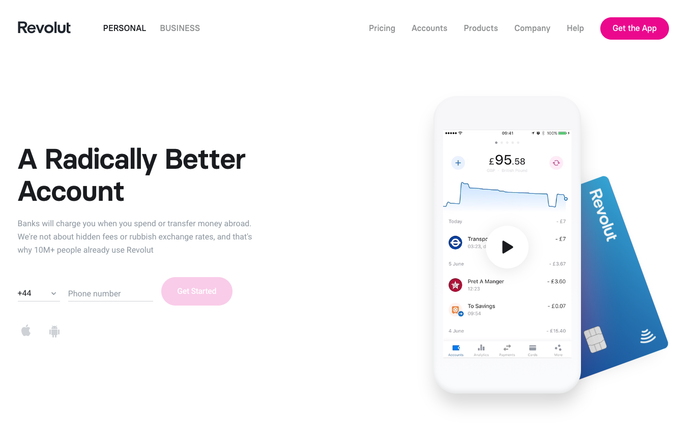
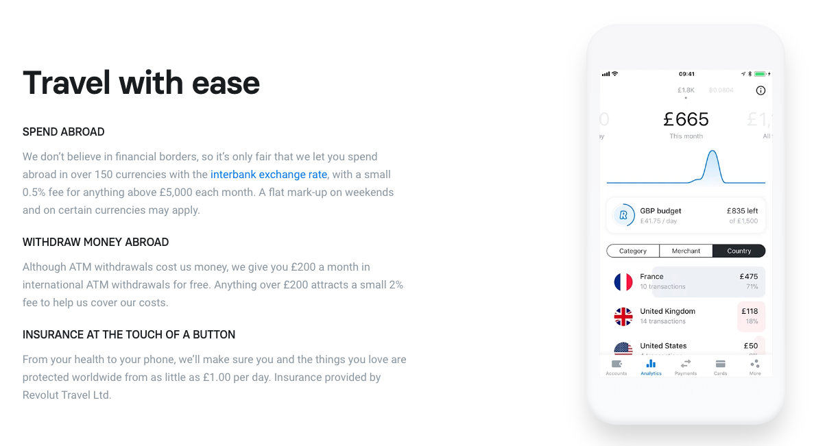
The section about travel money on their homepage is quite irrelevant at the moment, so from growth and UX perspective, probably the focus of the main offering and massage could be temporarily changed.
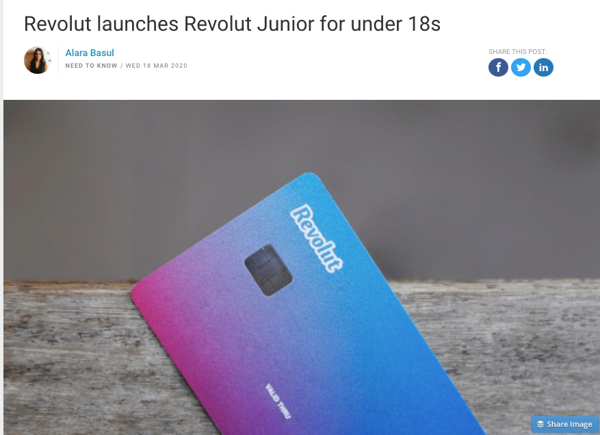
Also – the launch of Revolut Junior, a great product on its own, coincided with the schools closure and the national lockdown. A good lesson on flexibility and adaptability to be learned from this business decision…
Pret
After offering free drinks to NHS staff while still open, Pret continued to do an amazing job after the closure of their shops, delivering food and drinks to hospitals and charities across the country.

Their website was updated with a beautiful, empathetic, yet professional message from their CEO, truly reflecting their actions:
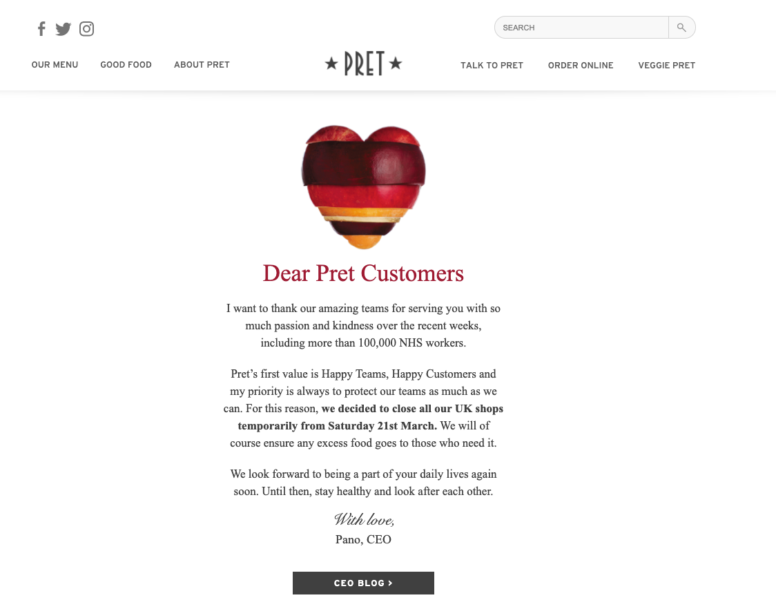
Obviously this is a business losing millions at the moment, but their carefully planned actions reflecting their brand values are still winning them prospect customers even while they’re closed.
Butternut Box
As a dog food startup, Butternut Box are not expected to be affected drastically, so a delicate message that deliveries are not affected is all the customer really needs:
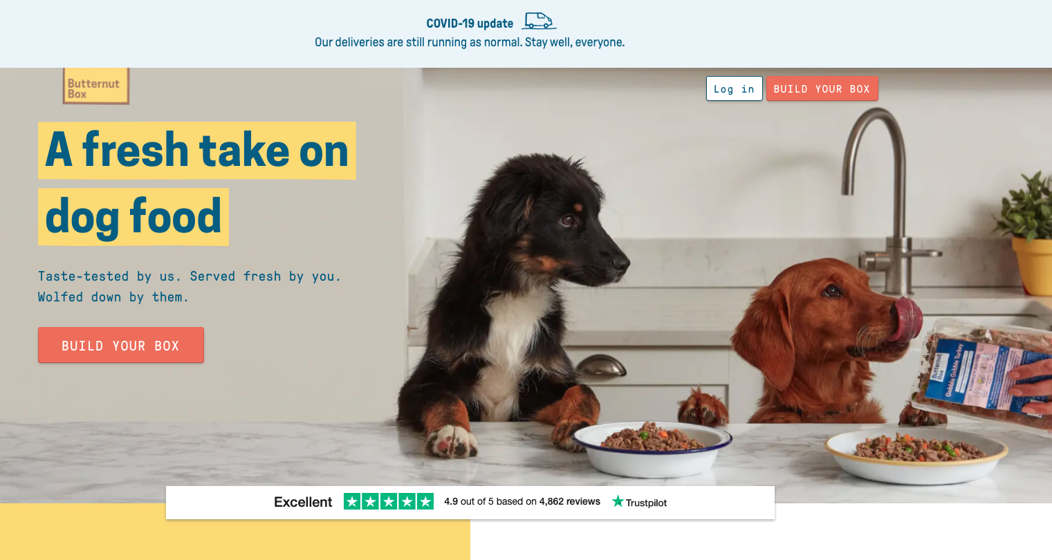
To stay relevant and support their audience, they introduced home school dog training lessons with an Instagram influencer.
Fetch
In contrast, the message Fetch’s customers are greeted with is this:
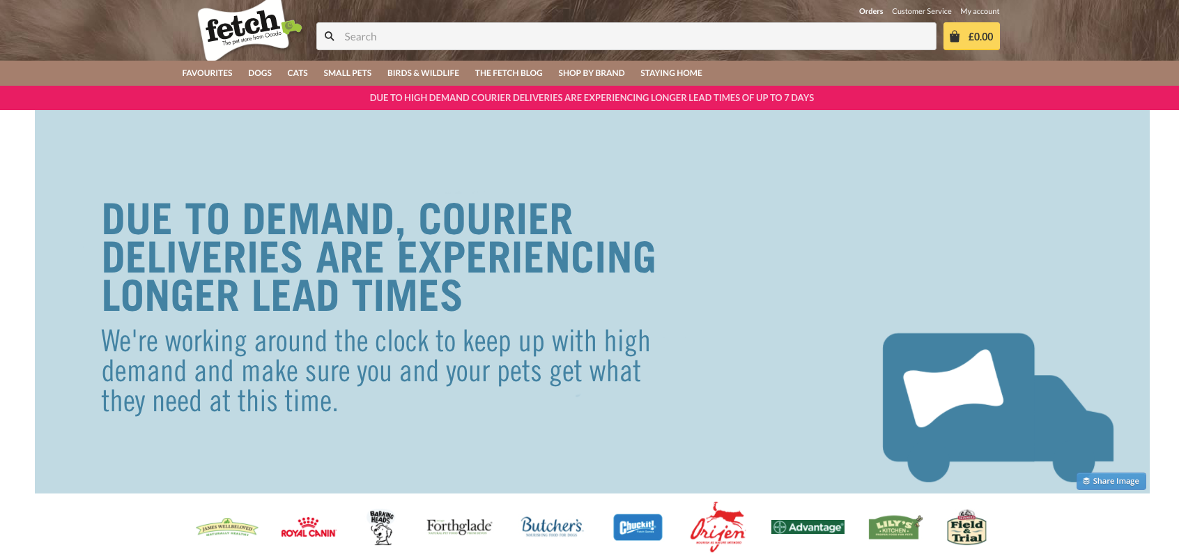
It overtakes the splash page and it screams one thing – issues. A bizarre UX decision. The same message could have been visualised in a more reassuring, discrete manner, while still brining the same results.
Rover
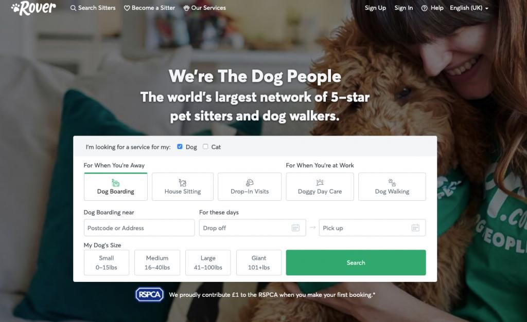
Similar to Revolut, pet sitting marketplace leader Rover doesn’t even mention covid19 or what steps have been made to guarantee the safety of its users. Unlike Revolut, Rover’s users actually need to have in-person social contact in order for people to use the offered services, so Rover’s silence on this matter is unprofessional and irresponsible, and sadly proving the marketplaces’ critics right.
M&S
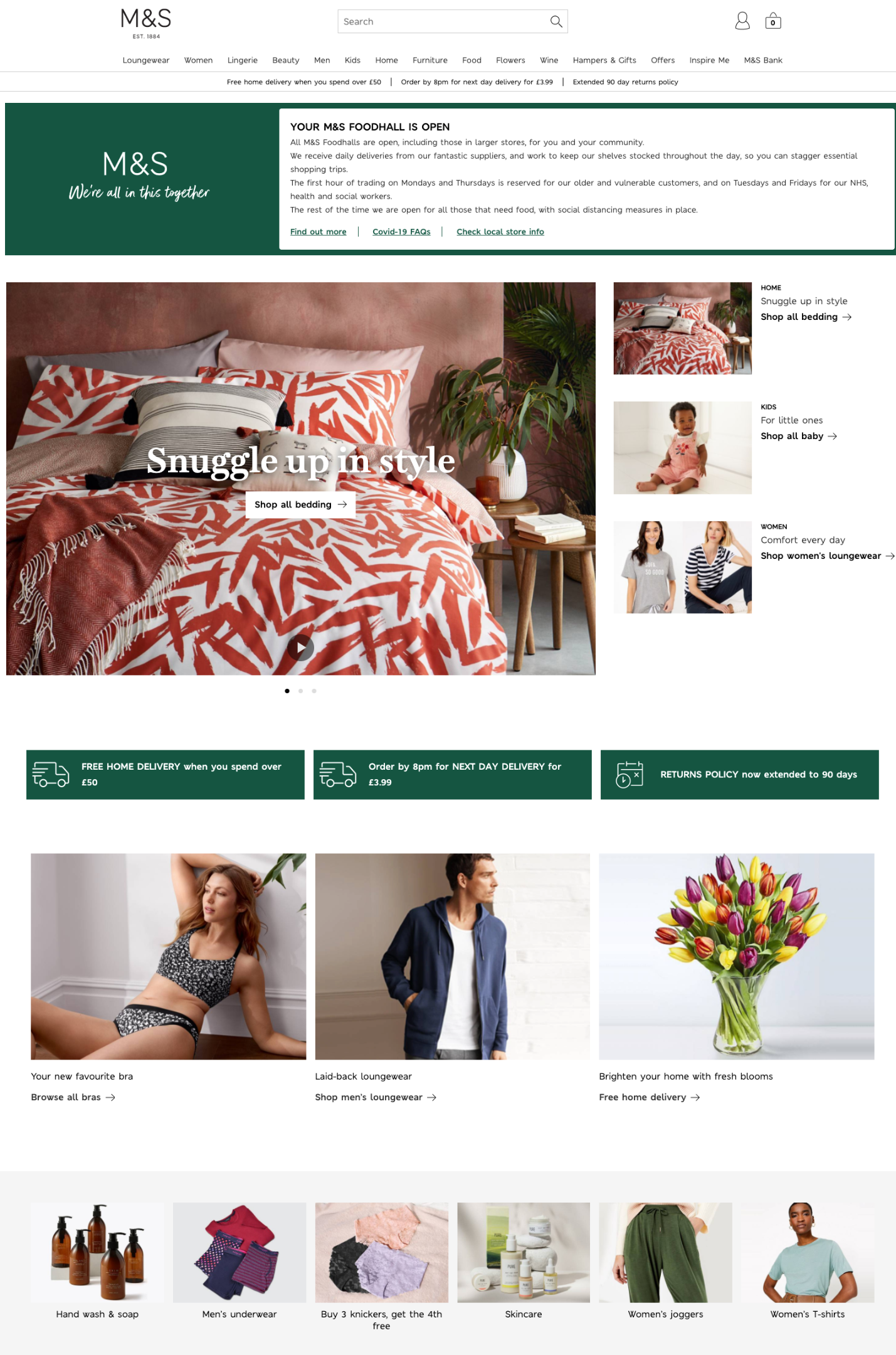
A message on balance by Marks & Spencer. A reassuring slogan “We’re all in this together” with a clear, concise message on how their operations are affected and the latest changes. The homepage has been smartly updated with the most relevant essentials people might be looking for: bed sheets, soap, comfy clothes. Somehow things look under control and close to normality, without being out of touch:
Patch
UK startup Patch that delivers plants to your door, mainly working with offices, have swiftly updated their homepage messaging with an accent on refreshing your home office.
“Bringing plants into your home office is the easiest way to bring the space to life, and create a relaxing environment.”

Ocado
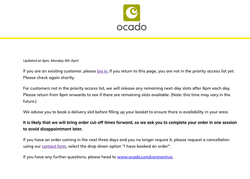
Online grocery shop Ocado, that has been one of the leaders in food delivery in the UK, is making little effort to reassure customers things will be under control soon.
Supermarkets are surely having quite challenging weeks and are struggling to keep up with the demand, but Ocado’s default message is off-putting and disappointing, and it only makes things worse.
Tesco
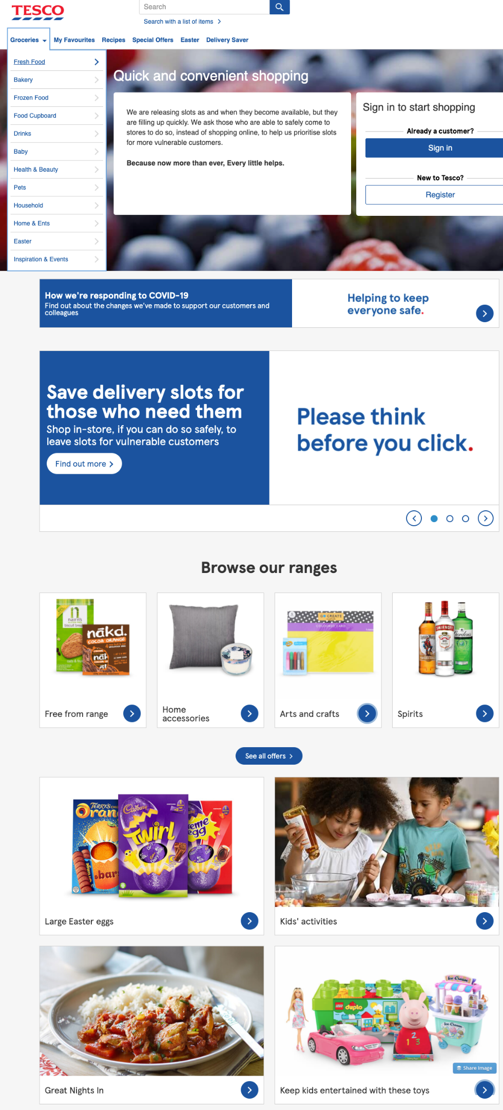
In contrast, Tesco, where the probability of booking a slot is similar to winning the lottery, have tried to reassure the user that with a little patience they still stand a chance.
Comparing the two (Ocado and Tesco) – which option makes you think it’s worth checking again soon?
Pipedrive
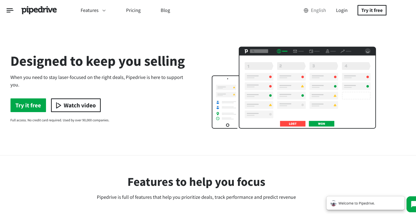
Pipedrive are smartly addressing the main pain points of their customers – decreased sales and lack of focus. They’ve recently updated their homepage copy from:
“The simpler way to sell. The sales CRM that makes your life easy, so all you have to do is sell. Deal?”
to:
“Designed to keep you selling When you need to stay laser-focused on the right deals, Pipedrive is here to support you.”
A great example of how smart UX copywriting could do miracles. They’ve only updated a few sentences, without even mentioning the virus, the rest of the design is the same. It’s reassuring and straight to the point, without unnecessary emotions.
To summarise:
We’ll have plenty of opportunities to observe how companies are reacting to the current crisis, but to reiterate what we all should straight away:
- Do a quick research on how your users have been impacted
- Update your user segments (this will be temporary)
- Don’t delay updating your copy, website/product UX and offering, even tiny changes can go a long way
- And most importantly – adjust the above three even weekly if needed to stay laser relevant to your core customers. You need them more than ever.
Metai mage: cottonbro on Pexels


