Master Public Speaking (Even If You're Terrified of It)
Dr. Alexander McWilliam


From Gamer to Web3 Disruptor: How Amos Whitewolf Is Rebuilding Gamer Trust with PerionXP
Amos Whitewolf


From 0 to $25M ARR Bootstrapped: Adam Robinson’s Blueprint for SaaS Growth Without Funding
Adam Robinson


How to Scale as a CEO – Mindset, Strategy & Leadership Shifts, with Joe Leech, CEO Coach
Joe Leech


From Corporate Lawyer to Social Impact Entrepreneur: Sanjay Lobo's Journey with OnHand
Sanjay Lobo


From Premier League Star to Wellness Entrepreneur: Thomas Robson-Kanu's Journey with The Turmeric Co
Thomas Robson-Kanu

Master Public Speaking (Even If You're Terrified of It)
Dr. Alexander McWilliam
From Gamer to Web3 Disruptor: How Amos Whitewolf Is Rebuilding Gamer Trust with PerionXP
Amos Whitewolf
From 0 to $25M ARR Bootstrapped: Adam Robinson’s Blueprint for SaaS Growth Without Funding
Adam Robinson
How to Scale as a CEO – Mindset, Strategy & Leadership Shifts, with Joe Leech, CEO Coach
Joe Leech
From Corporate Lawyer to Social Impact Entrepreneur: Sanjay Lobo's Journey with OnHand
Sanjay Lobo
From Premier League Star to Wellness Entrepreneur: Thomas Robson-Kanu's Journey with The Turmeric Co
Thomas Robson-Kanu
Design
6 min read
16 UX and UI Design Tips That Always Deliver Growth
UX is a discovery process. We often argue that user experience doesn’t start and finish with a project. As long as your product is live, the UX process never ends. When it comes to digital products, there’ll always be room for improvement and growth opportunities worth exploring, so the design process is an inseparable part of the growth journey.
When it comes to usability and design principles though, there’re proven and tested rules we could apply without hesitation. Why would you reinvent the wheel?
Check out our selection of 16 UX and UI tips and tactics that deliver instant growth results and save your brainpower for more complex UX and product challenges.
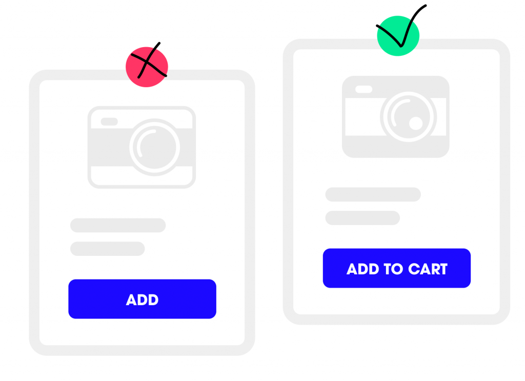
1. The best performing CTA
Your call to action button will always perform better if you add some context to the action, but try to keep it up to three words. Instead of “Add”, you could have “Add to Cart”, and instead of “Buy” – “Buy Now”
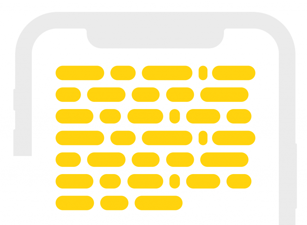
2. Copy on mobile
There’re plenty of tests that have been done proving that the best usability principle for the readability on mobile is no more than 9 words per line, or 50-60 characters.
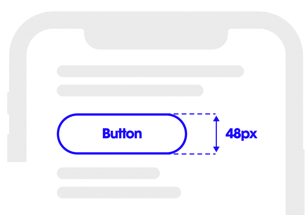
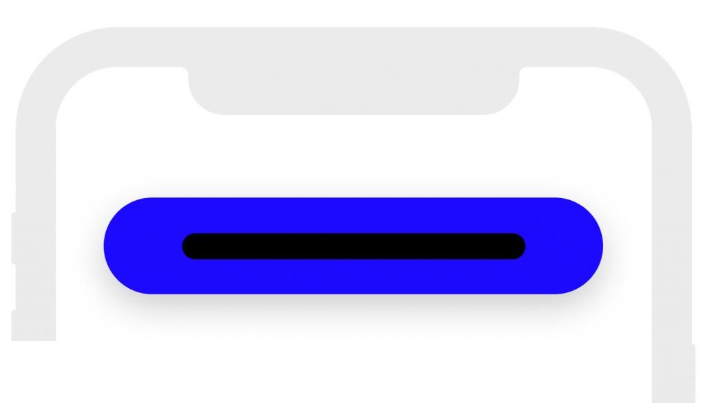
3. CTA on mobile
It’s larger than what the majority of designers use. An MIT Touch Lab study of Human Fingertips concluded that the average width of the index finger is 16 – 20 mm for most adults, which makes the ideal button size 40-50px wide.
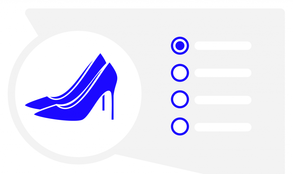
4. Ecommerce listing
Not sure when to use radio button and when a dropdown. The UX rule is simple – use radio-button style for less than 5 options and a drop-down for more than 5 options.
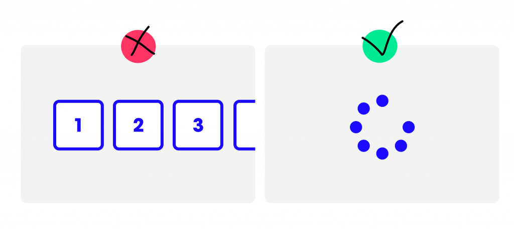
5. Pagination or infinite scroll
Many UX designers are tempted to use infinite scroll to make their design more sleek and modern. However, this doesn’t work for users trying to find the right content. The tests have proved that infinite scroll should be used for content exploration and pagination for goal-oriented UX, like e-commerce or data-rich websites.
6. Default selection – to be or not to be
Typing and additional clicking have high interaction cost. To increase your forms conversion rate, always use default selection, prompting the desired or the most frequent selection.
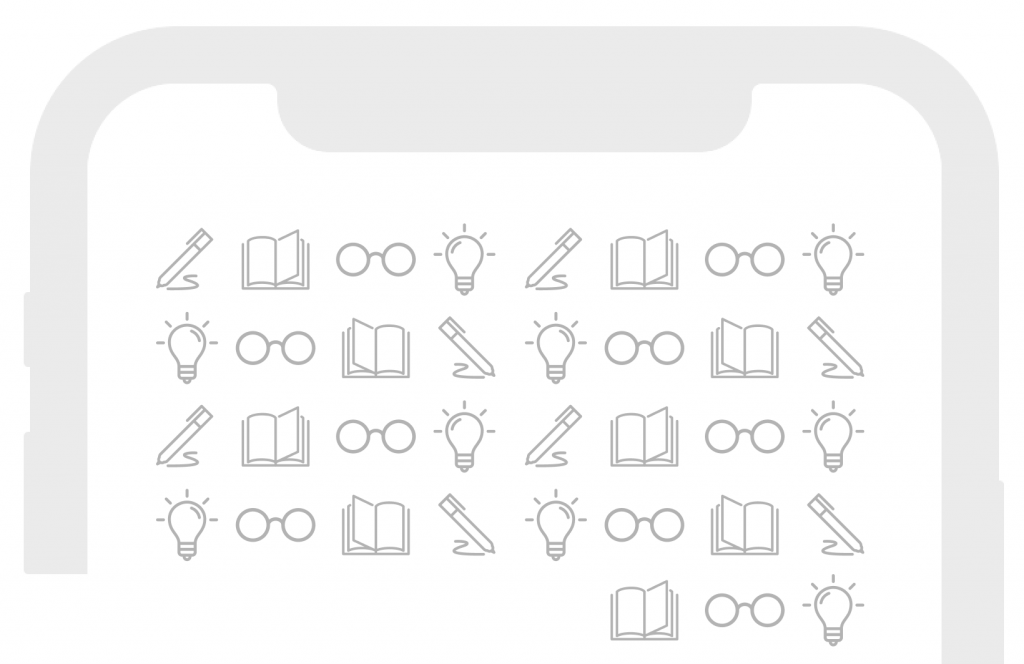
7. How to use icons
Overusing icons is a UI mistake, often compromising the UX. The use of icons should always have a strong meaning, reinforcing what can’t be said with words, never hiding the functionality behind a vague icon. The golden UX rule: use icons when the label is not enough to explain the action.
8. Error messaging
To boost conversion rates, always offer suggestions to correct errors, reducing user’s cognitive load. Keep it human and humouristic to avoid churn when the user faces an error screen or message.

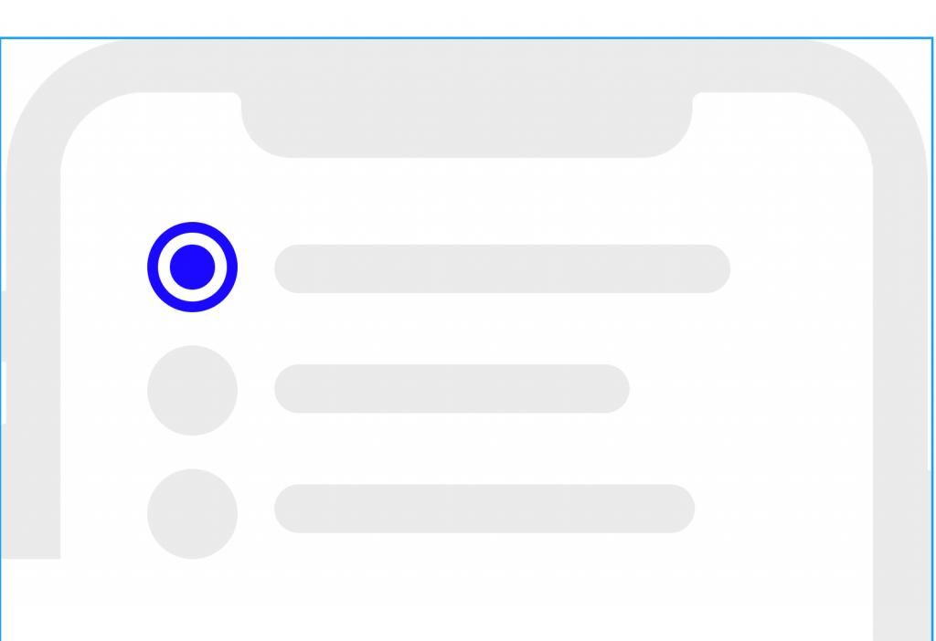
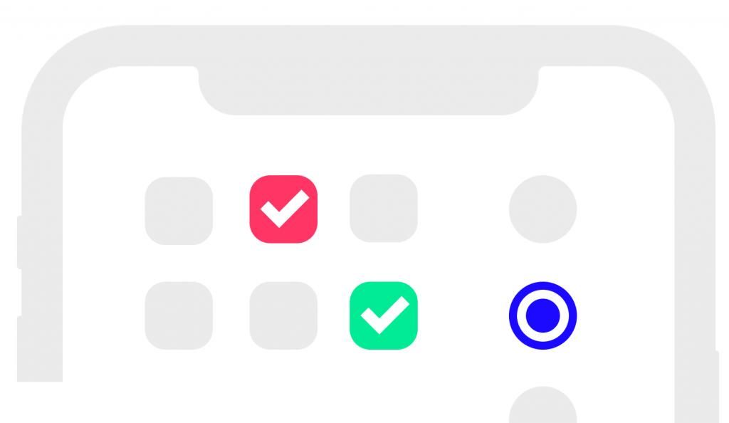
9. Checklist or radio-style button?
The UX principle here is simple: for multiple-choice selection go for a checklist, for single-choice selection – radio button. No designer should do otherwise.
10. Use the placeholder to show an example
Using placeholder copy sets a better context and increases form conversion. But you should go one step further – use an example, instead of the required field name. For example, insert a sample phone number (+44 757 869…), instead of putting “phone number”, or “hi@pony.studio” instead of “email”. It’s a proven UX principle.

11. Wider tappable area on mobile
Back to the MIT research from point 3, wider buttons and tappable areas on mobile always perform better than tiny UI components. So if the design allows it, always use wider, bigger visual options than radio buttons, dropdowns or copy links on mobile.
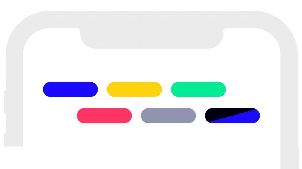
12. Use colours for classification
Colour-based labels for important classification decrease the cognitive load, so always go for a bit of colour on key design screens. The risk – don’t overuse it, as it might have the opposite effect and mess up the hierarchy of the UX.
13. Form field buttons
Always use a different colour for the button placed next to a text field to make sure it doesn’t blend with the text input area and it stands out as a call-to-action button.

14. The perfect line height
We all wished there was a perfect ratio between font size and line spacing, but, and we’re sorry to break it to you – there isn’t. The universal UX rule is – keep the line height to 20-30% more than the character height for better readability, so anything within this range will do the job for most cases.

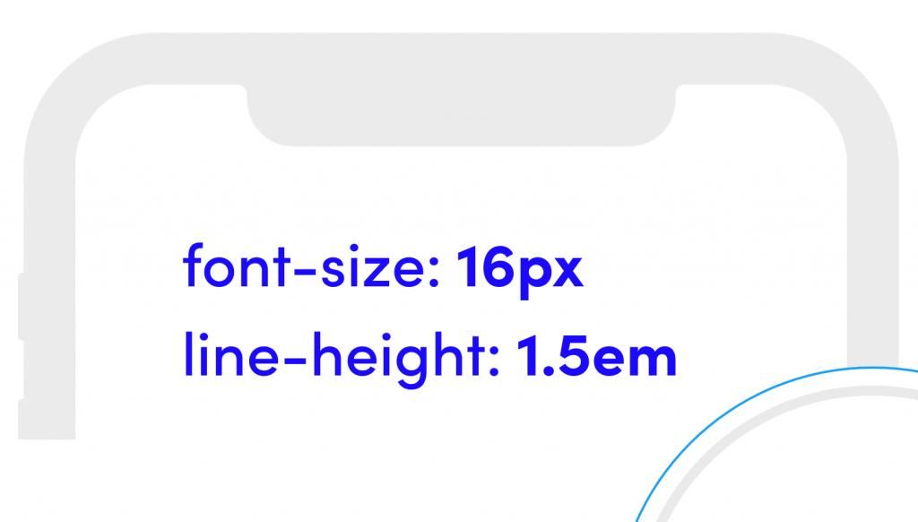
15. The font size that always works
If everyone used the same font size all the time, the design world would be a very boring place. If you want to be on the safe side though, 16px font with 1.5 line height always works. It’s the safest option for body copy.
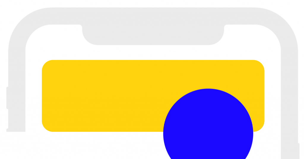
16. Overlapping images for a polished look
If you want to add a more fancy touch to your designs, go for overlapping images, especially if you’re designing user profile pages or cards. To make sure it stays balanced, always match the image border with the background colour.
You can follow us on Instagram for bite-size educational content on UX and Design.