Master Public Speaking (Even If You're Terrified of It)
Dr. Alexander McWilliam


From Gamer to Web3 Disruptor: How Amos Whitewolf Is Rebuilding Gamer Trust with PerionXP
Amos Whitewolf


From 0 to $25M ARR Bootstrapped: Adam Robinson’s Blueprint for SaaS Growth Without Funding
Adam Robinson


How to Scale as a CEO – Mindset, Strategy & Leadership Shifts, with Joe Leech, CEO Coach
Joe Leech


From Corporate Lawyer to Social Impact Entrepreneur: Sanjay Lobo's Journey with OnHand
Sanjay Lobo


From Premier League Star to Wellness Entrepreneur: Thomas Robson-Kanu's Journey with The Turmeric Co
Thomas Robson-Kanu

Master Public Speaking (Even If You're Terrified of It)
Dr. Alexander McWilliam
From Gamer to Web3 Disruptor: How Amos Whitewolf Is Rebuilding Gamer Trust with PerionXP
Amos Whitewolf
From 0 to $25M ARR Bootstrapped: Adam Robinson’s Blueprint for SaaS Growth Without Funding
Adam Robinson
How to Scale as a CEO – Mindset, Strategy & Leadership Shifts, with Joe Leech, CEO Coach
Joe Leech
From Corporate Lawyer to Social Impact Entrepreneur: Sanjay Lobo's Journey with OnHand
Sanjay Lobo
From Premier League Star to Wellness Entrepreneur: Thomas Robson-Kanu's Journey with The Turmeric Co
Thomas Robson-Kanu
UX & UI
7 min read
Improve Your Onboarding with Powerful UX Copy – 5 Products that Nailed It
The most successful way to ruin a stellar UX project or a brand new website is to add mediocre, boring, safe copy. UX copywriting has become a discipline on its own, because of the massive impact it has on product performance.
UX copywriting and microcopy are less about the core brand content and more about guiding the user to achieve specific product goals. This includes actions like completing the sign-up process, improving the conversion rate of a specific landing page, adding profile details, etc.
Having said that, UX copy has become the base of a brand’s tone of voice, as their website is the main touchpoint with users. Master copy is one of the key characteristics of influential brands and what sets disruptive startups apart from the crowd. While grammar and spelling remain the most important aspect of copywriting (74% of users pay attention to the quality of spelling and grammar on company websites), offering engaging, distinctive, and tested content is what will impact your KPIs. With 79% of users abandoning an app after the first use, the fight for the user’s attention is fierce.
We researched hundreds of examples of how brands use UX copy to impact user behaviour during onboarding and shortlisted 5 exceptionally good examples that you can learn from. For the purposes of this research, we use “onboarding” to describe the process not only when you enter your personal details (this must stay as clear as possible) but before, during, and immediately after signup. This is because we all know that a single email submission doesn’t mean much in 2020. You can’t fake engagement.
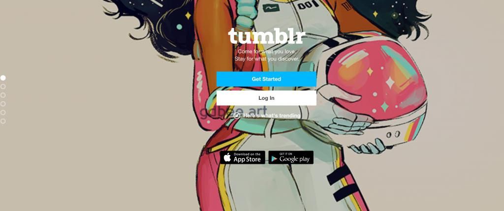
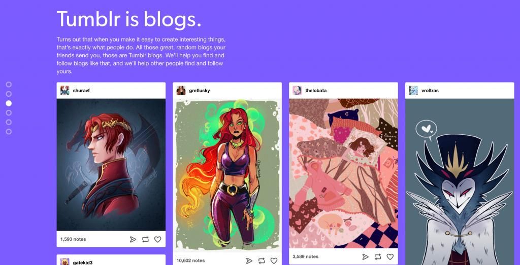
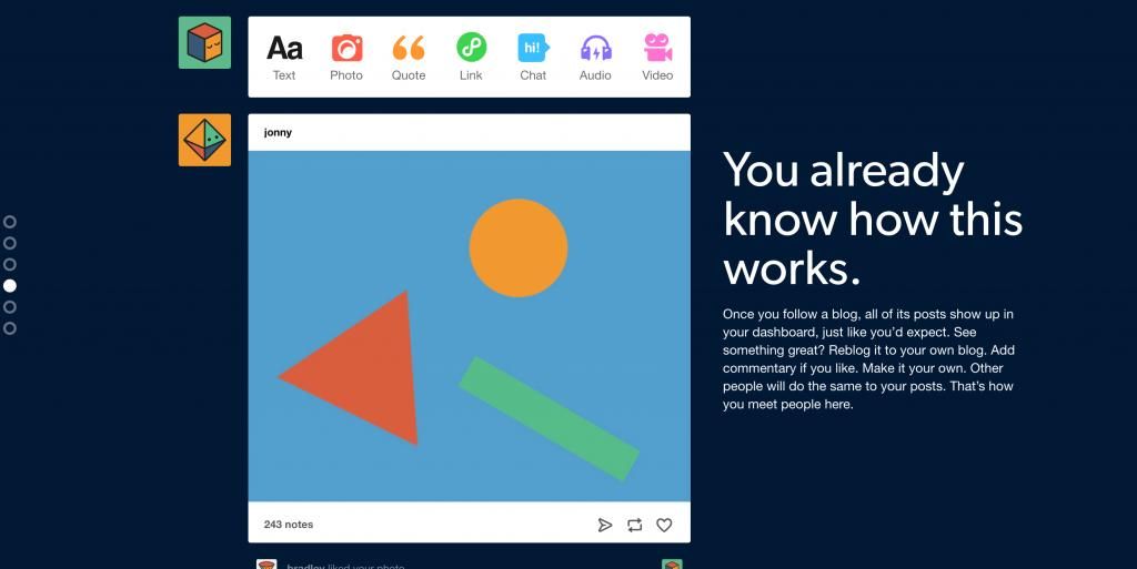
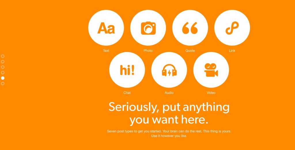
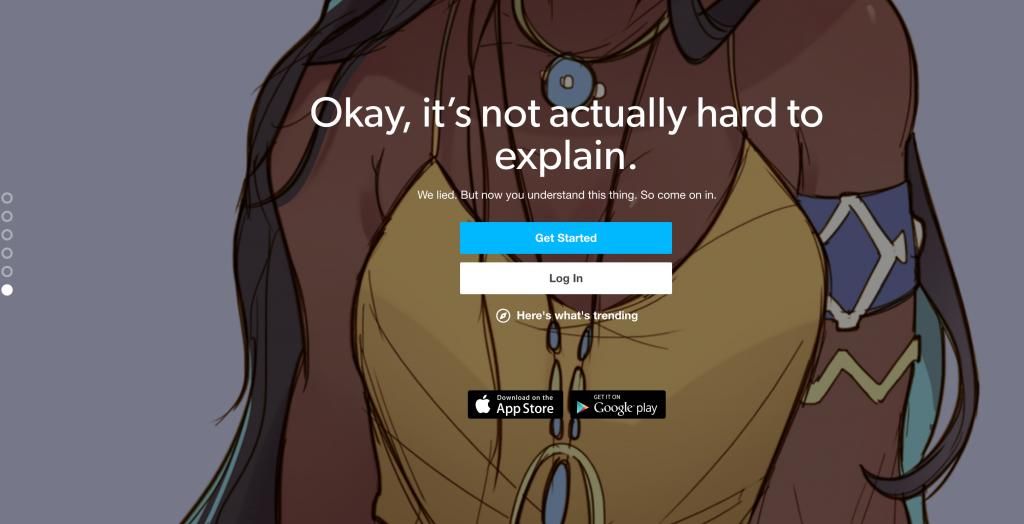
1. Brand Coherence on Sign Up Screens – Tumblr
A popular mistake we see across many products is the lack of brand consistency in key user flows. Data capture doesn’t need to be standarised and boring – or at least you can fight this practice. Many popular products still have generic signup screens (e.g. Trello, Booking.com, Airbnb), without much of a character. We get it: this is the easiest way to grab a customer’s email. But is it the best way to engage them?
Tumblr has done an amazing job with their registration page – a sequence of carousel images, staring and finishing with the sign-up screen. They don’t underestimate their user. She can sign up if she wants to. What they bet on is descriptive, amusing, and entertaining copywriting that will convince the user not only to submit their email but also to explore the platform.
2. Offer Clear Motivation for Push Notifications – Hopper
The most crucial part of an app’s onboarding is how you convince the user to opt-in for push notifications. If you don’t get a “yes” the first time, you’ll most likely lose them forever. Statistics show that almost 60% of iOS users decline push notifications.
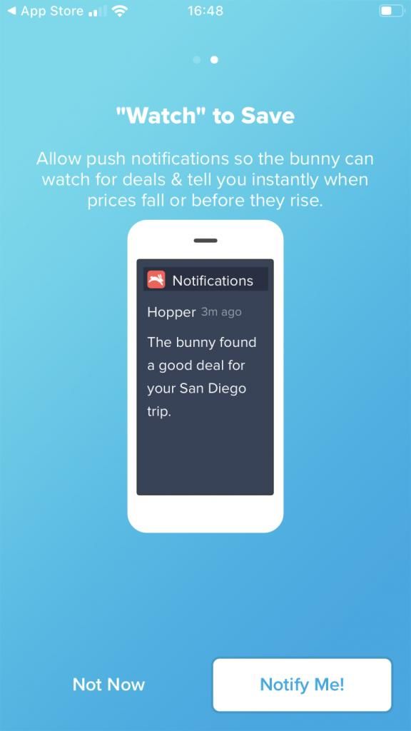
Hopper is a great example of doing your best to convince the user that their push notifications will make your life better: the copy is simple, consistent with the overall branding, and, most importantly, it clearly highlights the benefits. It’s also extremely important to override the default iOS prompt; this will increase the number of users who opt-in by 182%, according to Lean Plum.
3. Edgy & Original, in Moderation – MailChimp
The hardest thing to achieve in brand copywriting is the balance between being original (delightful, surprising, mysterious, or fun) and getting your message across clearly. It takes a long time to master this, and a great brand to learn from is Mailchimp. With this homepage copy, they perfectly strike a chord with their audience (marketers and startup founders).
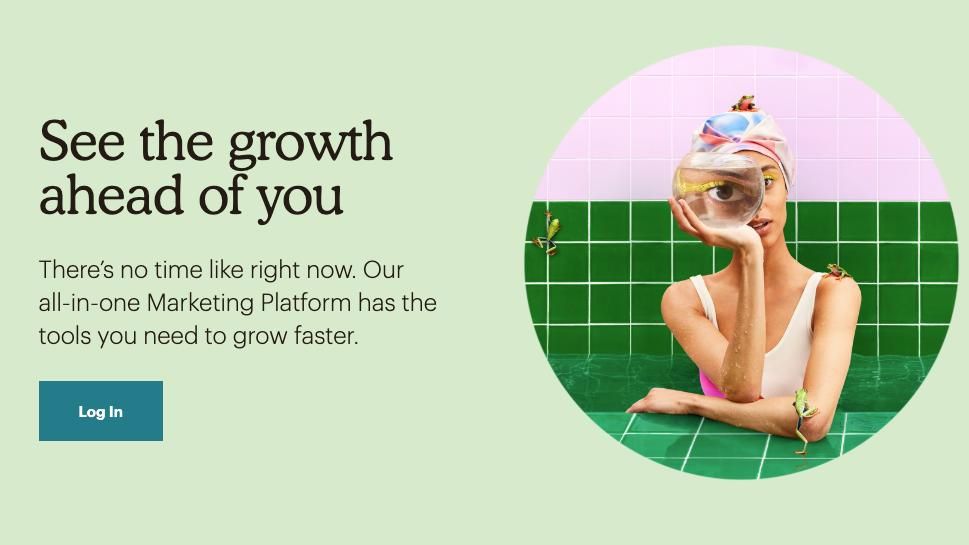
Growth is their main objective. Copy is just the right length, perfectly balancing creativity and clarity, leaving it to the image to add a pinch of playfulness. It’s dynamic, inspirational, and actionable.
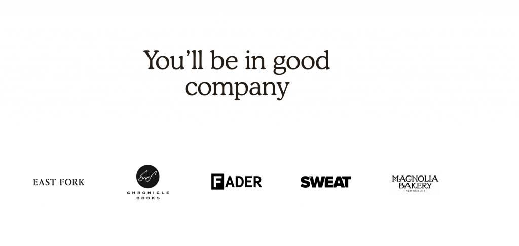
We also loved the way they worded the section listing brands using Mailchimp:
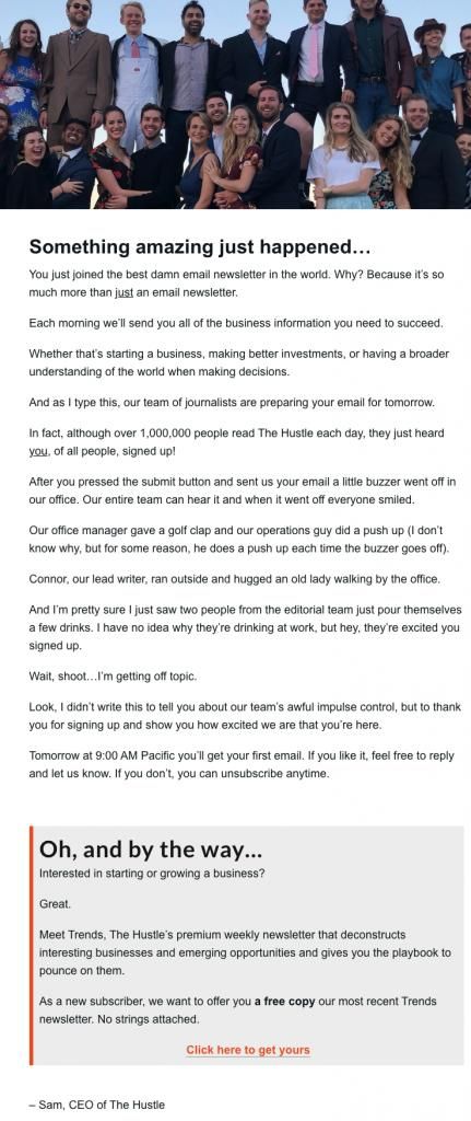
4. Masterpiece in Sign-up Confirmation – The Hustle
You know that feeling when you sign up for a newsletter and you’re not so sure why you did it, and you certainly know you’ll unsubscribe soon, as you don’t need another email clogging your inbox? The Hustle, a daily newsletter focused on business and tech news, knows this far too well. Once you subscribe, you’re faced with a page-long message which you can’t stop reading until the end. Why? Because it’s bold, informative, clever, and valuable. It informs you who they are, who is preparing the content, and who and how big their audience is. You feel you’re in good hands, as every sentence shouts professionalism and creativity. It also contradicts the general approach of short success messages like “Thank you for joining our growing community”. Read on and take notes:
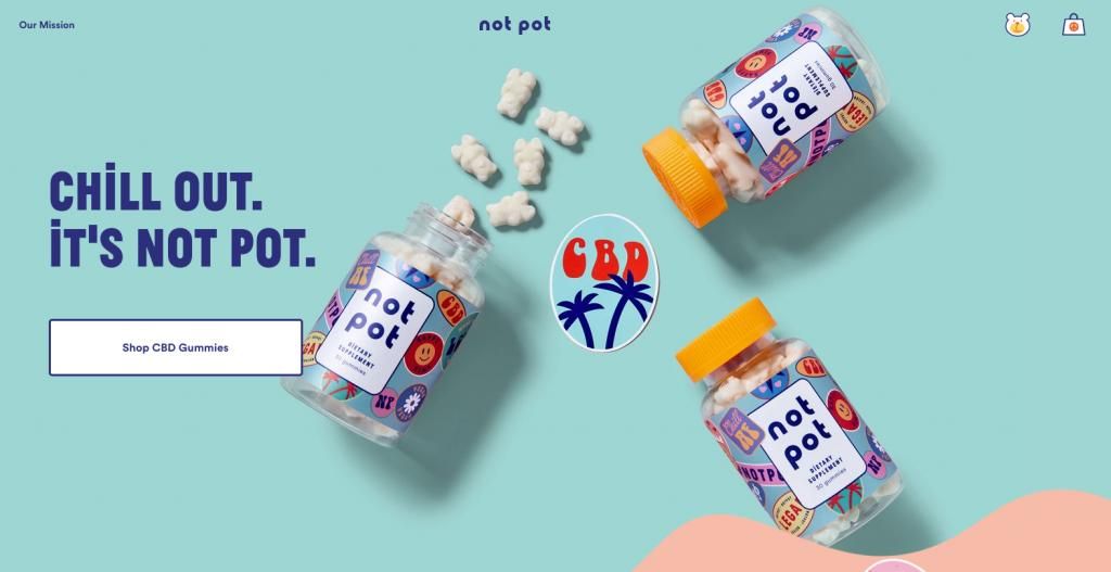
5. Overcoming Barriers with Character and Simplicity – Not Pot
When every word and pixel are perfectly balanced with each other and aligned with the brand’s tone of voice, then your website might even outperform your product.
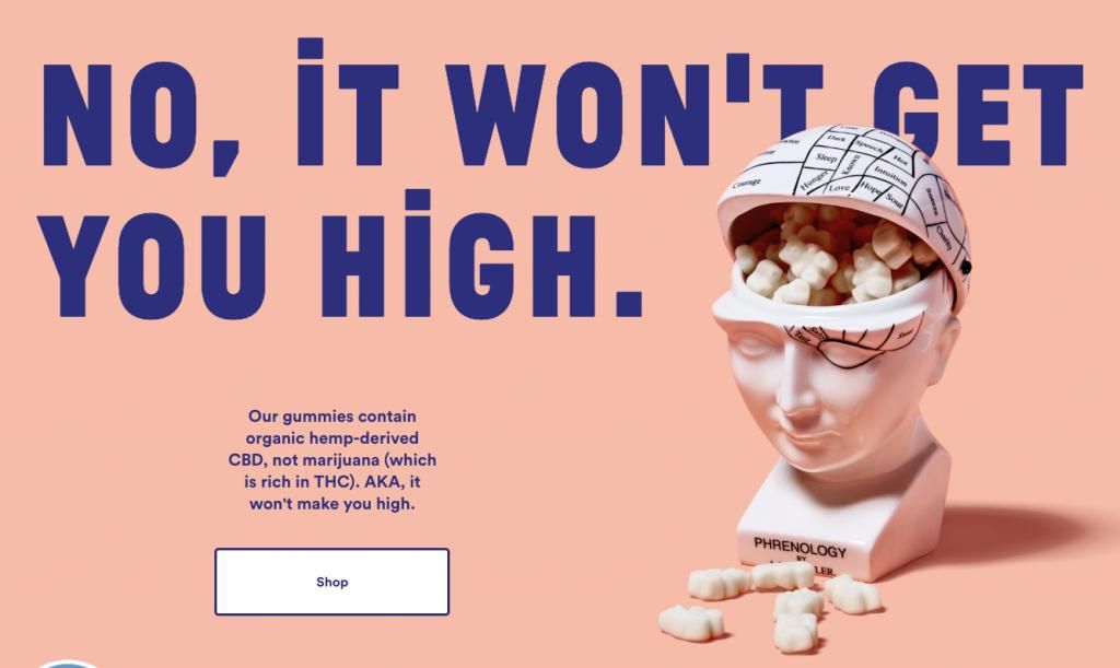
NotPot is a brand selling CBD gummies – a hot market that is still fighting prejudice and negativity, as the consumer doesn’t know the difference between marijuana and CBD. The main message that CBD sellers are trying to get across with endless blog posts and reports is that CBD won’t get you high and that it’s not a drug. Not Pot is a brilliant example of how creative copy combined with spot-on imagery might overcome barriers and stereotypes in a couple of seconds.
The main customer concern and a barrier for conversion (uncertainty) busted in one sentence:
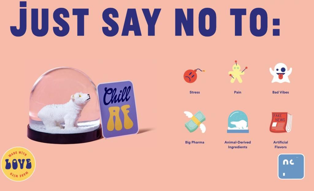
Highlighting the main benefits with clear, yet playful messaging:
The only CTA on the whole website is “Shop” – no “Read more” or “Subscribe”, the user is entertained, delighted, reassured, and politely guided to the only action that matters: purchase. The branding (creative and copy) is clearly targeting millennials and Generation Z. Focused and effective!
So, how do you master UX copywriting? The secret is in the size. You need to be original, edgy, and creative in the most concise and clear way possible. This is always a winner.