Design
5 min read
UX Design's Superheroes: Using Gestalt Principles to Save the Day
Prepare for an epic adventure into the realm of UX design, where some mighty superheroes save the day. These caped crusaders don’t hail from Krypton or Asgard; instead, they come from the world of psychology and leverage the power of the Gestalt principles. Each of these heroes has a unique superpower that makes user experiences more intuitive and engaging. Get ready to meet these protectors of good design!
The Justice League of UX: The Gestalt Principles
Here’s the ensemble cast of our design superheroes:
- Proximity Man
- Similarity Woman
- Continuity Kid
- Common Fate Flash
- Prägnanz Professor
- Figure/Ground Guardian
- Closure Crusader
Now, let’s meet each one!
1. Proximity Man: The Group Gatherer
Like a superhero using his gravitational powers to bring objects together, Proximity Man applies the principle that items close to each other are perceived as a group.
- Superpower: Creates coherent and meaningful groups out of individual elements.
- Saving the day: On a website, Proximity Man can pull together related links, group similar controls, or cluster associated images. A shopping site with distinct categories for each type of product? That’s Proximity Man in action.

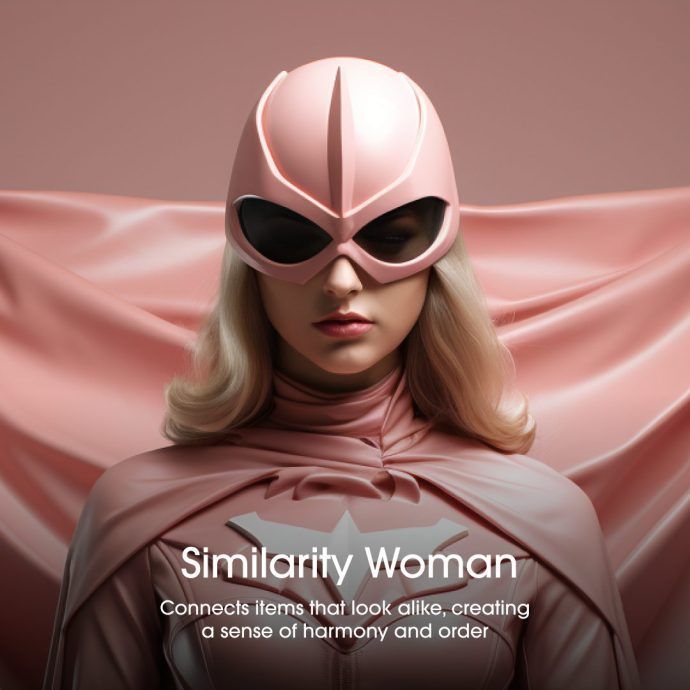
2. Similarity Woman: The Pattern Provider
With the power to make similar items appear as one cohesive unit, Similarity Woman exploits our natural tendency to seek patterns.
- Superpower: Connects items that look alike, creating a sense of harmony and order.
- Saving the day: By applying consistent visual design across buttons, icons, and other website elements, Similarity Woman makes it easy for users to identify related features. Ever noticed how similar tools in a software suite share design elements? That’s Similarity Woman at work.
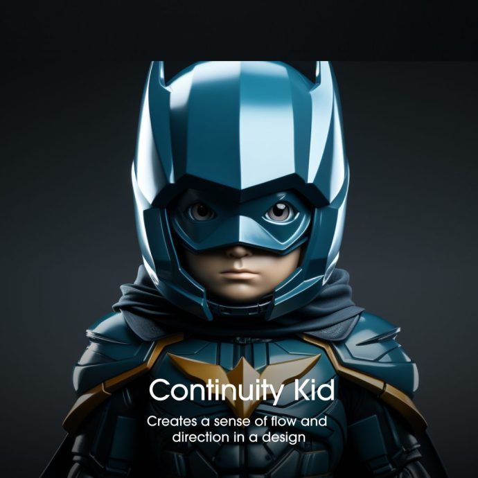
3. Continuity Kid: The Path Painter
Continuity Kid ensures that your eyes follow a path, leading them from one element to the next in a smooth, continuous journey.
- Superpower: Creates a sense of flow and direction in a design.
- Saving the day: On a landing page, Continuity Kid can guide the user’s eye from headline to copy to call-to-action. That easy, intuitive flow you feel as your gaze moves through a well-designed webpage? That’s Continuity Kid’s handiwork.
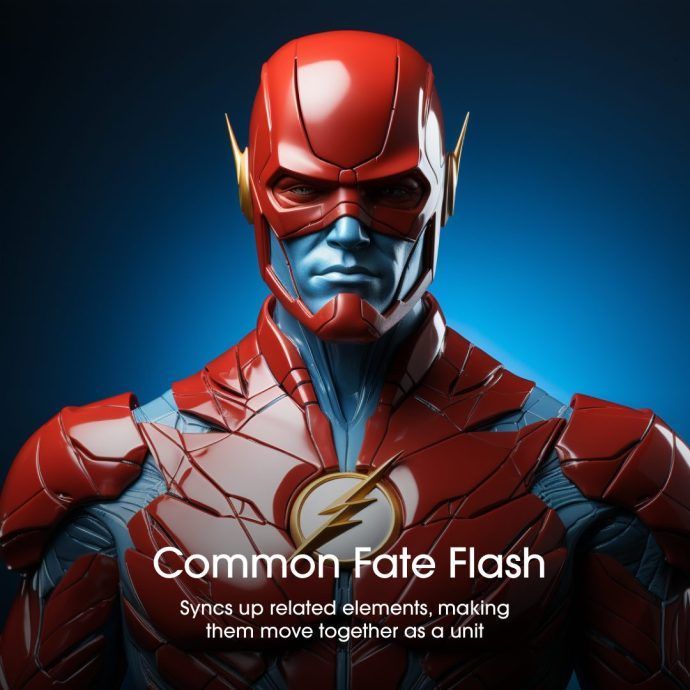
4. Common Fate Flash: The Movement Master
Possessing the power to synchronise movements, Common Fate Flash shows us that elements moving in the same direction are part of a group.
- Superpower: Syncs up related elements, making them move together as a unit.
- Saving the day: With animation becoming a staple in web design, Common Fate Flash uses this principle to link elements. Notice how objects in a menu slide together when you expand it? That’s the speedy work of Common Fate Flash.
5. Prägnanz Professor: The Simplifier
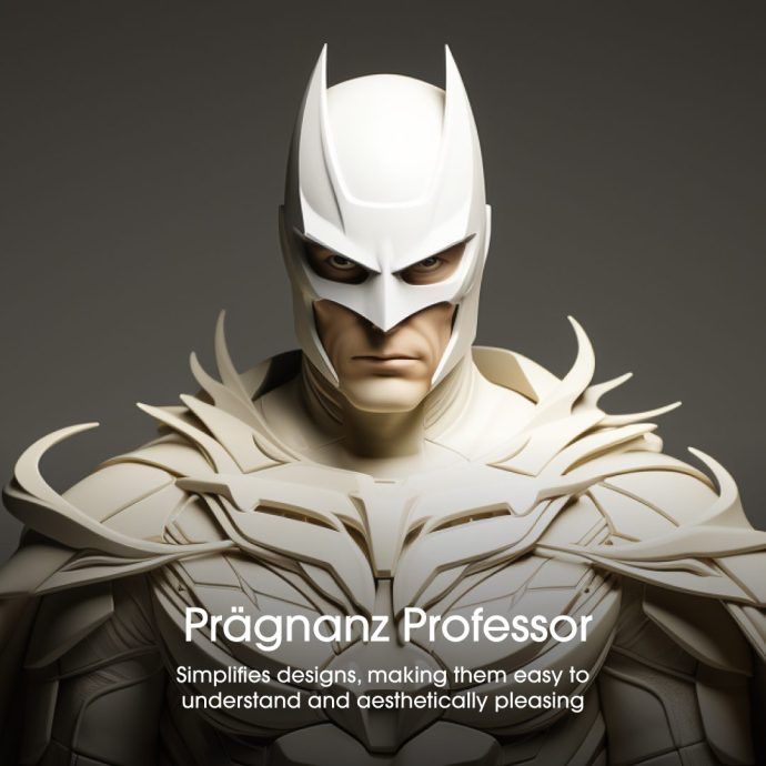
With a knack for making things simple and regular, Prägnanz Professor applies the principle of good form, turning complex shapes into simpler, recognisable ones.
- Superpower: Simplifies designs, making them easy to understand and aesthetically pleasing.
- Saving the day: Ever see a logo that’s a complex shape, yet still easy to recognise? That’s Prägnanz Professor distilling complexity into simplicity.
6. Figure/Ground Guardian: The Perspective Shifter
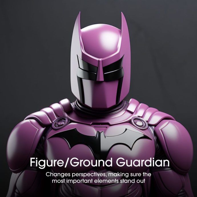
With the power to manipulate perceptions, Figure/Ground Guardian allows us to shift focus between an object (the figure) and its surrounding area (the ground).
- Superpower: Changes perspectives, making sure the most important elements stand out.
- Saving the day: This principle is everywhere, from a simple button standing out on a webpage to a drop-down menu that pops out from the background. Figure/Ground Guardian ensures the important features don’t get lost in the crowd.
7. Closure Crusader: The Gap Filler
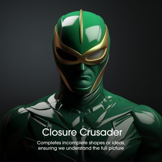
Closure Crusader uses our instinct to find closed shapes and complete unfinished ones.
- Superpower: Completes incomplete shapes or ideas, ensuring we understand the full picture.
- Saving the day: Ever seen a logo that’s only partially drawn but still recognisable? That’s Closure Crusader, helping your brain fill in the gaps.
Like a well-oiled superhero team, the Gestalt principles, when combined, can conquer even the most challenging design scenarios. They’re not just about making things look good; they’re about creating intuitive, engaging experiences that guide users on a journey. So next time you marvel at a website’s user-friendly design, remember the superheroes of UX design that made it all possible. After all, we’re all in need of a superhero now and then.


