Growth
7 min read
Are You Using the Decoy Effect in Your Favour?
The Decoy Effect is the phenomenon whereby adding a third pricing option makes the consumer change their preference towards an option the seller is trying to promote. The “decoy” is priced to make one of the other options much more attractive.
It’s also called “asymmetric dominance effect”. This is what you usually experience when you buy popcorn at the cinema or latte at Starbucks. The price difference between Medium and Large sizes is so little that you’d automatically opt-in for the larger option, unless you’re choosing the Small one for a specific reason (e.g. you like your coffee less milky)
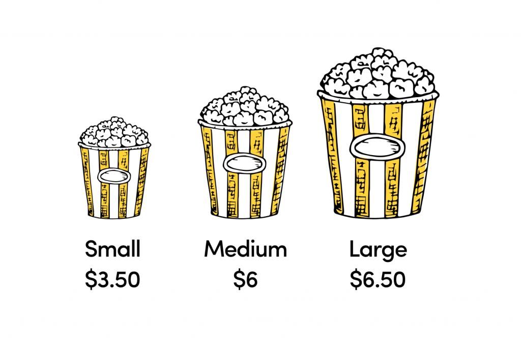
The Decoy Effect is a cognitive bias that’s often used when working on a pricing strategy, but also in politics, finance, insurance and pension plans, PR, and other areas. It almost always works, but the catch is – can you execute it smart enough so it attracts customers and still pushes your economics north.
Research proving that the Decoy Effect works
A few years ago MIT Professor Dan Ariely ran an experiment with his students asking them to choose a subscription plan for The Economist.
There were three subscription options:
1) web only $59;
2) print only $125,
3) web + print $125
When presented with only options 1) and 2), 68% of people chose the cheapest option. When presented with the 3 options, 84% of the students went for option 3).
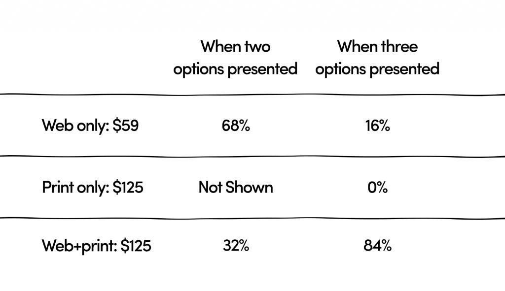
2 options delivered $8,012 of revenue 3 options delivered $11,444 of revenue
This is an increase of 43%, not bad, for adding an option that didn’t add a single hour of extra work.
The method has also been tested with high-profile investors by Brittany Paris from the University of New Hampshire. Her study, which included a number of surveys with strategically plugged decoys, concluded that even investors that are expected to act rationally were successfully influenced by the phenomenon. They were offered stock options to choose from and including a decoy, as a third option, successfully persuaded them to choose the option the company/founders wanted them to. You can see the full study here.
Why does it work?
Psychologically the Decoy Effect rules out the least attractive option and makes the third option more appealing. It gives users confidence that they’re making a smart choice and they’re getting good value for their money. Even though many of the students from the experiment above might have needed just the online version, they were tempted to get a print version, as well, because it was of unmissable value.
How to use the Decoy Effect for your business?
Just having 3 pricing options is not a strategic use of the Decoy Effect. For it to work, one of the options must be asymmetrically dominated by the “winner” option. You should introduce a “decoy” – a new, unattractive option that’s subconsciously ruled out because it’s of disproportionally worse value than the rest. It’s usually meant to make the most expensive option look super appealing, but not only.
If you’re interested in using the Decoy Effect in your pricing strategy, first it’s really important if your business model allows it. It could successfully work for:
- service businesses
- SaaS products
- B2C products
- ecommerce
- conferences and events
Here’s an easy example to help you see it in practice
Let’s say you’re running a social media management tool targeting SMEs. You offer two subscription options: one basic monthly subscription (Option 1); and one that offers all features and functionalities of the product (Option 2), both with potential add-ons.
Let’s say Option 1 is £10 and Option 2 is £49. This is a solid gap with surely a clear differentiator in terms of features. Seeing just the two options, many people might feel that Option 1 is too basic, while Option 2 is probably overpriced.
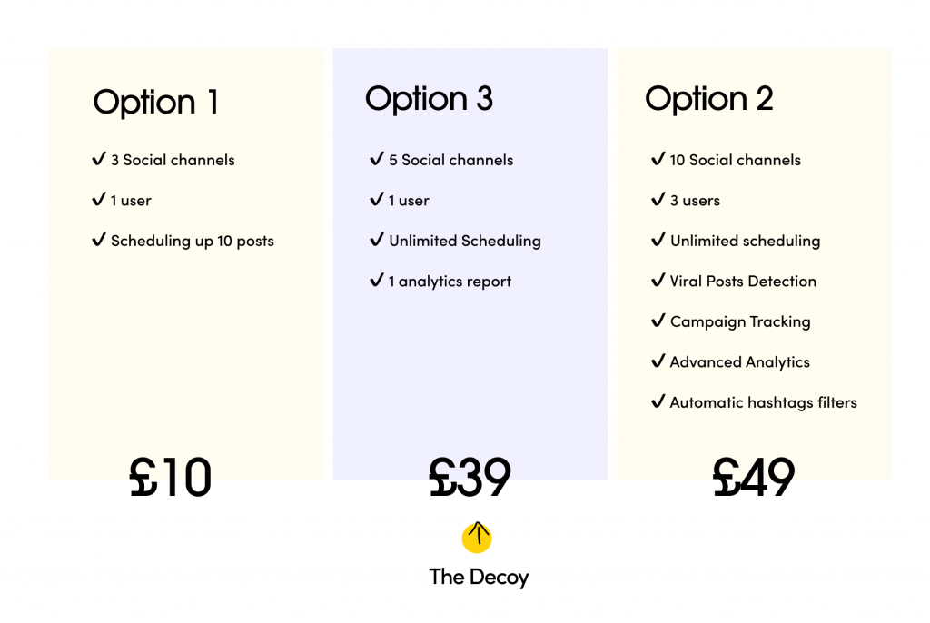
Now, if you add Option 3 (a decoy) with features closer to Option 1, but priced at £39, you’ll immediately make them think that Option 2 is actually a “bargain” as it’s slightly more expensive (£49), but much more powerful. This way you “persuade” them to choose the most expensive option, making the other two options looking inferior to Option 2.
Another popular way to use the Decoy Effect is to run sales, making the most expensive option even closer to the “decoy”, without compromising your returns of course.
Some companies, especially in ecommerce, flip the model and use the most expensive option as the decoy, to promote a cheaper option from which they have bigger margins. For example, they could push three types of chocolate, not expecting the majority of shoppers to buy the most luxurious item, instead, they expect them to go for the “middle” option which brings better returns.
There’re two critical elements when using the Decoy Effect:
- you should add an unattractive option to make an alternative option look more appealing
- never underestimate the consumer! All three option should have their purpose and value independently, so you’re not accused of dodgy sales tactics.
But wait, it’s not all perfect
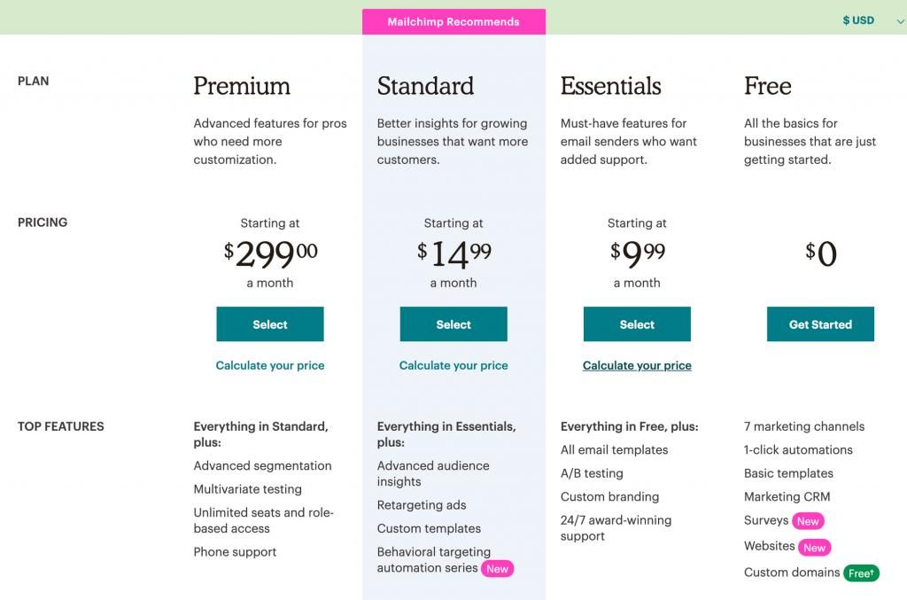
Critics of the Decoy Effect say that it’s a shady practice aiming to manipulate consumers and “force” purchases. To avoid being subject to similar criticism, always make sure that your “decoy” is still a viable option to consider, and it’s not on your pricing page just for the sake of it. Actually, many of the popular SaaS businesses we researched don’t use the decoy Effect to its full potential, probably because they don’t want to be associated with such a strategic pricing model. Examples of companies successfully using the Decoy Effect: Mailchimp: $5 extra sounds reasonable for the added features, right?
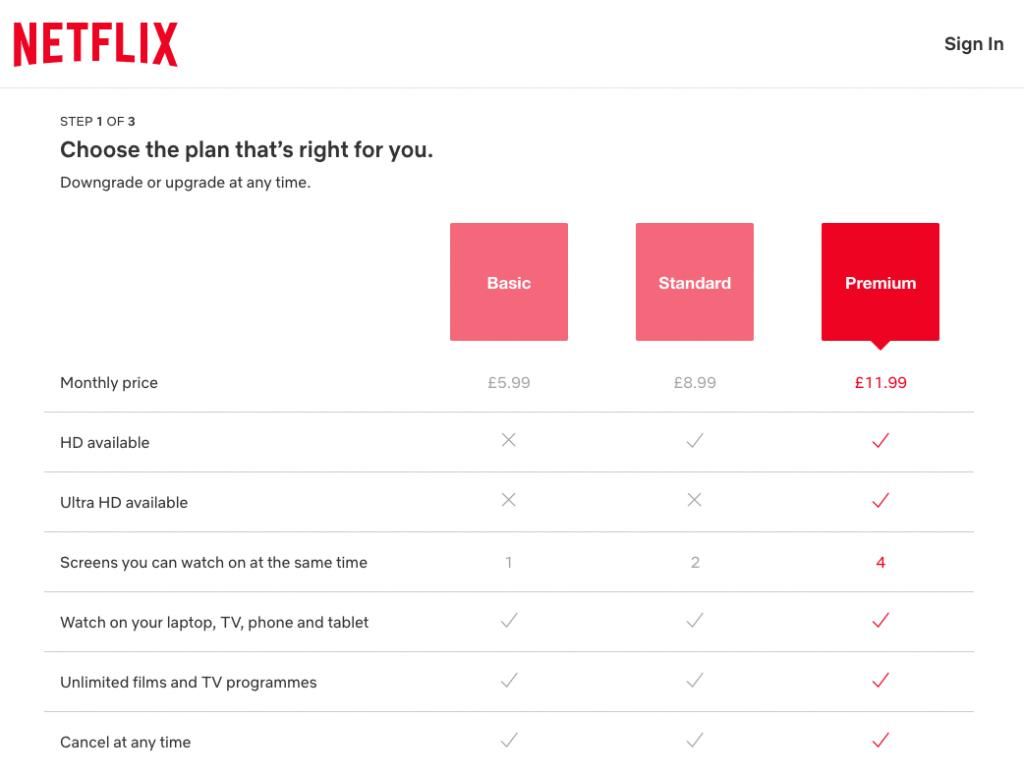
Netflix: £3 extra per month is totally worth it for ultra HD experience
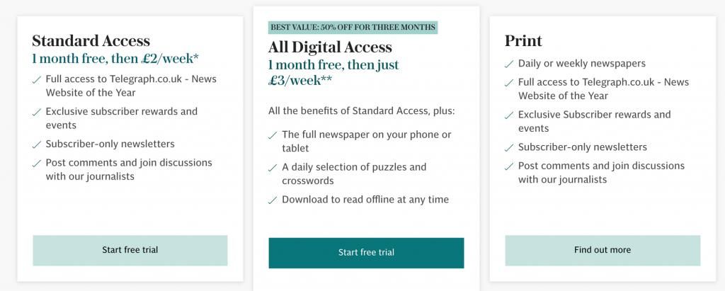
The Telegraph: they almost don’t leave you with other options
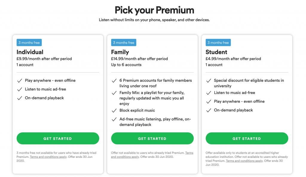
Spotify: they make it a no-brainer for couples or families
The Decoy Effect is also directly related to the Hick’s law (according to which too many options confuse the user), so it makes the annoying decision-making process easier and quicker. This is a type of scenario where the Decoy effect is thriving – having a no-brainer option is perfect for most busy users.
If you enjoyed learning about the Decoy Effect, check out The Most Important Elements of High Converting Landing Pages.


