Master Public Speaking (Even If You're Terrified of It)
Dr. Alexander McWilliam


From Gamer to Web3 Disruptor: How Amos Whitewolf Is Rebuilding Gamer Trust with PerionXP
Amos Whitewolf


From 0 to $25M ARR Bootstrapped: Adam Robinson’s Blueprint for SaaS Growth Without Funding
Adam Robinson


How to Scale as a CEO – Mindset, Strategy & Leadership Shifts, with Joe Leech, CEO Coach
Joe Leech


From Corporate Lawyer to Social Impact Entrepreneur: Sanjay Lobo's Journey with OnHand
Sanjay Lobo


From Premier League Star to Wellness Entrepreneur: Thomas Robson-Kanu's Journey with The Turmeric Co
Thomas Robson-Kanu

Master Public Speaking (Even If You're Terrified of It)
Dr. Alexander McWilliam
From Gamer to Web3 Disruptor: How Amos Whitewolf Is Rebuilding Gamer Trust with PerionXP
Amos Whitewolf
From 0 to $25M ARR Bootstrapped: Adam Robinson’s Blueprint for SaaS Growth Without Funding
Adam Robinson
How to Scale as a CEO – Mindset, Strategy & Leadership Shifts, with Joe Leech, CEO Coach
Joe Leech
From Corporate Lawyer to Social Impact Entrepreneur: Sanjay Lobo's Journey with OnHand
Sanjay Lobo
From Premier League Star to Wellness Entrepreneur: Thomas Robson-Kanu's Journey with The Turmeric Co
Thomas Robson-Kanu
Growth
12 min read
The Most Important Elements of High Converting Landing Pages
We’ve designed thousands of pages for hundreds of brands and we have identified 7 specific elements that always, for every product and brand, deliver better conversion rate results than if you don’t have them or, even worse, if you have executed them poorly.
So now you’re probably wondering now – are we talking about a homepage or a landing page? Well, the below findings usually apply for both. In case you’re not familiar with the difference:
- a landing page is usually used for specific campaigns (e.g. PPC ads, exclusive content, etc) with the primary objective – conversions, usually sales or sign-ups.
- a homepage should also sell, but since this is the front door to your business, it should balance branding, sales, product information, etc
In the real world, the landing page is usually a modified, more “salesy” version, of the homepage. A bit like – BUY THIS NOW but presented smartly
However, more often than not, for small products and startups the homepage has the same function as a landing page – it should educate and persuade the user that your product or service is exactly what they’re looking for. In fact, many startups use an identical page to their homepage for their Google Ads campaigns and that’s perfectly fine.
So if you’re not working on the homepage of IBM or Coca-Cola, following the below suggestions will definitely help you improve your conversion rate.
Compelling Headline
A smart, succinct headline that describes a pain point and offers a solution, while highlighting the product’s unique value proposition, can do miracles. We’ve done dozens of tests with the same designs and different copy variations and we can’t stress enough how crucial the quality of the copy is. It’s the first thing a visitor sees, you don’t have a second chance with it.
How to nail it: If you don’t have a strong content person inhouse, find a talented UX writer/copywriter to write the copy of your homepage. Then create a few variations of the headline and A/B test the, using tools like VWO or Optimizely, or run a Facebook A/B test (could be found in Experiments) with your target audience with the website headline used as the headline of the ad and compare the engagement performance. Quick tip – ideal length is between 5 and 12 words.
Customer Testimonials/Product Rating
Customer testimonials and product ratings are still one of the most underrated, but the most persuasive types of social proof. According to Search Engine Journal, 63% of consumers are more likely to purchase from a site if it has product ratings and reviews.
The catch is – how do you make them more believable? Getting solid customer testimonials from the right people is a project on itself. It takes time to plan and execute it properly, as you usually have one shot to collect the review and you don’t want to end up with just some stars.
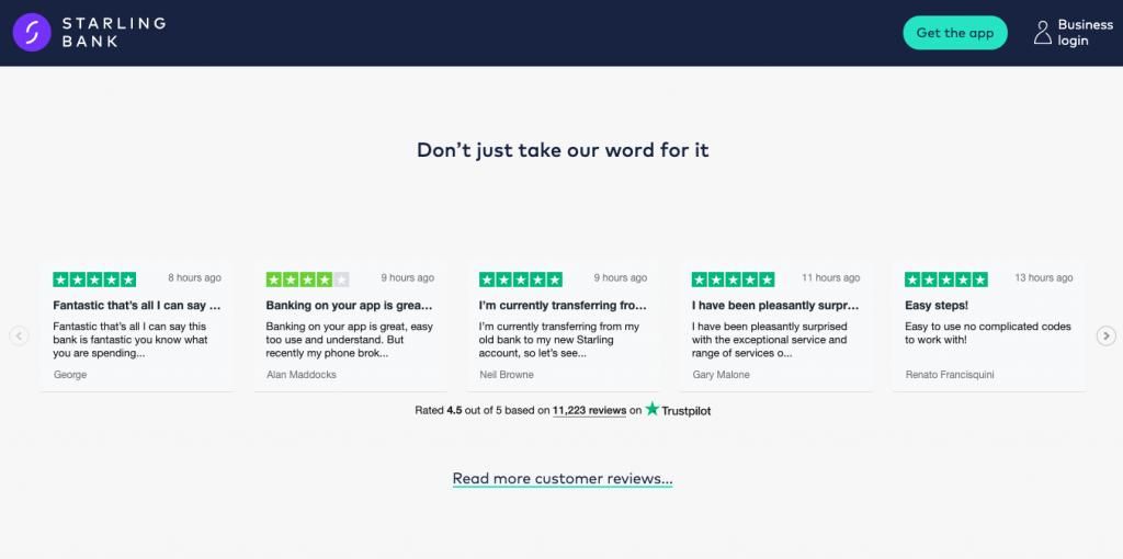
How to nail it: use a third-party tool like Google reviews, Trustpilot, Feefo, or Clutch to guarantee that the testimonials are legit and pick the best reviews to show on your landing page. Don’t embed them, design a nice section with the selected reviews, and include a high-quality photo of the person. If you’re using an external tool, show the overall rating and discretely link to the provider’s website for people who’d like to read more. Don’t worry that you take them away from the page – if there’s more praising feedback to read there, they’ll be back.
Press Logos and Customer Logos
Here’s a fun fact – people rarely pay attention if a recognisable brand logo on your landing page is included in the “Our Clients” or “As Seen On/ Featured in” sections. What matters is that a reputable brand is associated with your product, this is another example of how to use social proof successfully.
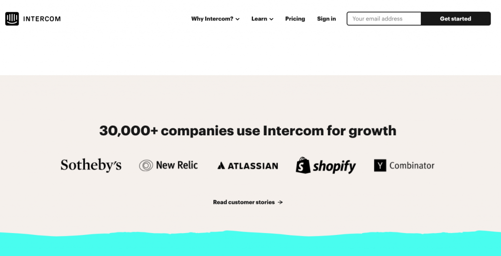
How to nail it: whenever you cross paths with a recognisable brand (e.g. they’re a client of yours, your brand has been featured or your work has been mentioned on their domain), make sure you find a smart way to visualise this on your key landing pages. In most cases, you first need to obtain their permission, in case this hasn’t been covered in the T&Cs of your agreement so far.
Lead Capture Form
For new products, the first interaction with your landing page would rarely lead to a direct conversion. You need to look at the user journey as a whole piece – from hearing about your brand (Awareness), through exploring your website (Consideration), to converting into a customer (Activation).
For this reason, if a user visits your landing page for the very first time, you should be thinking where this falls in their journey as a customer (your funnel) and make sure you find a way to keep them engaged until they reach the Activation phase. Lead capture is an absolute must for every product’s landing page.
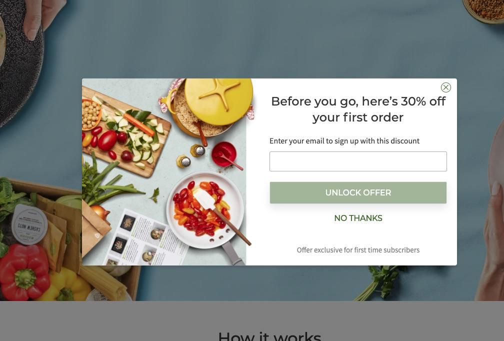
How to nail it: this really depends on the type of product you’re offering. Some brands are doing really well with offering freebies (industry-focused ebooks) or scheduling complimentary consultations, others have strong newsletters that are worth signing up form, and consumer brands are doing great with welcome discounts. Whatever the hook is, the most important factor is that you give them a compelling reason or a reward of unmissable value, that is clearly communicated on your page. “Subscribe for our newsletter” doesn’t cut it anymore.
Video Content
That’s a tricky one. Any business can benefit from using video on their landing page, but this is true only if the video covers these 3 elements: a) is of high quality; b) it provides useful information or entertains; c) it’s strategically implemented. One of the biggest challenges to increasing conversion rates is actively engaging your users, and this is an area in which video excels. According to Wyzowl, 72% of businesses say video has improved their conversion rate.
Video usually works great when it explains a more complex product/process, or when it triggers an emotional response (e.g. it’s really funny or visually mind-blowing).
How to nail it: If you don’t have the time or resources to produce a quality and engaging video piece, then it’s better to skip it. The ideal video length for landing pages is 60-90 secs. If used as a background – use autoplay, if not – leave it to the user to play it if interested. Having real humans always work better than just graphics.
Note: Carelessly implemented videos might have the opposite effect, so always A/B test the versions with and without a video to see if it’s working for you.
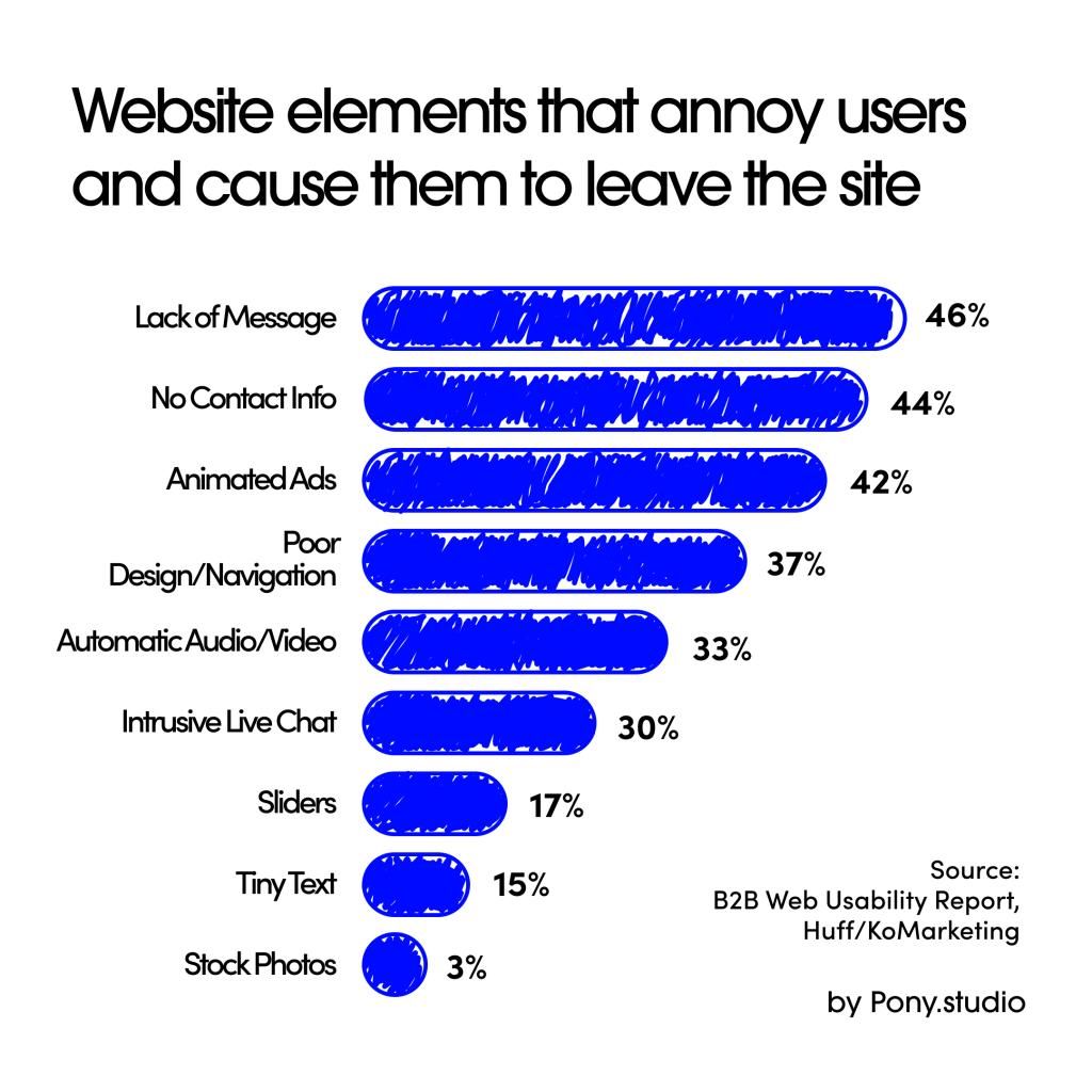
Contact Information
In today’s world full of budding startups that often overpromise and underdeliver, looking legit and reliable is becoming increasingly important. According to a report by KoMarketing, 44% of users say that the lack of contact information makes them leave a website and rated it as the second most important element of a homepage. So if you want people to stay on your page and move them down the conversion funnel, you have to offer them an easy way to contact you.
How to nail it: luckily, we now have an amazing choice of bot chats, business phone systems, shared office spaces, etc which can give you all the basics. Ideally, you should be aiming for as many as possible from this list:
- phone number
- live chat
- contact form
- office address
Create Something “Unforgettable”
Most conversions come from repeat visitors and those repeat visitors come from people remembering your brand for all sorts of reasons. Numerous studies have shown that repeat visitors have higher engagement and conversion rates and even though they don’t come back only because of your stunning landing page, this surely contributes a lot. According to a study by Brilliance.com retained e-commerce visitors converted 73.72% more than first-time visitors.
The memory does a remarkably good job at recalling events and items that are out of the ordinary. This means that if you manage to design a landing page that stands out and is not following the same pattern/layout as most of your competitors, you’re more likely to pop in your users’ minds next time when they think of your type of product.
How to nail it: creating a memorable brand goes much beyond an extraordinary landing page, but there’re tricks that you can implement on your landing page, even if your brand is not that strong. An easy way is investing in a memorable, interesting photo or making your headline a bit “shocking”. Delighting the user with impressive micro-interactions is another successful way, or using a witty sense of humour in your copy. Whatever you choose – make sure you stay consistent with the angle you’ve chosen to differentiate you.
For example, after introducing the pony animation with the smashing ice cream on our homepage contact form submissions increased by 63%.
CTA button on mobile – higher on the page and 60px
Whether you’re having a sticky button or multiple CTA buttons on your desktop version, it really depends on your layout and style. There’s no confirmed universal winner, you have to test for your specific page. However, when it comes to mobile, floating buttons often create usability issues, while CTA left at the bottom of the page might be often hard to find.
How to nail it: the CTA should be prioritised higher on the page and included a few more times in the rest of the page for easier access while the user scrolls. “The thumb zone” should be taken into consideration and the most preferred size is 60 pixels width.
If you enjoyed this article, you should also check: 16 UX and UI Design Tips That Always Deliver Growth 8 Practical Ways and Tools to Make Use of Data