Master Public Speaking (Even If You're Terrified of It)
Dr. Alexander McWilliam


From Gamer to Web3 Disruptor: How Amos Whitewolf Is Rebuilding Gamer Trust with PerionXP
Amos Whitewolf


From 0 to $25M ARR Bootstrapped: Adam Robinson’s Blueprint for SaaS Growth Without Funding
Adam Robinson


How to Scale as a CEO – Mindset, Strategy & Leadership Shifts, with Joe Leech, CEO Coach
Joe Leech


From Corporate Lawyer to Social Impact Entrepreneur: Sanjay Lobo's Journey with OnHand
Sanjay Lobo


From Premier League Star to Wellness Entrepreneur: Thomas Robson-Kanu's Journey with The Turmeric Co
Thomas Robson-Kanu

Master Public Speaking (Even If You're Terrified of It)
Dr. Alexander McWilliam
From Gamer to Web3 Disruptor: How Amos Whitewolf Is Rebuilding Gamer Trust with PerionXP
Amos Whitewolf
From 0 to $25M ARR Bootstrapped: Adam Robinson’s Blueprint for SaaS Growth Without Funding
Adam Robinson
How to Scale as a CEO – Mindset, Strategy & Leadership Shifts, with Joe Leech, CEO Coach
Joe Leech
From Corporate Lawyer to Social Impact Entrepreneur: Sanjay Lobo's Journey with OnHand
Sanjay Lobo
From Premier League Star to Wellness Entrepreneur: Thomas Robson-Kanu's Journey with The Turmeric Co
Thomas Robson-Kanu
Design
11 min read
Designing a High-Converting Pricing Page
There’s a reason why most pricing pages, especially for SaaS products, look similar. It’s down to Jakob’s Law — users feel more comfortable with a familiar interface that they’ve seen elsewhere and will transfer the expectations they have built around one product to another that appears similar. In other words, people won’t appreciate it if the layout of your pricing page looks much more different from what they’re used to and this won’t bring any positive results for your business.
So to start this off, if you’re fed up with the three or four-column layout, it’d be best if you accept it. The good news is that it’s easy to cover the basics. The great news is — you can leverage existing mental models and create an even more powerful user experience by fine-tuning the details.
And here’s what to do.
Understand the UX Laws behind the pricing page layout
Other than Jakob’s Law, marketers, designers, and product people love taking advantage of other popular UX and marketing principles that we’re so used to.
For example, The Von Restorff effect is the reason why we usually put emphasis on one of the listed options. It’s also known as the “isolation effect” and it “predicts that when multiple homogeneous stimuli are presented, the stimulus that differs from the rest is more likely to be remembered” and chosen.
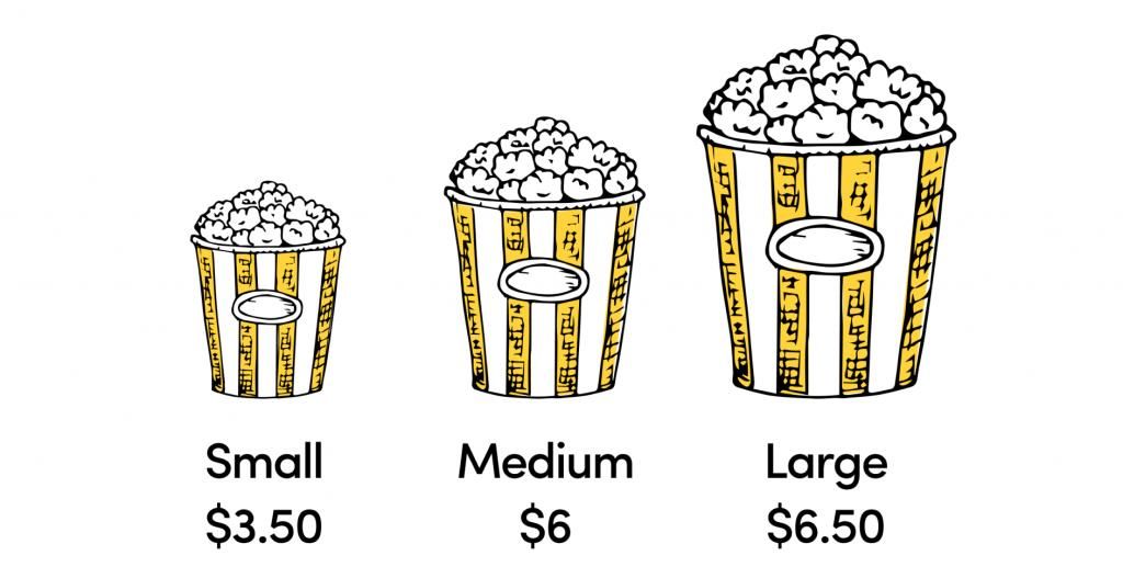
The Decoy Effect, also known as the “asymmetric dominance effect”, is the phenomenon whereby adding a third pricing option (the decoy) makes the user change their preference towards an option the company is trying to promote. The “decoy” is priced to make one of the other options much more attractive.
The Scarcity effect, not so relevant to SaaS pricing pages, but still widely used, makes us believe that one or more of the available options are “scarce” and we subconsciously think it’s more valuable. So we want it (FOMO kicking in here).
Price anchoring is largely used to make the user believe that a product or service is more expensive and they could be getting a better deal with one of the options on offer. Similar to the Decoy Effect, the “expensive” option is usually added to make the most popular option look a better deal. In reality, how expensive or cheap something is, it’s all subjective and relative. Having an anchor price simply allows us to compare it to something else and make a decision.
So taking into consideration that all these rules and principles are largely used and they usually work, here’re some practical tips on how to make sure you’ve designed a pricing page optimised for conversions. All based on our experience designing hundreds of products.
The golden elements of a high-performing pricing page
Simple and easy to understand
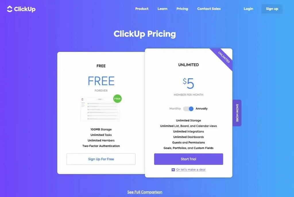
It goes without saying that simplicity is the keyword when it comes to pricing page best practices. You don’t need all the details listed on one page — you need the main features and functionalities that bring the biggest value to your buyer persona. The best way to check how easy to understand your pricing page is to test it with people who’re not familiar with your product. Do they get straight away what each tier is offering? Ambiguity leads to confusion. Confusion creates friction. A fantastic example by Clickup.
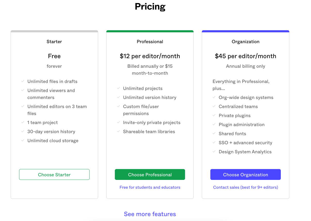
Split the comparison table in two sections
Some of the best-performing pricing pages follow this structure. The main comparison module has the most important features and differences between the pricing plans (up to 15 rows is best). The rest are separated in an accordion-style drop-down, a pop-up modal, or another section down the page. Below is an example from Figma.
Freemium or free trial option
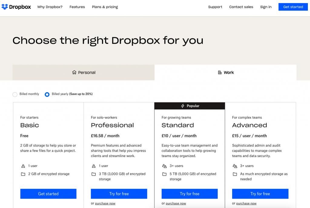
This goes beyond the design of the pricing page, it should be part of your pricing strategy. A freemium version or a free trial have proven to increase conversions and activation. It has become a standard in the SaaS space for products relying on product-led growth and it also gives you credibility — if you can’t offer a free taster, why should I invest my time and money in evaluating the suitability of your product. Perfectly done by Dropbox.
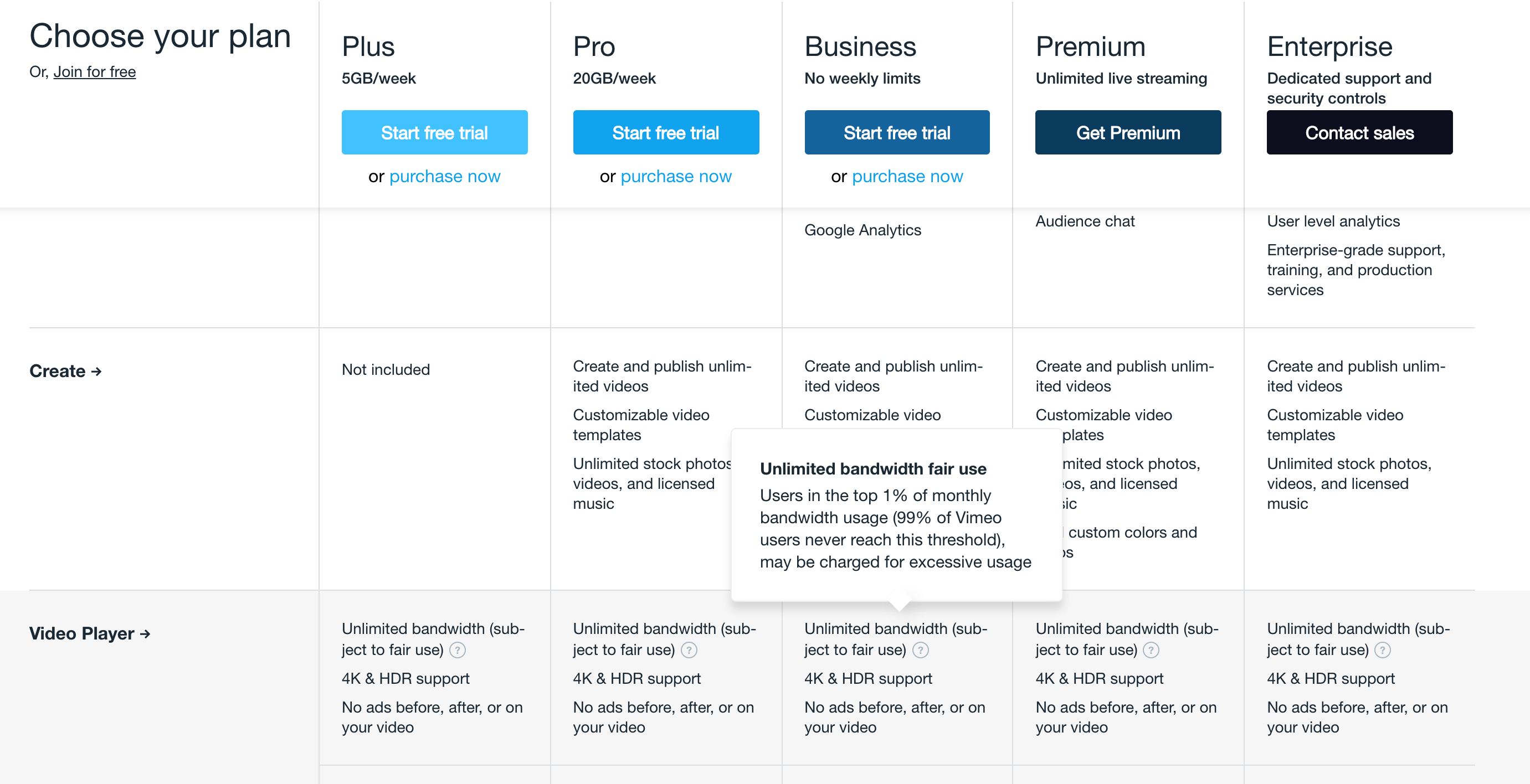
Use tooltips to provide more details
More complex product features require more details and explanation. To avoid cluttering the page, we recommend going with a beautifully designed tooltip, instead of including everything in the main layout or linking to another page. This will keep the user experience smooth and still provide all the necessary information. Check out how Vimeo is solving this.
Center your pricing around your value metric
Patrick Campbell and his company ProfitWell are the champions when it comes to SaaS pricing strategies, so we highly recommend their content if you’re serious about optimising yours (you can also check our interview with Patrick below, with plenty of tactical tips). They recommend quantifying your buyer personas and then aligning your pricing plans to the different customer personas, both in terms of packaging (i.e., what’s included) and the number you’re actually charging.
You must price and package your product around the value the user is getting and their most pressing needs. This will ensure you’re hitting the mark when it comes to listing the right features and being “fair” with your pricing (or at least what the customer thinks is fair)
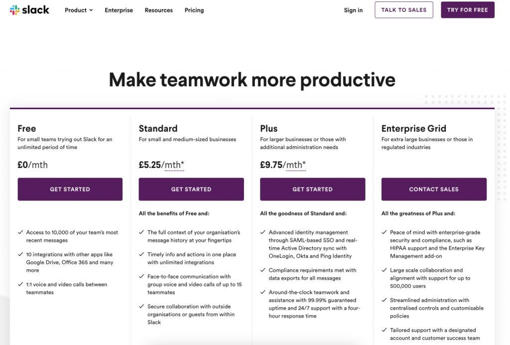
Slack are popular with their extensive work in this space.
Take advantage of the add-ons
Another great piece of advice from the same company is the way we treat features that are not relevant to all users. A good rule of thumb is that if a feature is used by less than 40% of your users, it should be offered as an add-on. The reason? — Your customers won’t feel they’re paying for something they don’t use. It’s also an amazing opportunity to upsell and generate more revenue from the users who’re happy to pay for that feature.
A toggle to switch between annual and monthly pricing
This is already adopted by thousands of companies, but one thing we don’t see as often is the annual pricing shown as a discount. Make sure you make your annual subscription as appealing as possible, as the annual subscribers retain at a much higher rate and are also linked to lower churn. So instead of just showing the lower price, design the layout so the user feels they’re getting a discounted price if they go with the annual option.
Your most expensive plan first?
This surely goes against Jacob’s law, but we’ve seen a number of studies suggesting that starting from your most expensive plan rather than the cheapest might increase revenue. According to Neil Patel, “81% of those with pricing pages listed the least expensive pricing plan on the left-hand side before moving up to the most expensive.” But a study by CXL suggests that users choose expensive packages most often when they were listed first. If I’m launching a pricing page now, I’d surely run an A/B test and see the results for my business.
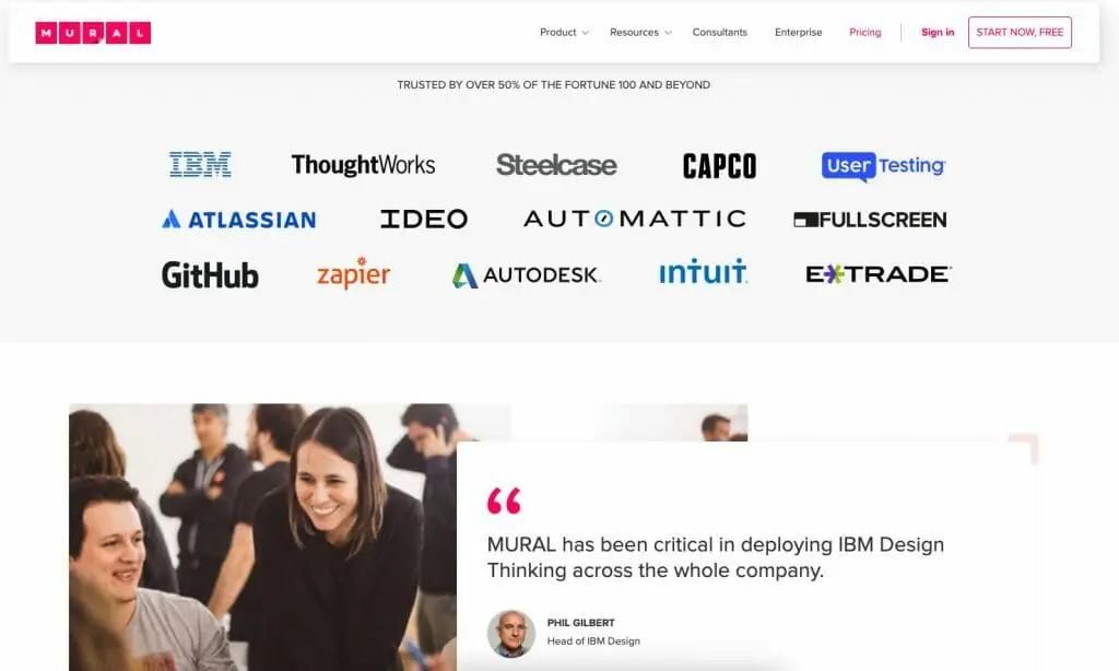
Include social proof elements
Recognisable brand logos and customer recommendations are a super-effective way to improve conversions. The challenge with including them on the pricing page is making sure they don’t interfere with the subscription flow, which is a relatively easy task. A nicely designed section “Trusted by” listing your most popular clients’ logos could have an amazing impact on your conversion rate, as well as carefully selected testimonials by respected industry experts in your space. Great example by Mural.
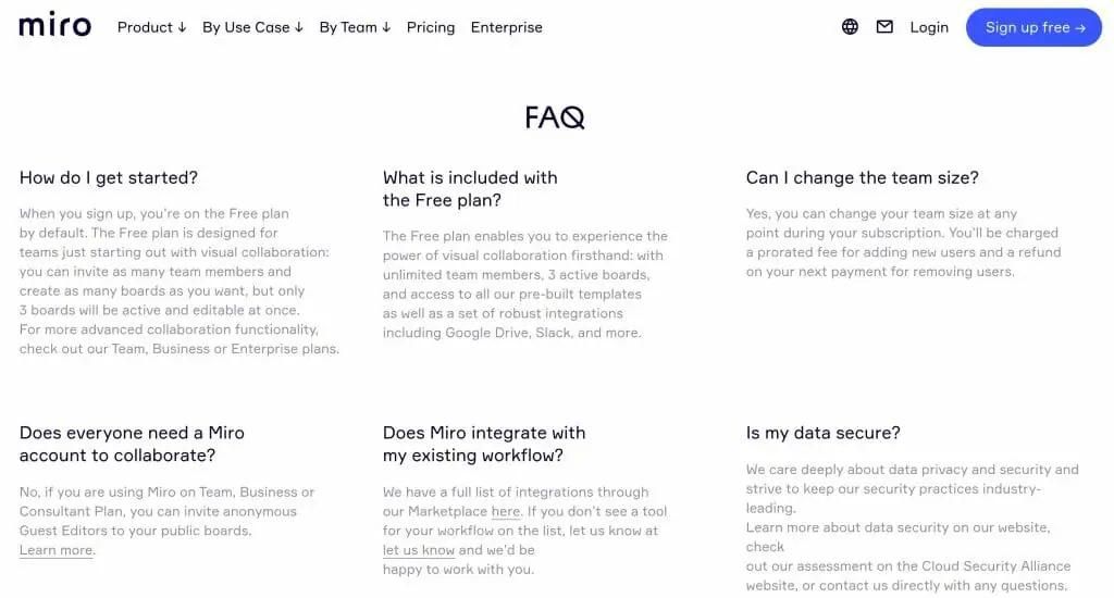
FAQs and Live Chat
The goal here is to remove any uncertainty and ambiguity around your pricing plans. If a user has a quick question, they should be able to find the answer easily. Even if you have designed a spotless pricing page, you’ll still have people who just need greater peace of mind or by nature, they love asking questions. Showing you’re available to help any time gives you extra credibility, too. The only thing we advise against is an automated popup chat window on the pricing page, as it might come across as a bit spammy and it might interfere with the subscription flow. Miro are doing a great job here.
Include your personality
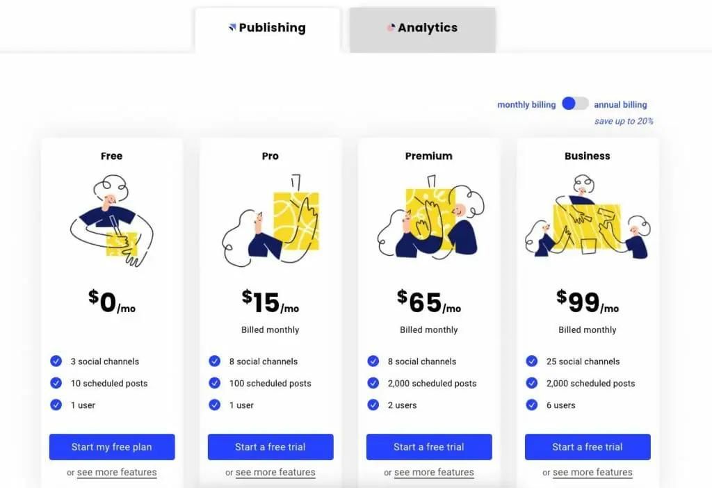
Similar to a restaurant menu, your pricing page should be on-brand, reflect your personality, and make the user excited about “ordering” the best option. Simplicity is your main priority but to make your product even more enticing, you should let your brand personality shine through. If a user has reached the pricing page, it means they’re ready to trust you, so having a generic design might have the opposite effect. Brand and design have a huge impact on our willingness to pay, so make sure your pricing page reflects what you stand for as a brand. A beautiful example by Buffer below.
Keep an eye on your bounce rate
This is one of the simplest and most effective things you could do to make sure you understand how users feel about your pricing. A high bounce rate indicates issues with your pricing strategy and tiers. Long sessions with a low conversion rate suggest your pricing is not clear enough. If your conversion rate is better than expected, there might an opportunity to increase your prices.
One thing is for sure — designing the perfect pricing page is not a one-off task, it’s a process of continuous monitoring, research, testing, and improvements.
Check our interview with Patrick Campbell, founder and CEO of ProfitWell, discussing pricing page tactics, pricing optimisation, and monetization strategies.