Master Public Speaking (Even If You're Terrified of It)
Dr. Alexander McWilliam


From Gamer to Web3 Disruptor: How Amos Whitewolf Is Rebuilding Gamer Trust with PerionXP
Amos Whitewolf


From 0 to $25M ARR Bootstrapped: Adam Robinson’s Blueprint for SaaS Growth Without Funding
Adam Robinson


How to Scale as a CEO – Mindset, Strategy & Leadership Shifts, with Joe Leech, CEO Coach
Joe Leech


From Corporate Lawyer to Social Impact Entrepreneur: Sanjay Lobo's Journey with OnHand
Sanjay Lobo


From Premier League Star to Wellness Entrepreneur: Thomas Robson-Kanu's Journey with The Turmeric Co
Thomas Robson-Kanu

Master Public Speaking (Even If You're Terrified of It)
Dr. Alexander McWilliam
From Gamer to Web3 Disruptor: How Amos Whitewolf Is Rebuilding Gamer Trust with PerionXP
Amos Whitewolf
From 0 to $25M ARR Bootstrapped: Adam Robinson’s Blueprint for SaaS Growth Without Funding
Adam Robinson
How to Scale as a CEO – Mindset, Strategy & Leadership Shifts, with Joe Leech, CEO Coach
Joe Leech
From Corporate Lawyer to Social Impact Entrepreneur: Sanjay Lobo's Journey with OnHand
Sanjay Lobo
From Premier League Star to Wellness Entrepreneur: Thomas Robson-Kanu's Journey with The Turmeric Co
Thomas Robson-Kanu
Design
4 min read
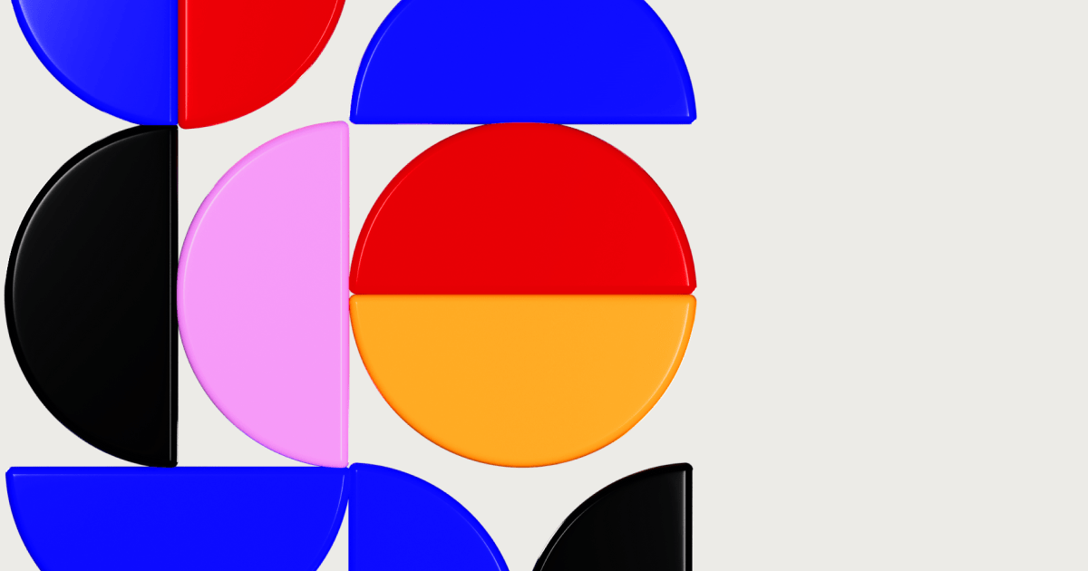
The Key Principles of Great Design
Design is an exciting and dynamic world, and there are a few tried-and-true principles that can help you create designs that are not just visually pleasing, but also captivating and engaging! Let’s dive into these design principles and see how you can make your designs stand out from the crowd!
Balance
Imagine your design as a seesaw. You don’t want one element to hog all the attention, right? Achieving balance means finding that sweet spot where everything works together in harmony, whether you’re going for symmetry or a little bit of asymmetry. So, make sure your design is not tipping too much to one side or the other!
Contrast
If your design is as boring as watching paint dry, it’s time to shake things up with some contrast! Using differences in colour, size, texture, or shape can create eye-catching combinations that draw the viewer’s attention to specific parts of your design. It’s like a funky dance move that catches everyone’s attention!
Proximity
Just like people, design elements need friends too! Elements that are close to each other are seen as related and connected, so use proximity to your advantage. Bring your elements together and create a sense of unity and organisation that’s like a big, warm hug.
Repetition
Repetition might be boring in real life, but in design, it’s the secret sauce for creating unity and cohesion. By using repeating elements like colour, shape, texture, or typeface, you can make your design instantly recognisable and memorable. It’s like a catchy chorus that gets stuck in your head (in a good way).
Hierarchy
You can’t have everyone shouting at once – that’s just chaos! Establishing a clear visual hierarchy means giving some elements more prominence than others, guiding the viewer’s eye through the design like a wise conductor leading an orchestra. So, make sure your design is not a chaotic noise, but a harmonious symphony!
Alignment
Nothing screams “unprofessional” like a design that’s all over the place. Proper alignment can help you create a sense of order and organisation that’s like a well-organised closet.
Make sure your elements are in the right place, so your design looks sharp and polished.
White Space
Don’t be afraid of the blank canvas – it can be your friend! Using white space intentionally can help you create a sense of balance and clarity that’s like a breath of fresh air. Let your elements breathe and draw the viewer’s attention to the most important parts of your design.
By following these design principles, you can create designs that are not just visually stunning, but also communicate your message loud and clear. So, unleash your creativity, have fun and create designs that will blow everyone’s minds away!
Check out Pony’s portfolio for real-world examples of great design.