Master Public Speaking (Even If You're Terrified of It)
Dr. Alexander McWilliam


From Gamer to Web3 Disruptor: How Amos Whitewolf Is Rebuilding Gamer Trust with PerionXP
Amos Whitewolf


From 0 to $25M ARR Bootstrapped: Adam Robinson’s Blueprint for SaaS Growth Without Funding
Adam Robinson


How to Scale as a CEO – Mindset, Strategy & Leadership Shifts, with Joe Leech, CEO Coach
Joe Leech


From Corporate Lawyer to Social Impact Entrepreneur: Sanjay Lobo's Journey with OnHand
Sanjay Lobo


From Premier League Star to Wellness Entrepreneur: Thomas Robson-Kanu's Journey with The Turmeric Co
Thomas Robson-Kanu

Master Public Speaking (Even If You're Terrified of It)
Dr. Alexander McWilliam
From Gamer to Web3 Disruptor: How Amos Whitewolf Is Rebuilding Gamer Trust with PerionXP
Amos Whitewolf
From 0 to $25M ARR Bootstrapped: Adam Robinson’s Blueprint for SaaS Growth Without Funding
Adam Robinson
How to Scale as a CEO – Mindset, Strategy & Leadership Shifts, with Joe Leech, CEO Coach
Joe Leech
From Corporate Lawyer to Social Impact Entrepreneur: Sanjay Lobo's Journey with OnHand
Sanjay Lobo
From Premier League Star to Wellness Entrepreneur: Thomas Robson-Kanu's Journey with The Turmeric Co
Thomas Robson-Kanu
UX & UI
11 min read
How UX Impacts SEO - 10 UX Fixes That Will Improve Your Google Ranking
Strong keywords and quality backlinks are still important SEO factors, but in 2020 all Google cares about is if users genuinely like your website and engage with your content. In other words – have you done a good job with your UX?
As the SEO expert Neil Patel puts it “Google wants to rank sites you want to see”. If you can’t win people’s attention and your website doesn’t match their search intent, you’ll have a hard time with SEO.
Fast, easy to use and content-heavy websites will rule the SEO game in 2020 and beyond. Sounds easy, right? It’s surely more straightforward than before, but nailing it requires consistent cross-functional effort from designers, UXers, front-end developers, copywriters, marketers and back-end engineers.
Read later: Improve Your Onboarding with Powerful UX Copy – 5 Products that Nailed It
Here’re the key UX components to consider when designing with SEO performance in mind (in fact, you should always be designing with SEO in mind!)
1. Page Speed
Good old site speed that we’re all trying to get to 99% is one of the key site metrics that impact the user experience, hence how much Google likes your website.
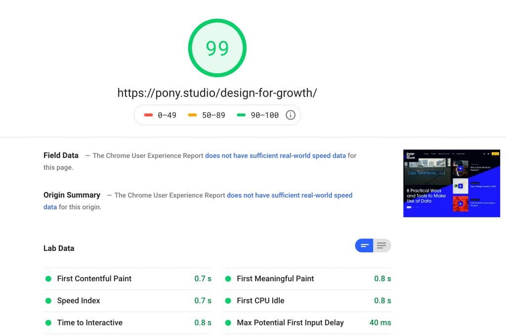
The most common mistakes from a design point of view is not optimising images and including too many animations and visual effects in key landing pages, which add tons of JavaScript and CSS snippets.
Want to fix your site speed? Start with minifying your HTML, CSS and JavaScript, and implement all UX and front-end suggestions on PageSpeed Insights.
2. Maximise H1 and H2
H1 and H2 are the most important content elements for Google. Treat them almost like your meta titles and meta description.
The ideal length for H1 is 20-70 characters and for H2 – 50–160 characters. Three words titles might look cool, but are not always the best options from a growth point of view, so make sure your design allows enough copy, especially on your splash page.
3. Dwell time
Dwell time is the time a user spends between clicking the link on the search engine results page (SERP) and the moment they comeback to the SERP. The back and forth clicking when googling something that you’ve done thousands of times. Basically, the more time search users spend on your website, the better.
From a UX point view, you should be aiming for engaging, rich layouts with informative pieces of content that catches the user’s attention and ideally makes them nod while reading the page. Don’t try to trick them into clicking though endless pages, as this would have the opposite effect.
To calculate your dwell time, go to Google Analytics and see the session duration from organic search. This is different from an average session duration that you see in the overview section.
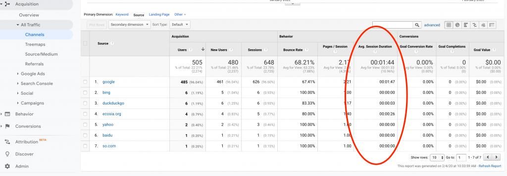
Go to Google Analytics –> Acquisition –> All traffic –> Channels –> Organic Search and see the average Session duration from your organic traffic.
4. In-depth content
Directly related to the previous point, Google favours pages that offer detailed, informative content that people read, spend time on and engage with. Sadly, large empty site sections with limited copy and stunning imagery are not Google’s favourites (sorry, motion designers and illustrators!)
There’s no ideal copy length for SEO, but analysing the results from a quick Google search on any topic proves that you need around 1000 words to make a page stand out.
Bear in mind that Google is smarter than that and it can detect if the content is repetitive and shallow. It’s looking for in-depth information on the topic related to the specific search.
For example, if you’re designing a landing page for an organic cosmetics brand, consider extra sections like case studies, customer testimonials, embedded video, before and after photos with optimised alt text, etc.
Anything that’s informative and will make the user spend more time browsing the content. These could be just snippets from other pages you link to, but with different copy (to avoid duplicated content).
5. Optimise for all screens to improve bounce rate
This sounds like advice from 2005, BUT your site must be optimised for all screens and devices. Poor mobile experience is the main reason for high bounce rate, which we all know is an SEO killer.
Higher than the average bounce rate is not always a bad thing. From a UX point of view it might mean that the user found the content they were looking for straight away. However, if the bounce rate is extremely high it means users are generally disappointed with the quality or relevance of the content, or with the site performance.
So check all browsers and all devices to make sure that you’re not drawing wrong conclusions about the quality of your content. Start this tool – Responsive Design Checker.
6. Nail the site navigation
Complex or hard to navigate site menu is a common UX mistake that’s affecting your SEO performance more than you think.
The site navigation should be accessible from all pages and all devices. Menu items should have clear and concise titles. Avoid more than 2-level navigations and consider a search bar for websites with more than 50 pages.
Best practice for mobile – make the menu sticky.
7. Make social media share buttons sticky
Google favours content that’s been shared on social media and accessed from a variety of sources and mediums. A great UX tweak would be to make the social media share buttons easily accessible on all pages.
You can make them sticky or include them in a few areas of the page, depending on the design.
Just don’t treat the social media share buttons as an afterthought, as they’re an essential growth tool for content-heavy websites. Of course, don’t overdo it as this might annoy users.
8. Design for the user intent
Are you designing an e-commerce shop, a SaaS product or a B2C marketplace? What it matters the most here is if the user finds what they’re looking for quickly and efficiently.
Different queries have different intent – research, news, branded, commercial, etc. After analysing the most common intent for your users, you should design pages that serve their search intent. For example, you’re having tons of search queries related to “is raw diet good for dogs” that land on a page with your raw food brands. To improve the UX, you can add a section providing more information about raw food, why it is good for dogs, what vets and other customers say about raw feeding etc.
You should approach this in two steps:
- Add enough information about raw food to your initial landing page, as it’s already been “chosen” by Google.
- Create a new content-heavy landing page dedicated to the benefits of raw diet and link to it from the previous page, for users who’d like to read more about this topic.
Over time, Google will detect that the first page is for commercial intent queries and the second page is for information/research intent queries.
9. It’s not all about the homepage
Designer and UX practitioners love a linear approach when it comes to designing a new product. It all starts with the homepage and how all pages are linked to it.
Well, this is just right (a nice way to say it’s wrong 😉). Why? Because, as we quickly realise, the user flow funnel is sadly not something we create in a lab, users click everywhere and could land on any live page.
The UX of each page should be carefully optimised for the desired action. For example, can users easily come back to the main website when visiting the blog? What happens when they visit the “Contact Us” page and don’t submit an enquiry? Do they have the opportunity to engage with your product even further – case studies, FAQs, etc?
Have a look at your top 20 pages and you’ll be surprised how much UX work is needed beyond the homepage to make sure your user flow is optimised.
10. Accessibility
Accessibility has become a buzzword in the tech industry with many practitioners still not knowing how to approach it. It often comes as an afterthought, not a requirement when building new products.
Even if you leave the responsibility factor aside (and you shouldn’t!), making your site more accessible will result in:
- more traffic
- lower bounce rate
- improved SEO (Google favours accessible websites)
It’s also an opportunity to dominate your industry, as the majority of your competitors are probably not there yet.
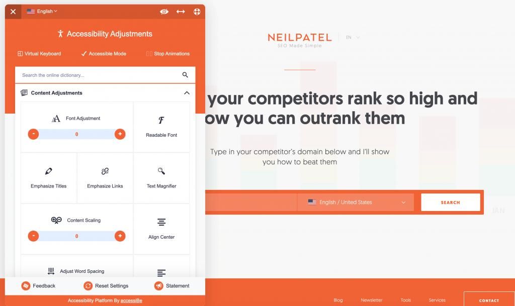
The tricky part is that we all want to make our websites and products accessible, but when this comes with a massive cost we’re forced to measure the ROI of this investment. A good widget to help you get started with accessibility is AccessiBe.
Google loves websites that users love. It has become that simple. Every minute you invest in improving your UX will result in positive outcomes for your SEO. Start with the above 10 steps and keep optimising your pages to see your traffic from organic search growing month by month.