The brands of tomorrow
Moneda
Sovereign Borderless Finance

Smartstream
Redefining Financial Technology

Fluent
The First Blended Execution Network

IMSERV
Energy Data Intelligence

Radius
A Guiding Light for the Rollup Ecosystem

Advai
Assuring Artificial Intelligence

Seda
A Foundation for Data in Web3

Coinbase backs Seda in strategic move for web3 infrastructure

Paradym
Crypto iGaming, Rewired

Dusk
Decentralised & Regulated Finance

Smey
Engineering the Future of Biotech with AI
"The rebrand has strengthened conversations with major international partners - there’s growing interest across the board."
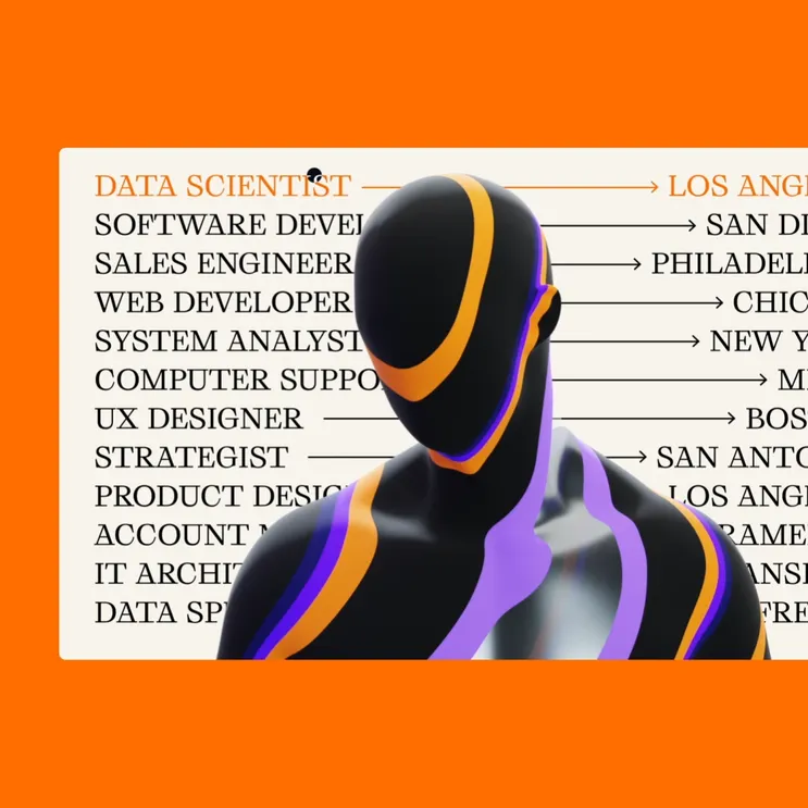
Raydar
Emerging Tech Talent

Districts
Earth's Digital Twin

Oxford Heartbeat
Life-Saving Surgical Decisions

Elixir
Market Making Reimagined


