Pony Studio UX/UI design studio in London

Hop · product design and brand identity

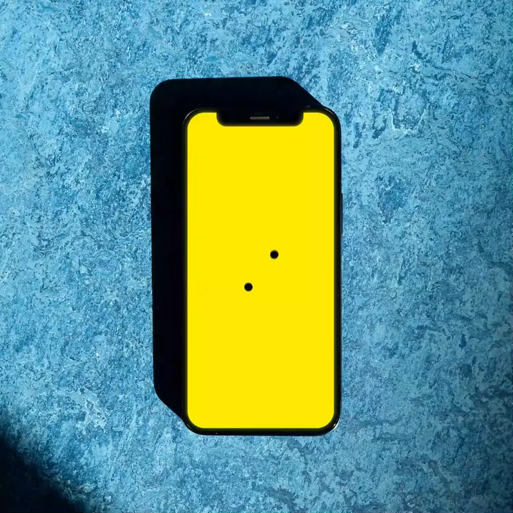
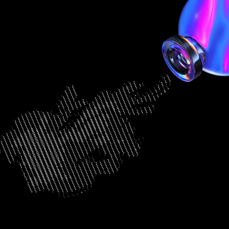
Illustrations for Hop

Hop is democratising access to cryptocurrency, making it easier for everyone to buy and spend their crypto. They want to make sure that even your mum will enjoy using it!

The easiest way to spend your crypto

Hop users can easily exchange a number of cryptocurrencies with fiat money and spend it whenever they wish using their Hop debit card. The product also offers investment opportunities for people who wish to only buy and keep crypto in their digital wallet. Hop’s main differentiator in the crowded fintech market is that they’re making using your crypto “deadly easy” and every element of the branding and the user experience had to convey that message.

Logo Design for Flok

The Visual Identity

The branding was all about communicating the ease of use and accessibility - there’re no barriers or sophisticated financial jargon. Hop is for everyone and you don’t need to be tech savvy to be a user. The team was after a fun, exciting look & feel, without jeopardising the trust and safety it needed to communicate. The colours speak calm and trust, while the playful typography and illustrations bring the millennial spirit to live.

The identity lives and breathes innovation and forward thinking. It’s a new era in the fintech world and your finance don’t need to be associated with boring endless phone calls with the bank.

Logo Design for Flok

User Experience

The challenges around the UX were how do we turn traditionally heavy user journeys, impacted by the number of regulatory requirements, into a more enjoyable process, matching the brand vision that this should be “ very easy”. This project is a great example of how strong branding, smart micro-interactions and the right UX copy can influence the perception of the user and turn usually boring tasks (like identity checks and money transfers) into fun and engaging user flows. We were laser-focused on making each “red route” as quick, painless and intuitive as possible, which would ultimately result in quicker adoption and reaching the Aha! moment sooner in the user lifecycle.

Logo Design for Flok

You might have seen our work on:

The latest tech and startups Print and online magazine about design and technology The biggest media for startups and tech news The best ux and ui designs
Contact us

Avg response time: 52min

Like what you see?

Next project

👉

◆ OPEN MINDS - A LIMITED EDITION NFT COLLECTION SEE ON OMS.XYZ ◆ OPEN MINDS - A LIMITED EDITION NFT COLLECTION INSPIRED BY 7 TYPES OF ENTREPRENEURS SEE ON OMS.XYZ ◆ OPEN MINDS - A LIMITED EDITION NFT COLLECTION INSPIRED BY 7 TYPES OF ENTREPRENEURS SEE ON OMS.XYZ ◆ OPEN MINDS - A LIMITED EDITION NFT COLLECTION INSPIRED BY 7 TYPES OF ENTREPRENEURS SEE ON OMS.XYZ